Custom code
This article explains how to customize the appearance and behavior of Org Chart using custom code.
With CSS, you can control styling, such as colors, box size, and spacing. With JavaScript, you can modify how elements are rendered and add dynamic behavior based on your employee data.
Custom CSS
You can already customize content styles by creating a theme in the Templates panel. But if you need more control, you can also apply custom CSS styles and match the appearance of your charts to your brand.
Note
For the versions earlier than 4.x.x (including on-premises ones), please check the instruction.
How to change the background
You can use CSS to change the appearance of chart elements, such as background colors. In most cases, you don’t need custom styling for that; just use the General settings panel to change the chart background.
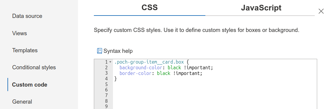
For example, you can use the following code to set both the background and border color of each box to black.
.poch-group-item__card.box {
  background-color: black !important;
  border-color: black !important;
}
On the picture below you can see the CSS code added in the wizard:
How to resize boxes
You can resize boxes to fit more items on the screen, which is useful for larger org charts.
/*Width of the box*/
.poch-group-item__card {
  width: 170px;
}

/*Font size for the fields in the box*/
.poch-group-item__card.box .poch-box__field {
  font-size: 12px;
}

/*Font size for the header field in the box (the first in the box)*/
.poch-group-item__card.box .poch-box__field.poch-box__header a {
  font-size: 12px;
}

/*Width of the photo in the box*/
.poch-group-item__card.box .poch-box__photo-container {
    width: 42px;
    height: 42px;
    min-width: 42px;
    min-height: 42px;
}
How to customize lines
We use different classes for the connection lines, based on their purpose:
poch-node-line: Base class for all connection lines.poch-node-line_solid: Solid lines, which represent base connections.poch-node-line_dashed: Dashed lines, typically used to indicate dotted-line subordinates.poch-node-line_small-dashed: Small-dashed feature lines. These lines are specifically used for connecting a box and a small dot button to dotted-line managers’ menus.
And you can customize these lines using the following properties:
stroke: Defines the color of the lines.stroke-width: Defines the width of the lines.stroke-linecap: Defines the shape of the line endings for open subpaths.stroke-dasharray: Defines the pattern of dashes and gaps in the line.
Hint
For most use cases, you can change the connection line color in the General settings panel.
Let’s look at an example of how to customize dotted lines:
/*Dashed lines*/
.poch-node-line_dashed  {
  stroke: coral;
  stroke-width: 1px;
  stroke-linecap: round;
  stroke-dasharray: 10px 5px;
}
Resulting Org Chart:
Review more articles on customizing Org Chart look:
JavaScript
Note
For the versions earlier than 4.x.x (including on-premises ones), please follow the Introduction to JavaScript framework.
Note
Editing JavaScript is available only for Tenant Administrator (Global Administrator). Also, the Tenant Administrator can disable the Custom JavaScript feature globally.
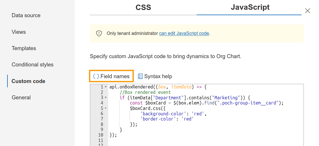
You can also add custom JavaScript to modify how elements are rendered, and functions from JavaScript framework to handle events such as box rendering, tooltips, and search results. Each event provides the rendered element and its associated data, and the object includes all fields from the data source.
Click Field names to see available fields.
For more information, read about JavaScript framework.
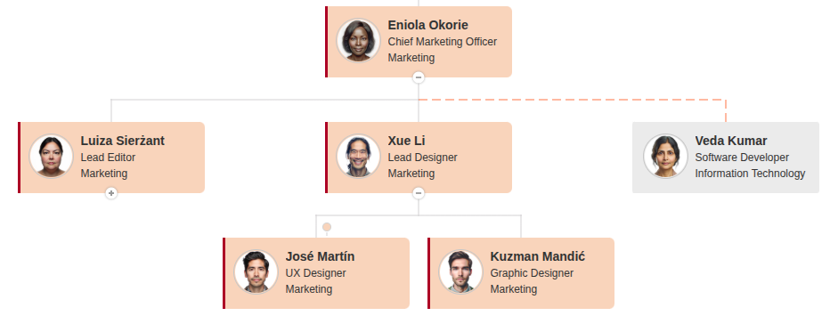
The example below highlights employees from the Marketing department by changing their box color to red.
api.onBoxRendered((box, itemData) => {
    //Box rendered event
    if (itemData["Department"].contains("Marketing")) {
        const $boxCard = $(box.elem).find(".poch-group-item__card");
        $boxCard.css({
            'background-color': 'red',
            'border-color': 'red'
        });
    }
});
Note
Go to the next step of the configuration wizard – General.