Customize box HTML template and CSS styles in Org Chart
Note
For the versions earlier than 4.x.x (including on-premises ones), please follow this instruction.
This article shows how to customize box templates and styles using HTML and CSS.
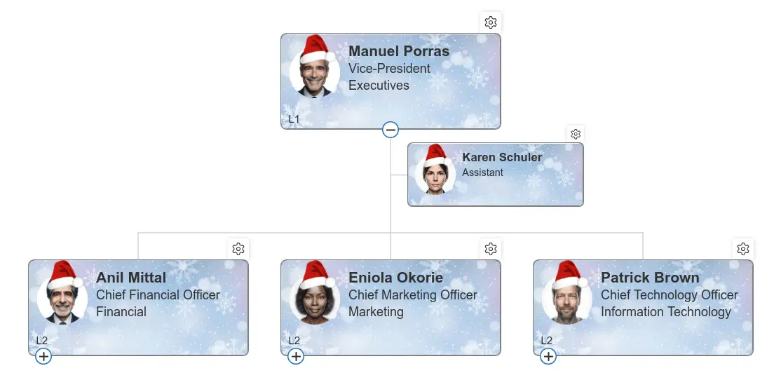
As an example, we’ll create a Christmas themed layout by adding decorative elements (a Santa hat and beard) and styling the boxes with custom backgrounds and animations.
While this example is seasonal, the same approach can be used to build any custom design for your org chart.
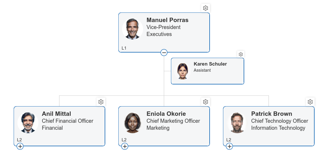
This is how it looked before customization:
Org Chart allows you to customize templates for boxes, tooltips and search results using Handlebars templating framework. It supports conditions, iterators, and custom helpers. You can experiment with templates using this tester.
How to customize box template
First, upload the images for the cap, beard, and background to a document library.
Hint
We used the PublishingImages library. If you use a different location, update the image paths in the HTML and CSS accordingly. You can also download archive with pictures.
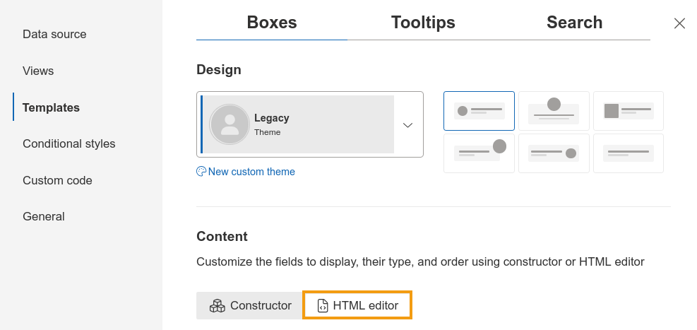
Open the configuration wizard in the Templates step and switch the Boxes template to HTML editor. This converts the visual template into editable HTML.
Then add two additional <div> elements for the custom images:
One for Santa’s cap:
<div class="santa-cap">
  <img src="../PublishingImages/santa-cap.png"/>
</div>
And one for the beard:
<div class="santa-beard">
  <img src="../PublishingImages/beard.png"/>
</div>
These elements are placed inside the box template and will later be styled with CSS.
The resulting template looks like this:
<div class="poch-box media">
  {{#if PhotoUrl}}
    <div class="santa-cap">
      <img src="../PublishingImages/santa-cap.png"/>
    </div>
    <div class="poch-box__photo-container poch-photo-container media-left">
      {{#detailsTooltipLink}}
        {{safeImage PhotoUrl}}
      {{/detailsTooltipLink}}
    </div>
    <div class="santa-beard">
      <img src="../PublishingImages/beard.png"/>
    </div>
  {{/if}}
    <div class="poch-box__content media-content">
      <div class="poch-box__fields-container content">
        <div class="poch-box__field poch-box__header">
          {{#detailsTooltipLink}}
            {{Title}}
          {{/detailsTooltipLink}}
        </div>
        <div class="poch-box__field">
          {{JobTitle}}
        </div>
        <div class="poch-box__field">
          {{Department}}
        </div>
      </div>
    </div>
</div>
{{subordinatesCount pochContext.needSubordinatesCount}}
{{boxLevelNumber pochContext.boxLevelNumber}}
It includes multiple tokens to display data source properties, along with the new custom elements.
The template also includes helpers such as detailsTooltipLink, which enables tooltip interaction when clicking a box.
You can include additional fields from the data source by adding {{Field}}, where Field is the internal field name.
How to customize CSS styles
Now that the HTML elements are in place, we need to style and position them correctly.
In this example, CSS is used to:
changes the box background,
positions the cap and beard,
and controls beard animations on mouse over.
Switch to the Custom code step to include the following selectors:
.poch-group-item__card: sets box background and border..santa-cap: positions the cap element..santa-cap img: defines cap size..santa-beard: positions beard and sets hover animation..santa-beard:hover: shows beard on hover..santa-beard img: defines beard size.
You can find complete CSS styles below. It includes comments that will help you to understand how it works:
/*Change box background*/
.poch-group-item__card {
  background-image: url('../PublishingImages/box-background.png') !important;
  background-color: white !important;
  border: grey 1px solid !important;
}

/*Set position for Santa's cap*/
.santa-cap {
  position: absolute;
  top: -2px;
  left: 16px;
  z-index: 1;
  -webkit-transform: rotate(-13deg);
}

/*Set size for Santa's cap*/
.santa-cap img {
  width: 36px;
}

/*Set position and initial state for beard*/
.santa-beard {
  position: absolute;
  bottom: 10px;
  left: 21px;

  /*Set animation delay for beard in all browsers*/
  -webkit-transition: margin 1s ease;
  -moz-transition: margin 1s ease;
  -o-transition: margin 1s ease;
  -ms-transition: margin 1s ease;
  transition: opacity .5s ease-in-out;

  /*Hide beard by default*/
  opacity: 0;
}

/*Show beard on hover*/
.santa-beard:hover {
  opacity: 1;
}

/*Set size for beard*/
.santa-beard img {
  width: 30px;
}
Conclusion
This completes the customization of the Org Chart box template. You’ve seen how to:
modify the HTML template to add custom elements
apply CSS styling to change appearance and layout
introduce simple hover-based animations
This example demonstrates a creative use of template customization, but the same approach can be applied to more practical scenarios such as highlighting roles, adding badges, or improving visual hierarchy. You can also extend it further with JavaScript for more advanced interactivity.