Choose how employee boxes look in the current template.
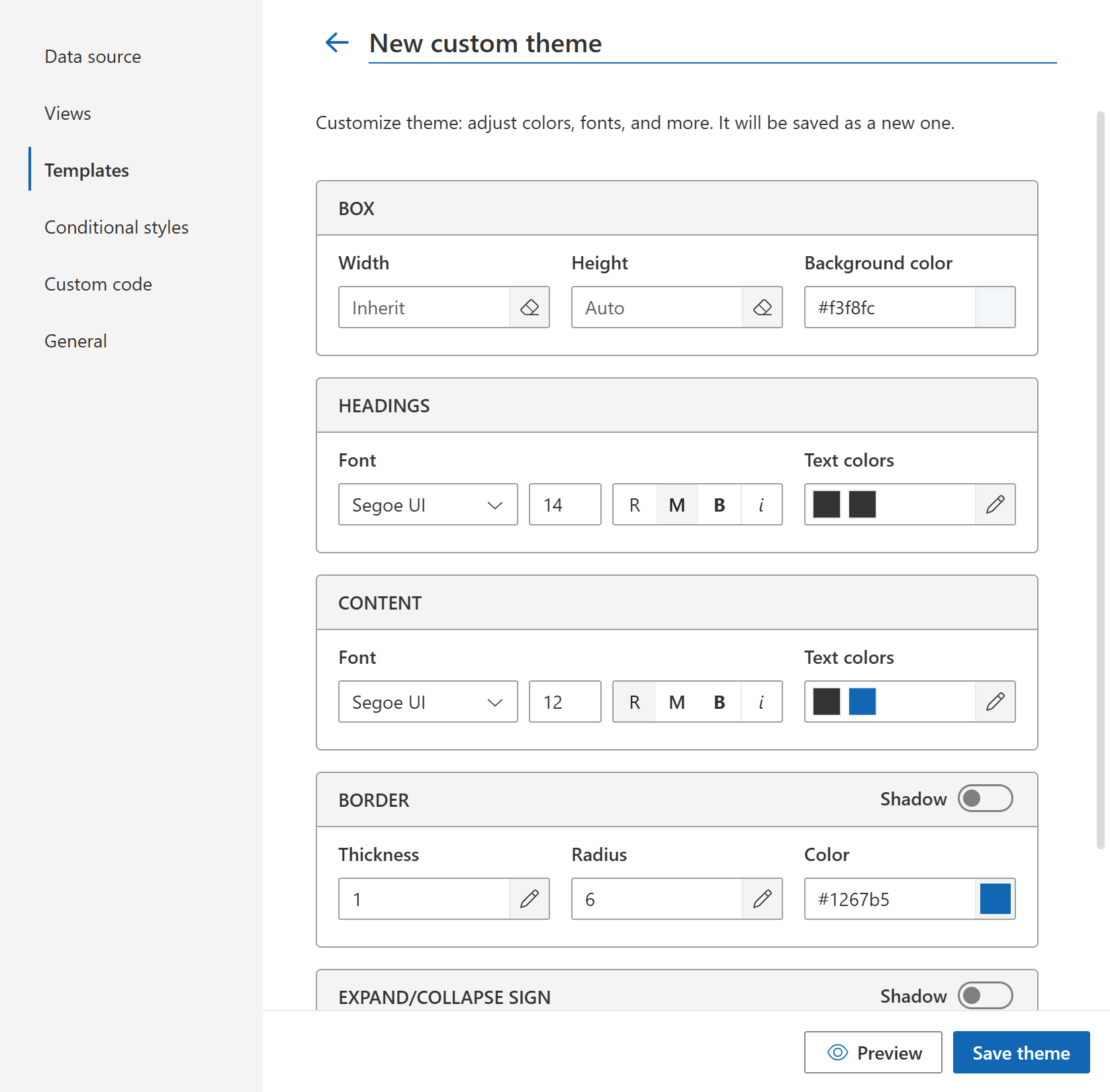
In the Design section, you can select a built-in theme, choose a box layout, create a new custom theme, or customize an existing theme. Theme customization includes colors, fonts, box size, borders, shadows, and other appearance settings.
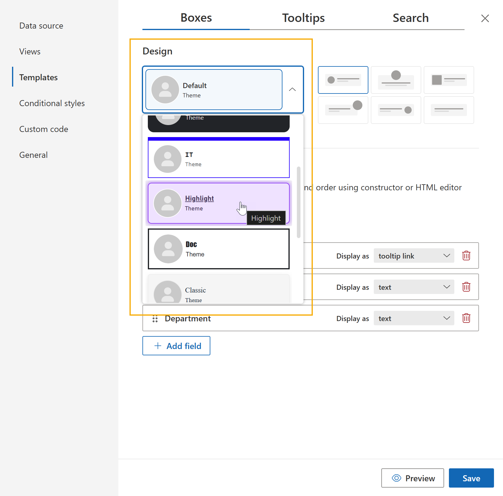
Use themes to control the overall appearance of employee boxes.
You can select one of the built-in themes, create a new custom theme, or customize an existing one. When you edit a built-in theme, Org Chart saves the result as a separate custom theme.
Theme settings let you configure box colors, fonts, dimensions, borders, shadows, and other visual properties.
Note
The selected theme is applied to all boxes in the current template by default. Conditional styles are applied only to boxes that match their conditions and override the general theme where applicable.
Choose how content is arranged inside employee boxes.
Each layout defines the position of the photo and text fields inside the box. Select the one that best matches your template design.
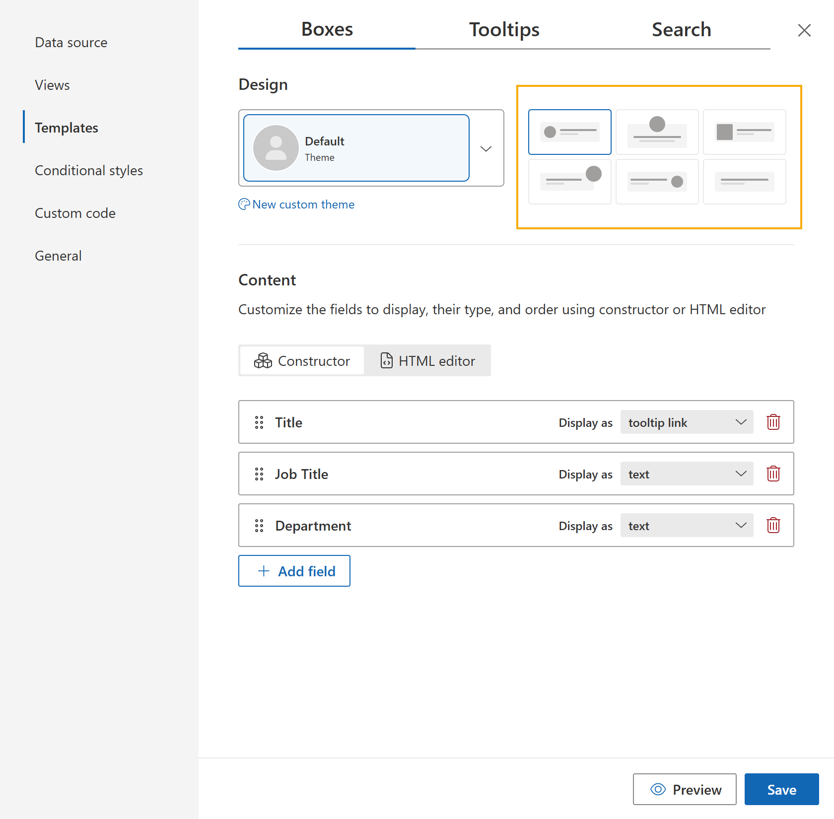
You can customize templates for three Org Chart elements:
Each element has its own tab, but the editing process is similar in all of them.
In this article, we use Boxes as an example. The same approach applies to Tooltips and Search templates.
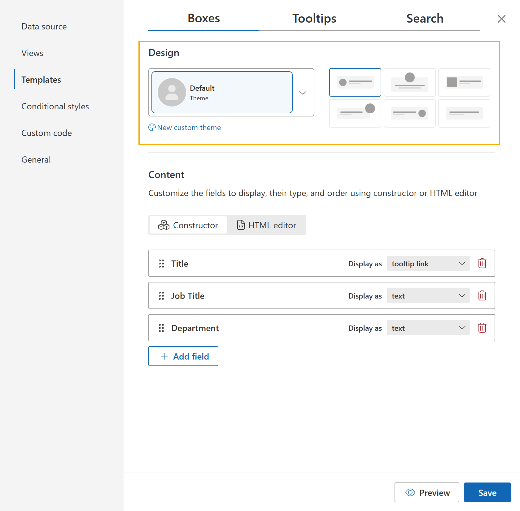
You can edit each template in one of two modes:
Use Preview to check your changes before saving them.
The Constructor mode lets you build a template without writing code.
In this mode, you can:
add fields to the template,
drag and drop fields to change their order,
choose how each field is displayed,
remove fields you do not need.
To add a field, click Add field and select a field from the list.
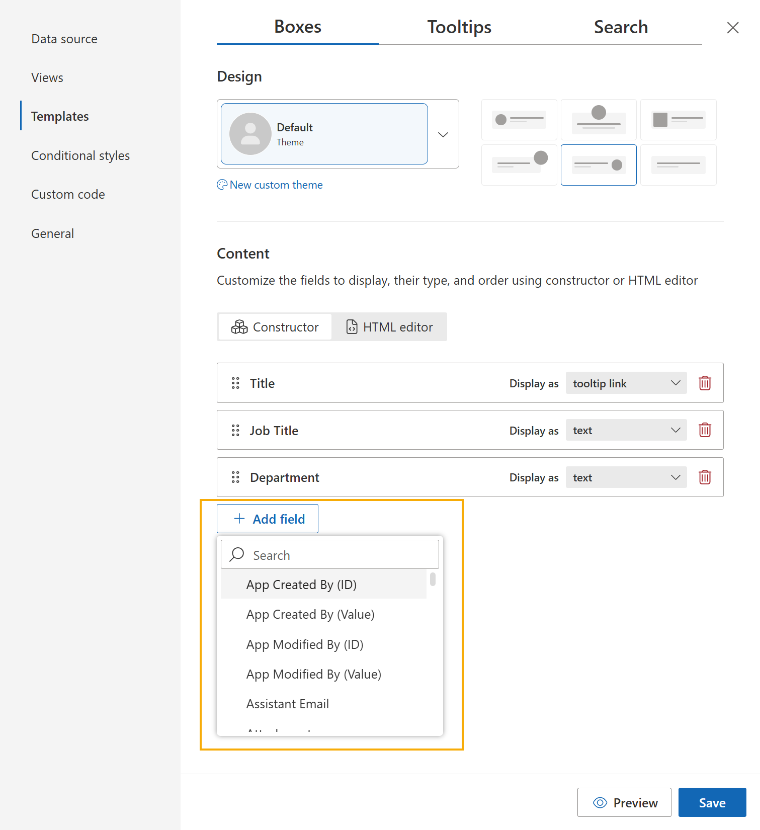
After adding a field, it appears in the template editor. You can drag and drop fields to reorder them.
Each field also has a Display as property that controls how the field is rendered.
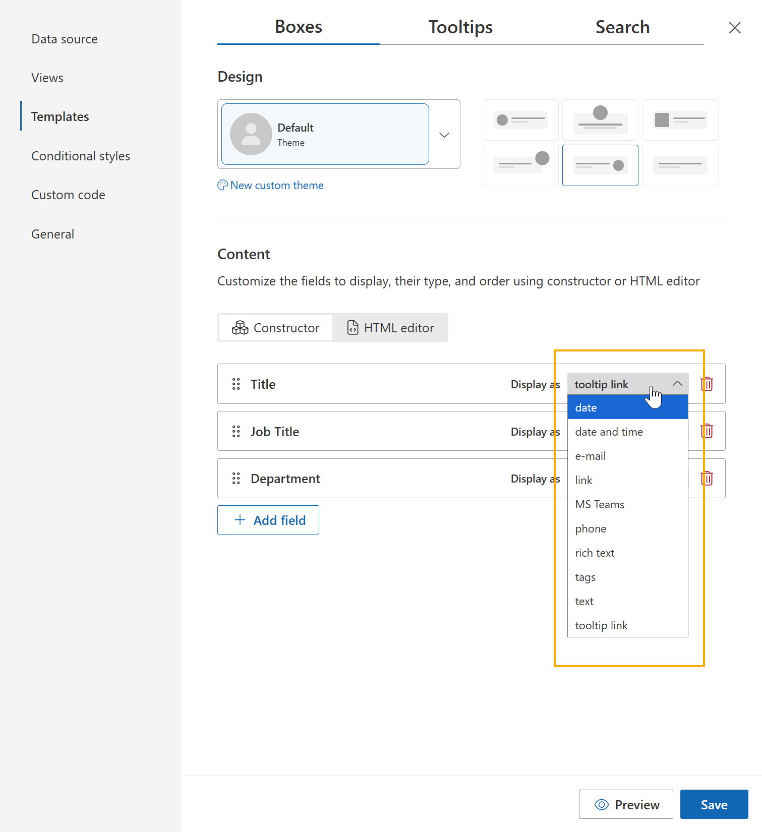
The following display types are available:
Type |
Description |
|---|
date |
It will be displayed as a date. |
date and time |
It will be displayed as a date with time. |
e-mail |
It will be displayed as a mailto link. |
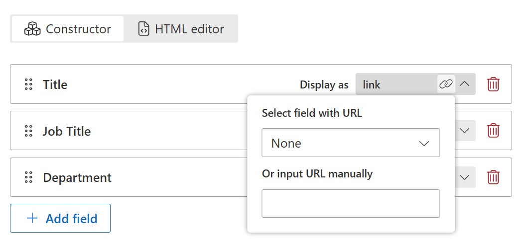
link |
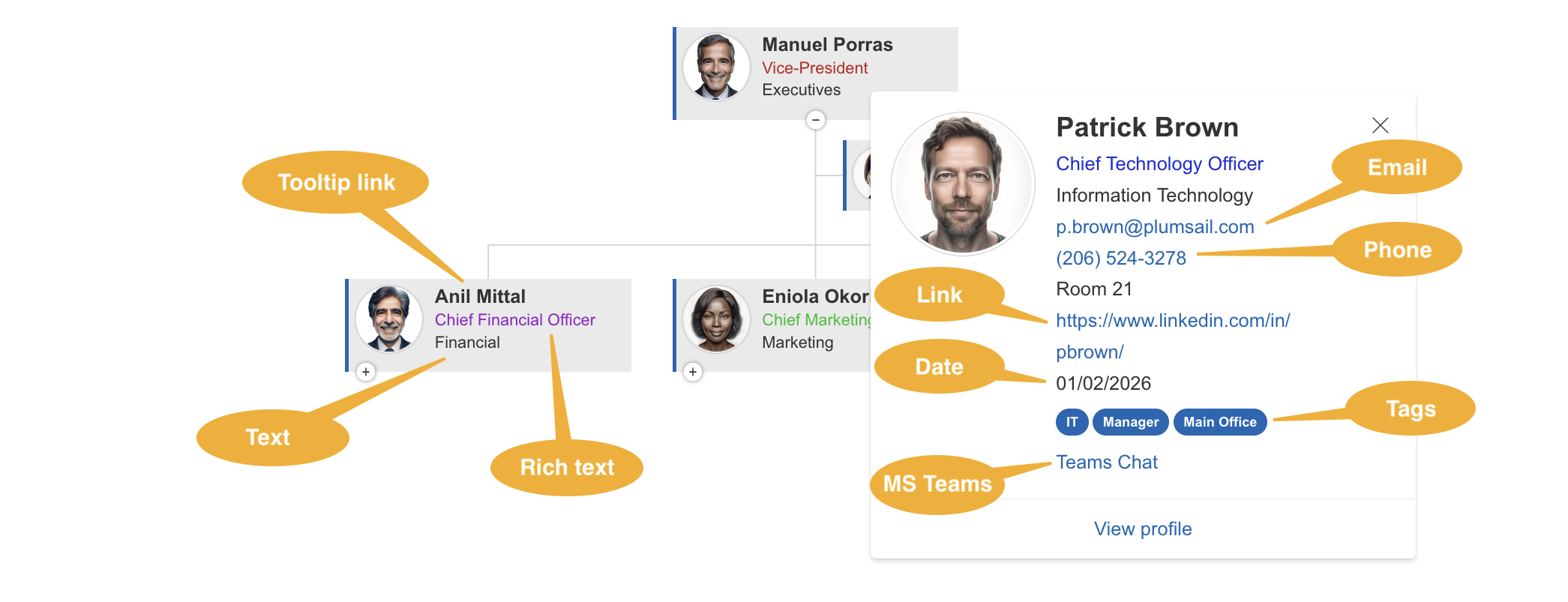
It will be displayed as a link.
Once you choose link as a display type, a tooltip will appear. This tooltip allows you to:
|
MS Teams |
It will be displayed as a link that opens a Microsoft Teams chat with the selected user.
For example, if you select the “Work email” field as a source for the MS Teams link, the Org Chart will open a chat with the user whose email is specified in that field. |
phone |
It will be displayed as a phone number. |
rich text |
It will be displayed as rich text (content that can include formatting such as bold text, colors, and other styling using HTML tags). |
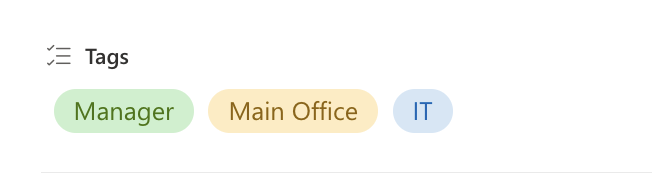
tags |
It will be displayed as multiple separated tags.
You can use this option with:
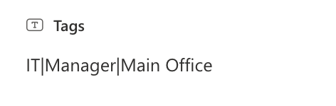
pipe-separated values (“|”) in a text column within a SharePoint list data source:
The Org Chart does not support semicolon-separated values yet.
multi-choice columns within a SharePoint list data source, where each selected value will be displayed as a separate tag:
this also applies to properties like “Skills” and “School & Education” in Entra ID or User Profiles data sources.
|
text |
It will be displayed as plain text (without formatting). |
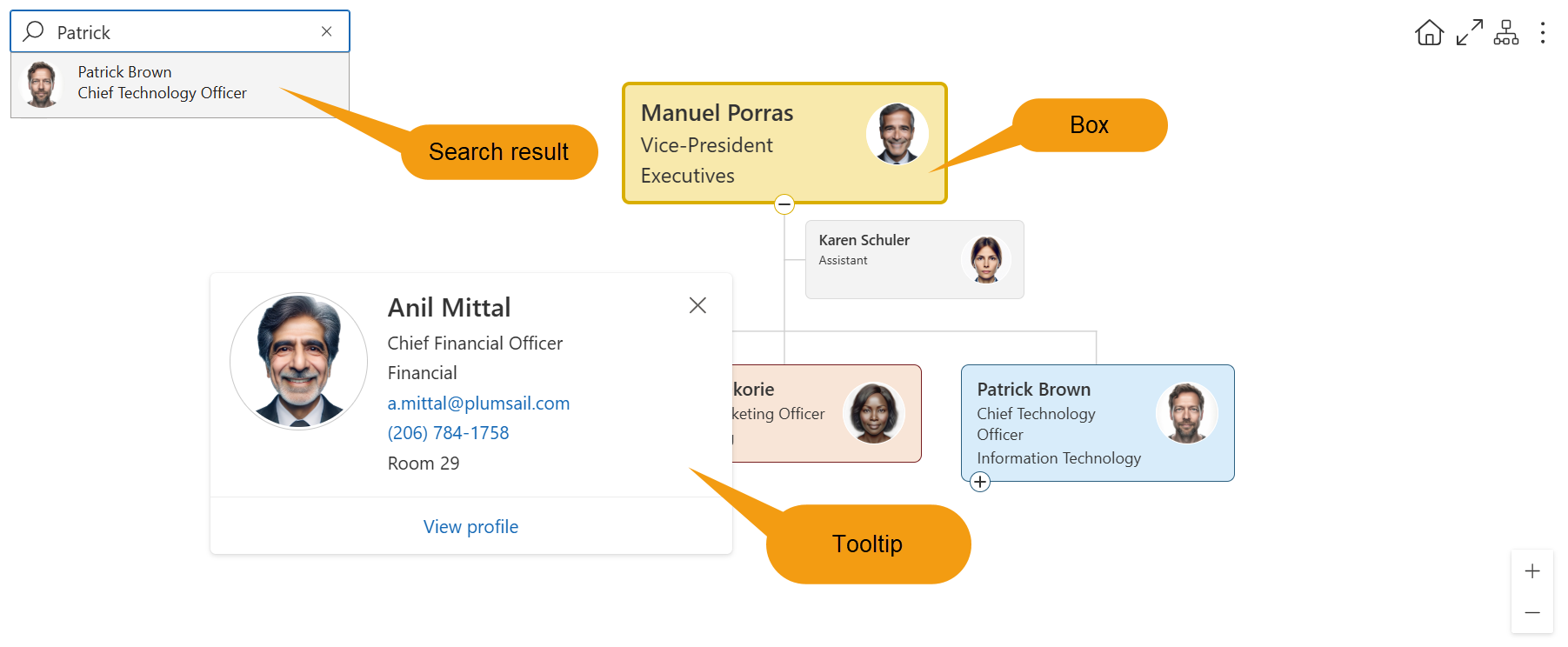
tooltip link |
It will show the details tooltip for the current box on click. |
This is how the properties look in the Org Chart:
Use the HTML editor mode if you need more advanced customization.
Note
If you switch to HTML editor and save the template in that mode, you will not be able to return to Constructor for that template unless you restore the default template.
In this mode, you can edit the template markup directly using the Handlebars templating engine.
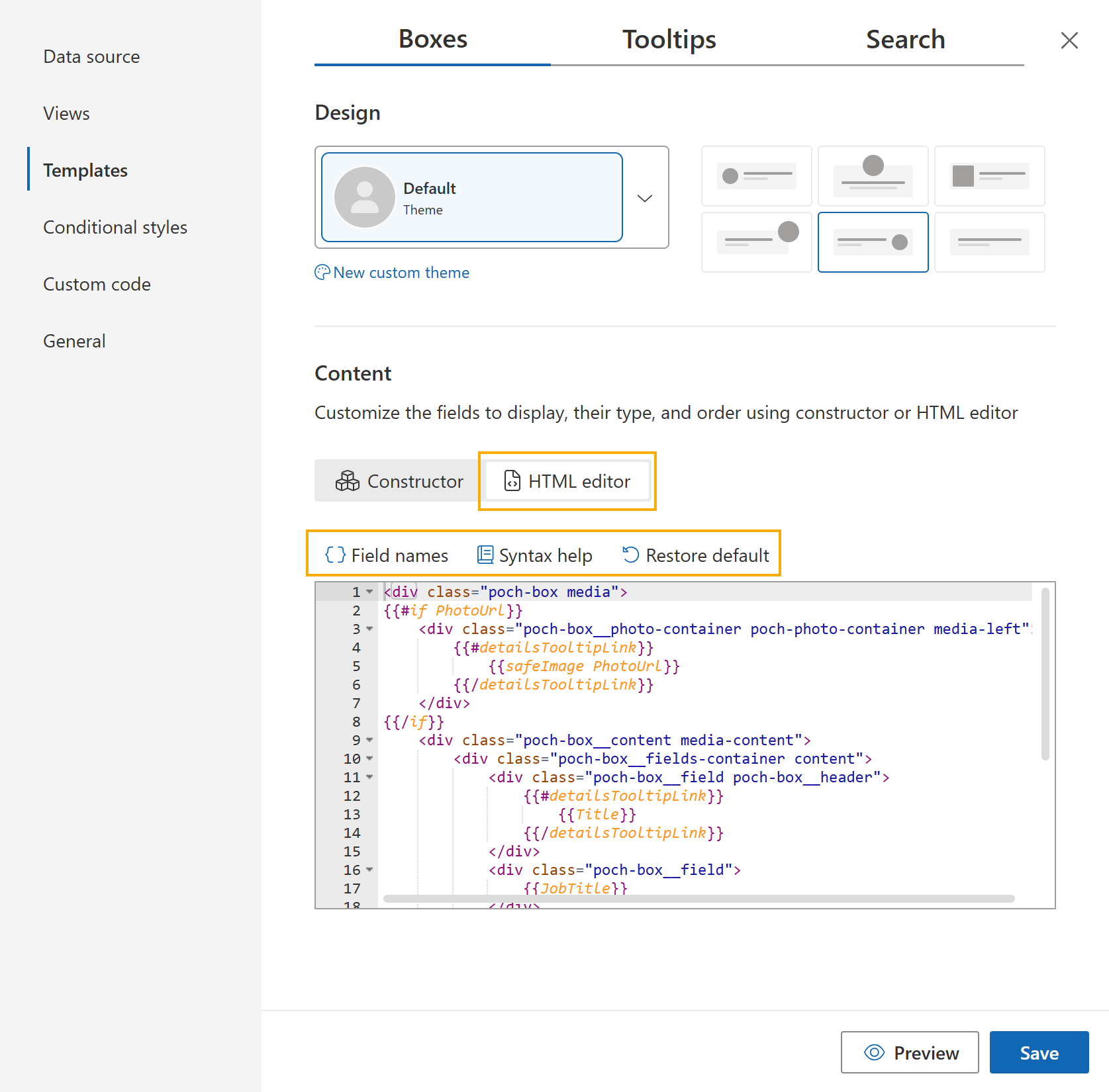
The HTML editor also provides the following options:
Field names to view available field names,
Syntax help to open Handlebars syntax guidance,
Restore default to reset the current template to its default version.
A Handlebars template looks like regular HTML with embedded expressions enclosed in double braces, for example {{Title}} or {{Department}}.
For more information, see the HTML templating syntax description.