Conditional style rules
Customize the appearance of boxes in the Org Chart using box style rules, individual box styles, and custom CSS.
To avoid unexpected results, it’s important to consider the order in which styles are applied:
Individual styles - styles applied directly to a specific box,
Box style rules - conditional rules defined in the configuration wizard,
Custom CSS - customization using CSS.
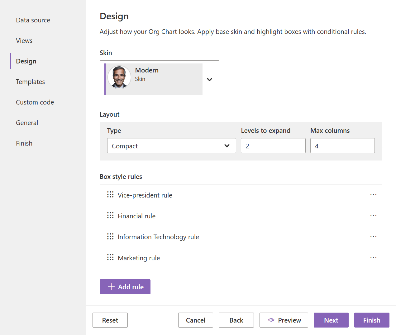
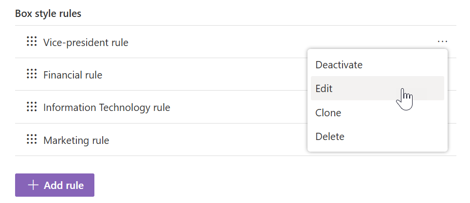
You can add new rules in the Design step and change their order. Additional options — Deactivate, Edit, Clone, and Delete — are available in the drop-down menu for each rule.
Box style rules
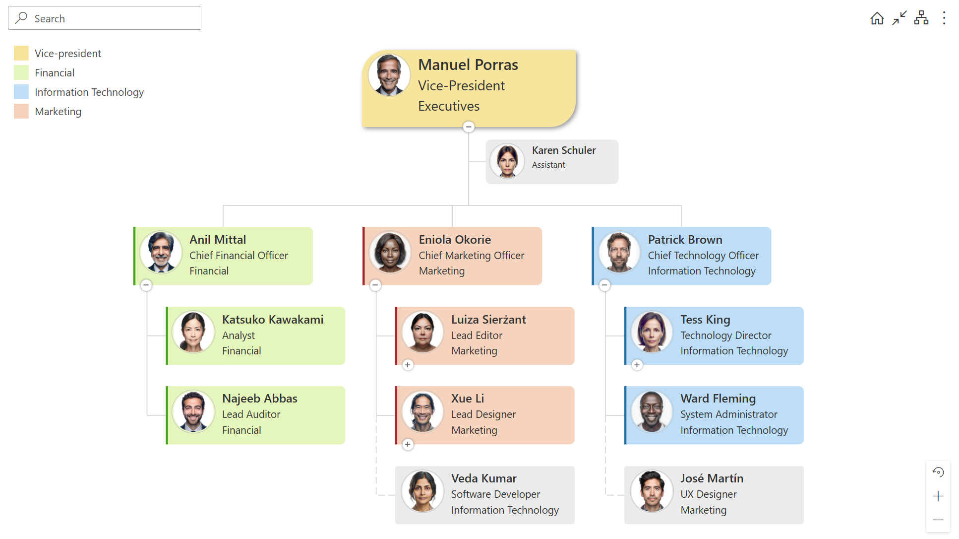
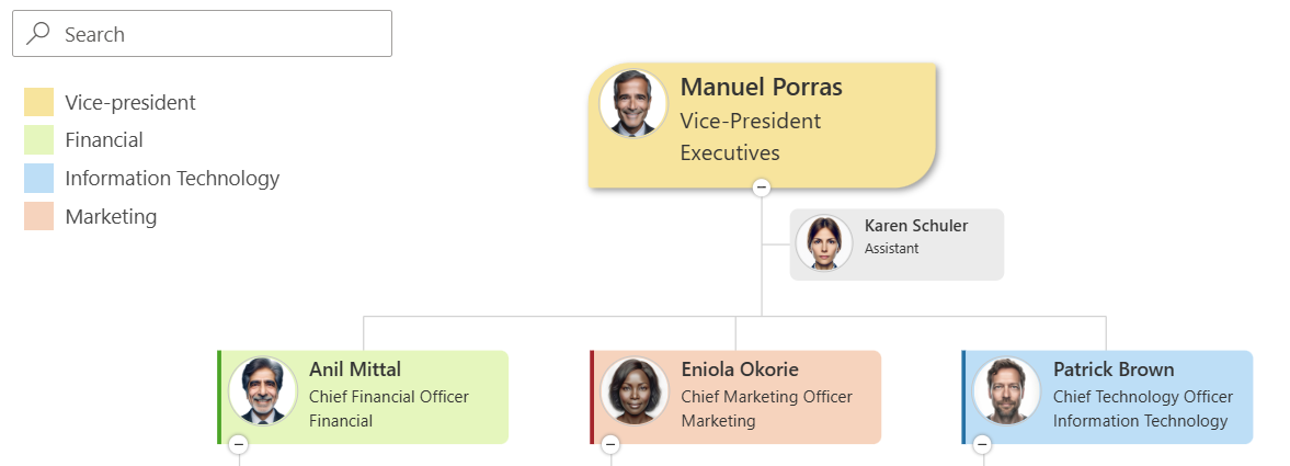
Create style rules that apply to boxes based on conditions. In the screenshot below, there are four rules that change the background color and box shape depending on the department. If any rules conflict, Org Chart will use the one that’s higher in the list.
When creating a rule, name it and then proceed to the following main sections for configuration:
Condition
The condition works the same way as in filtering. You can create a universal rule for all boxes by leaving it empty. Partially, it replaces custom CSS settings. The condition provides access to all data source fields and box types in Org Chart.
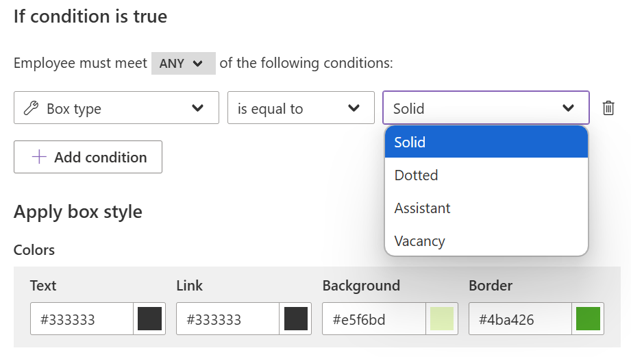
Styles
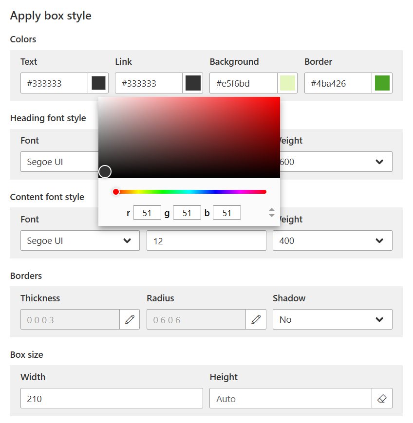
In the style properties, all numeric values are measured in pixels (px). Colors can be set using either the color picker or a specific value. Org Chart supports color names and codes in three formats: RGB, HEX, and HSL.
Note
When saving a rule, all style properties are applied, not just modified ones.
For advanced customizations that go beyond these standard settings, you can use custom CSS styles and JavaScript code.
Legend
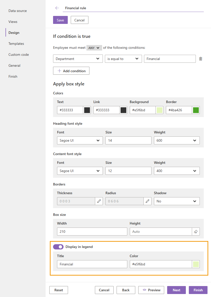
To display the rule in the chart legend, turn on the Display in legend toggle in the rule settings. Specify a Title and Color if needed:
After saving the settings, the rule is added to the chart legend. The legend is displayed in the top-left corner of the structure. You can add each style rule to the legend or display only specific ones:
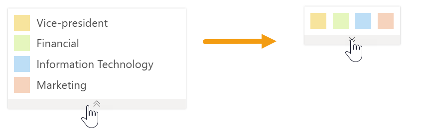
The legend supports two modes: full and compact. Click the arrow below the legend to switch between modes:
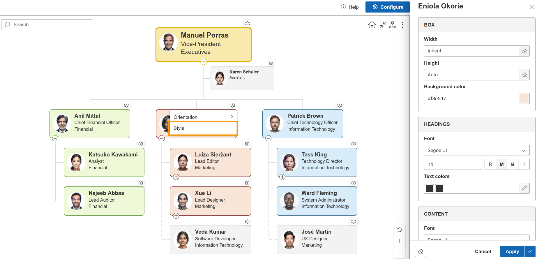
Individual styles
Additionally, you can customise styles of an individual box directly in the chart. These styles can then be reused by creating box style rules based on department, job title, or box type.
Note
Go to the next step of the configuration wizard – Templates.
Note
Go to the next step of the configuration wizard – Templates.