 Lookup control
The Lookup control is very similar to the SharePoint Lookup field, but can be used to connect to different sites and even site collections.
You can find step-by-step instructions for setting up the Lookup control in Configure cross-site lookup field article.
This page contains a detailed description of the control properties and JavaScript samples, which you can use with this control.
Properties
Here you can find properties available for the Lookup control.
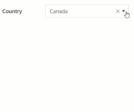
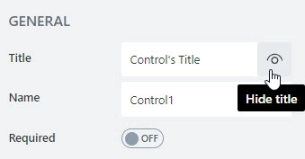
Title
Specify text of the title that will appear next to the control.
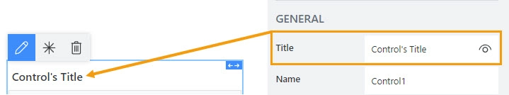
Can also toggle Title’s visibility on/off:
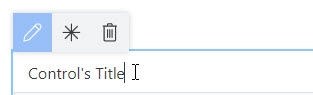
Title can be changed directly on the form after a double click:
JavaScript
This code will allow you to get or set the control’s title dynamically:
// returns the control's title as a string
fd.control('Control1').title;

// sets the control's title
fd.control('Control1').title = 'Last Name';
Name
A unique identifier for the control.
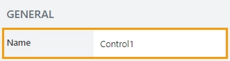
The Name property is used in JavaScript to select a specific control.
JavaScript
The Name property allows to work with the control via JavaScript code, like this:
fd.spRendered(() => {
    // can access the control using its Name:
    fd.control('Control1');
 });
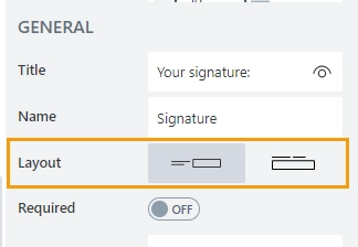
Layout
Define whether the Title will appear to the left of the control or directly above it:
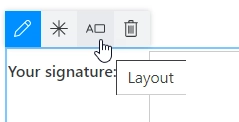
Orientation can also be changed directly in the context menu of the selected control:
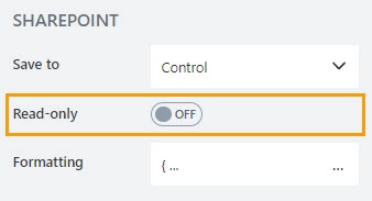
Read-only
Define whether a user can view or edit the contents of the control:
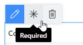
Required
Define whether the control will be required to submit the form or not:
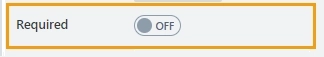
Required status can also be changed directly on the form via the Asterisk button:
JavaScript
This code allows you to get and set control’s required status
// returns the control's required status as true/false
fd.control('Control1').required;

// sets the control's required status
fd.control('Control1').required = true;
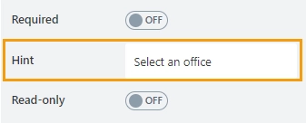
Hint
Define a placeholder text that appears in the input box before a user starts typing:
JavaScript
This code allows you to get or set the control’s placeholder text dynamically:
// sets the control's Hint
fd.control('Control1').placeholder = "Enter your name";
Class
Add a CSS class to the control, which comes in handy with CSS or even JavaScript code. This will work like class attribute for an HTML tag.
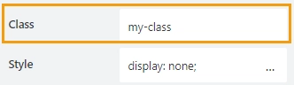
Same class can be applied to multiple controls, and then you can use CSS to modify the appearance of these controls.
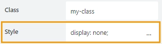
Style
Add custom CSS style to the control. This will work like style attribute for an HTML tag.
You can apply different styles to the control. For example, the following style will add a shadow under the control:
box-shadow: 0 9px #999;
And this makes the control invisible to user (but still usable with JavaScript):
display: none;
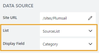
Data source
Define the site URL where the source list is located:
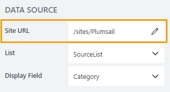
Then, select which SharePoint list or document library will be used as the source and which field values will be displayed as options:
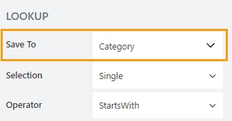
Save to
Select a Single line of text field, or create a new one in the current SharePoint list to save control data.
In a list view, the column is rendered as a regular lookup field with the help of a field customizer.
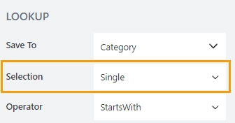
Selection
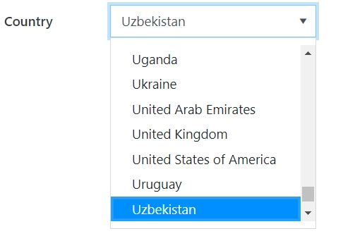
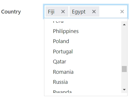
Define whether a user is allowed to select a single option or multiple options from the drop-down list:
Single Selection allows a user to select only one option from the drop-down list:
Multiple Selection allows a user to select multiple options from a drop-down list:
Note
In single selection mode, the value is stored as an object.
In multiple selection mode, the value is stored as an array of objects.
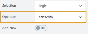
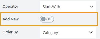
Operator
Defines how the search is handled by the lookup control:
StartsWith — only show items that start with the entered value.
Contains — show all items that contain the entered value.
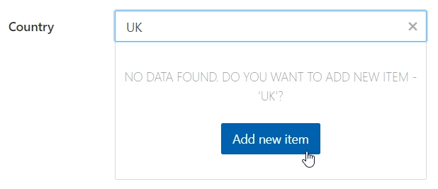
Add new
Determines whether the user can add new values to the source list of the Lookup control:
To see the ‘Add a new item’ button, user must first enter an option that does not exist yet:
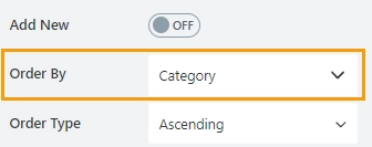
Order by
Select a field to display available options in a specific order.
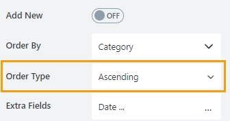
Order type
Available if the Order by property is set. Determines how to sort data: in ascending or descending order.
Extra fields
By default, only the item ID and the displayed field are retrieved. The Extra fields property holds data for OData $select query option.
Specify which fields should also be returned from the source list:
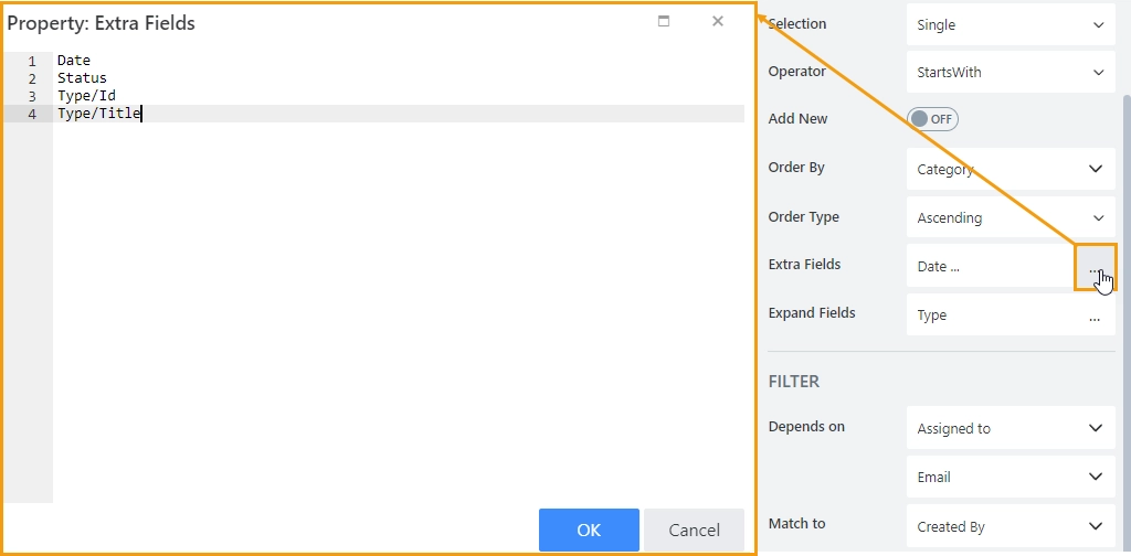
Important
For Lookup and Person or Group fields, specify which property to return.
For instance, to return lookup field ID and the display text, enter Category/ID, Category/Title.
These field names must also be listed in the Expand property.
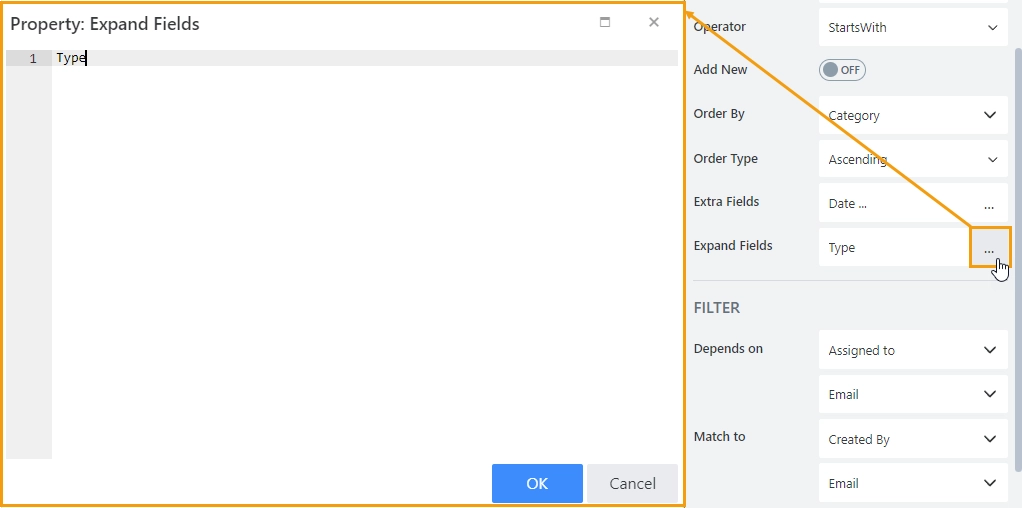
Expand fields
The property holds data for OData $expand query option. Define Lookup, Person or Group field names that you are getting in Extra Fields.
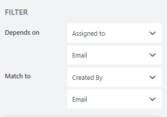
Depends on/Match to
Use these properties to set up a filter condition for a lookup control. You can filter lookup items by any field on the form without JavaScript.
In the Depends on property, select what field on the current form will be used for filtering items available in the Lookup control. For complex fields, such as Lookup and Person or Group, also select which property to match (ID, Title or Email, Display Name, etc.):
In the Match to property, select what field in the source list has to match the field selected in the Depends on property.
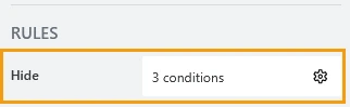
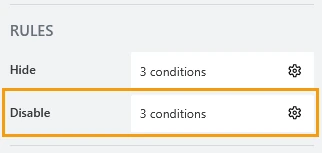
Hide
Define one or more conditions to hide this form element based on form state. To manage these no-code conditions, click the gear icon.
Disable
Define one or more conditions to disable this form element based on form state. To manage these no-code conditions, click the gear icon.
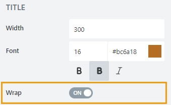
Title width
Specifies width of the control’s title in pixels.
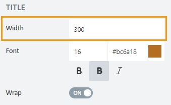
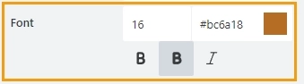
Title font
Change the formatting of the control’s title using these settings:
font size
font color; use the color picker or enter the hex color code
font style: normal, bold, or italic
Title wrap
Defines whether title wrapping is enabled:
If wrapping is enabled, title text is split in multiple lines if it doesn’t fit in one line.
If wrapping is disabled, title text is shortened with ellipsis until it fits
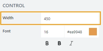
Control width
Specify in pixels how much space should the lookup’s input box take.
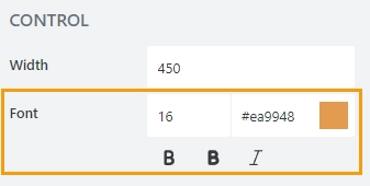
Control font
Change the formatting of the lookup’s input box using these settings:
font size
font color; use the color picker or enter the hex color code
font style: normal, bold, or italic
JavaScript framework
In this section, you can find basic examples of how to work with the control using JavaScript.
If you are not familiar with the JavaScript framework, get started with the JavaScript basics.
Note
The control is only accessible once the form is rendered, so all calls to the control must be inside fd.spRendered event:
fd.spRendered(() => {
    fd.control('Control1').ready(control => {
        // alert selected option as a text string
        alert(control.value.LookupValue);
    });
});
Wait until control is ready
Wait until the control is loaded. The ready method returns a promise that is resolved when the control has been fully initialized and is ready to work with.
fd.control('Control1').ready(control => {
    // alert selected option as a text string
    alert(control.value.LookupValue);
});
// or
fd.control('Control1').ready().then(control => {
    // alert selected option as a text string
    alert(control.value.LookupValue);
});
Get or set control value
Get or set the Lookup control value.
In a single selection mode, the control value is stored as an object:
// returns the selected option as an object:
fd.control('Control1').value;

// returns an ID of the selected option:
fd.control('Control1').value.LookupId;

// returns the selected option as a string:
fd.control('Control1').value.LookupValue;

// select option with the ID:
fd.control('Control1').value = 5;
In a multiple selection mode, the control value is stored as an array of objects:
// returns an array of objects
fd.control('Control1').value;

// returns the first selected option as an object
fd.control('Control1').value[0];

// returns the ID of the first selected option
fd.control('Control1').value[0].LookupId;

// returns first selected option as text:
fd.control('Control1').value[0].LookupValue;

// set with an array of IDs:
fd.control('Control1').value = [2, 3, 4];
Handle change event
Execute a function when a control value has been changed:
fd.control('Control').$on('change', value => {
    alert('New value: ' + value.LookupValue);
});
Refresh the control
The function refreshes the connection with the source list.
If any items or documents were changed in the source list, the data presented in the Lookup control will be updated.
fd.control('Control1').refresh();
Reload selected option data
The method reloads data for the selected item, such as item display text and extra fields.
The reloadValue method returns a promise that is resolved when the data has been fully loaded.
fd.field('Lookup').reloadValue().then(() => {
    console.log('Reloaded!');
})
Make control required
Make a control required or optional:
// make control required
fd.control('Control1').required = true;

// make control not required
fd.control('Control1').required = false;
Disable control
Make a control non-editable. The control value can still be changed with JavaScript and saved:
// disabled control
fd.control('Control1').disabled = true;

// enable control
fd.control('Control1').disabled = false;
Get HTML element
Access HTML element inside the control in order to modify it, hide it, or do something else.
// access control's HTML
let htmlControl = fd.control('Control1').$el;
Hide/show control
Hide or show control from a user. The control value can still be accessed and changed with JavaScript.
// hide control
fd.control('Control1').hidden = true;

// show control
fd.control('Control1').hidden = false;
Configure widget
You can access the widget used by the control. The control is built on top of Kendo UI ComboBox (single choice) and Kendo UI MultiSelect (multiple choice).
// get the widget
fd.control('Control1').widget;

// change the widget's configuration
fd.control('Control1').widgetOptions = {
    spinners: false
};
widgetOptions is the same as widget.setOptions({}) but can be defined before widget initialization.
Configure widgetOptions
Get or set configuration options for the lookup. Must be set before the controls render, cannot be changed afterwards.
fd.spBeforeRender(() => {
    // display Extra Field Price, if it is available
    let tmp = '#: data.LookupValue # #: data.Price ? " $" + data.Price : "" #';
    fd.control('Control1').widgetOptions = {
        template: tmp
    }
});
Learn how to customize the appearance of search results using the widgetOptions property in this article.
Add new item button text
The Add new item button appears if a search is unsuccessful:
The addNewText property defines a text for the button. You might want to change the button text for localization.
The property must be set before the form is rendered.
fd.spBeforeRender(() => {
    fd.control('Control1').addNewText = 'Ajouter un nouvel élément';
});
No items are found text
The text appears if a search is unsuccessful:
The noDataText property defines a text. You might want to change the text for localization.
The property must be set before the form is rendered.
fd.spBeforeRender(() => {
    fd.control('Control1').noDataText = 'Pas trouvé. Ajouter un item - "#: instance.filterInput.val() #"?';
});
Search operator
Property defines how the search is handled by the lookup control:
StartsWith — only show items that start with the entered value.
Contains — show all items that contain the entered value.
fd.control('Control1').operator = 'startsWith';
fd.control('Control1').operator = 'contains';
Order by
Set $orderby Query option. Allows sorting the results by one or multiple fields.
// order by one field
fd.control('Control1').orderBy = 'Title';

// order by one field in descending order.
fd.control('Control1').orderBy = { field: 'Title', desc: true };

// order by multiple fields
fd.control('Control1').orderBy = [
    { field: 'FirstChoice', desc: true },
    { field: 'Title', desc: false }
];
Extra fields
The property holds data for OData $select query option.
Get or set extra fields to retrieve from the source list. Returns an array.
fd.control('Control1').extraFields = ['Status', 'Category/Title'];
The following code populates the price and category title of the selected item. Note that Category is also a lookup, so we need to use expandFields() to access its fields.
fd.spRendered(() => {
    const lookup = fd.control('Lookup1');
    lookup.extraFields = ['Price', 'Category/Title']; // get extra fields
    lookup.expandFields = ['Category']; // to access complex fields, expand them first

    lookup.ready(() => {
        function updateFields() {
            fd.field('Title').value = lookup.value.Category.Title;
            fd.field('Price').value = lookup.value.Price;
        }

        updateFields(); // update fields when the control is ready
        lookup.$on('change', updateFields); // update fields whenever the lookup value is changed
    });
});
Expand fields
The property holds data for OData $expand query option.
Get or set expand fields to retrieve extra data. Returns an array.
Important
Required for Lookup and Person or Group fields.
fd.control('Control1').expandFields = ['Category'];
Custom filtration
Get or set a filter query for the lookup control for filtering results.
You can also pass a function that is executed when a user inputs text into the search box to modify search behavior.
Read more about OData $filter query.
// filter by one field
fd.control('Control1').filter = "Country eq '" + fd.control("Country").value + "'";

// search by two fields at once - Title and Category
fd.control('Control1').filter = filter => {
    let search = encodeURIComponent(filter);
    return filter
        ? "substringof('" + search + "', Title) or substringof('" + search + "', Category)"
        : '';
}
fd.control('Control1').useCustomFilterOnly = true;
Learn how to use filter property for various fields in the Filter by another field with JavaScript article.
Use custom filter only
You can specify if the custom filtration is applied in addition to the default one or exclusively.
The default filtration is based on user’s input and search operator.
// only custom filtration is applied
fd.control('Control1').useCustomFilterOnly = true;
Dialog options
Get or set the configuration of a dialog that appears when a user clicks ‘Add new item’ button.
// define the dialog size
fd.control('Control1').dialogOptions = {
    width: 1280,
    height: 720
};