 List or Library
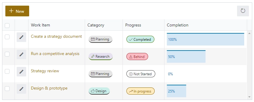
The List or Library is a control which allows you to view, edit, add or delete items or documents to related SharePoint List or Document Library from the form.
This control is extremely powerful and versatile — it supports filtering, selecting root folder, uploading multiple documents at once and much more.
Properties
Here you can find properties available for the List or Library control.
Name
A unique identifier for the control.
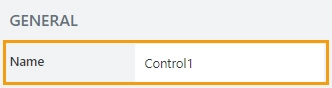
The Name property is used in JavaScript to select a specific control.
JavaScript
The Name property allows to work with the control via JavaScript code, like this:
fd.spRendered(() => {
    // can access the control using its Name:
    fd.control('Control1');
 });
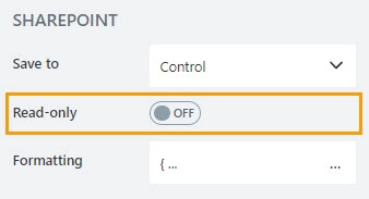
Read-only
Define whether a user can view or edit the contents of the control:
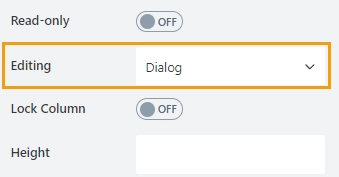
Editing
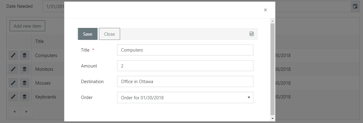
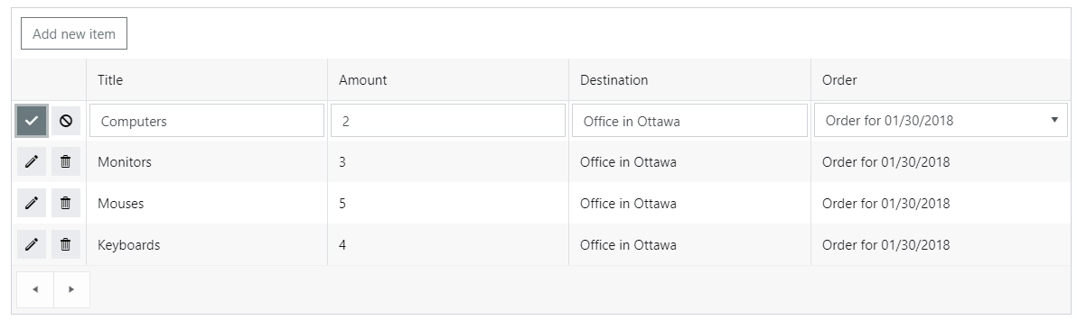
Choose between Dialog and Inline editing.
The Dialog mode launches a dialog to create new and modify existing items:
The Inline mode allows you to do it right on the form:
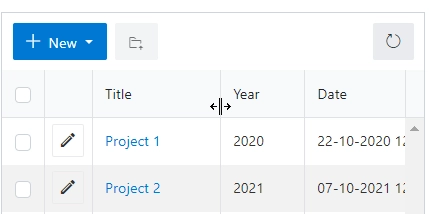
Lock Column
Locks select, edit and delete columns in place for horizontal scrolling.
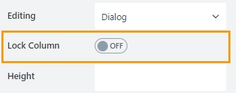
It also allows to lock other columns:
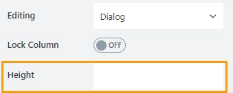
Height
Height of List or Library control in pixels. Usually, the control takes as much space as necessary to show all items on the page, but if Height is set, the control gets a scrollbar.
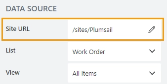
Site URL
Define the site URL where the source list or library is located:
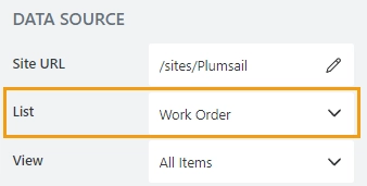
List
Select which SharePoint list or library will be used as a source:
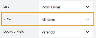
View
Select the view to display in the control:
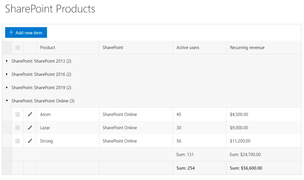
If the list view includes grouping and totals, all of this formatting will be automatically applied to the List or Library control:
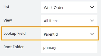
Lookup field
If the source list has a lookup field to Parent list, items will automatically be filtered by it:
More on this in the Create forms with related items or documents article.
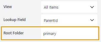
Root Folder
Specify the name of the folder in the source list. The user will then only see its contents inside the control.
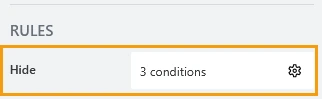
Hide
Define one or more conditions to hide this form element based on form state. To manage these no-code conditions, click the gear icon.
List or Library Column Properties
Here you can find properties specifically related to the List or Library columns. Click on a column to access its properties.
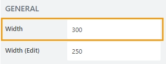
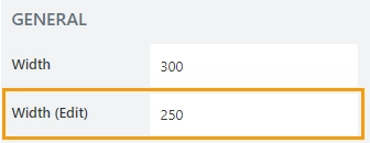
Width
Specify the column width in pixels.
The column can still be dragged by a user on the form to manually resize it:
Width (Edit)
Specify the column width in pixels when a user edits a row in the inline editing mode.
Mode
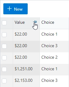
List or Library control supports column formatters:

Defines the formatting applied to the column:
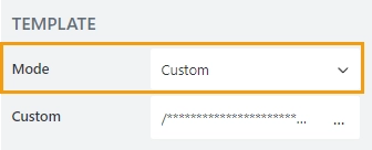
Select the mode for the column from the dropdown:
Default – the formatting configured in List View → Column Settings → Format this column:
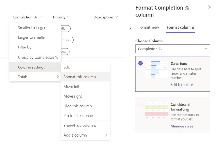
Custom – a custom formatting template applies.
Custom
Specify a custom template that will be used to format the column:
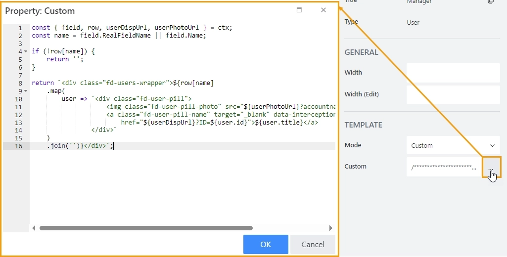
See custom formatting examples in Customize view of columns article.
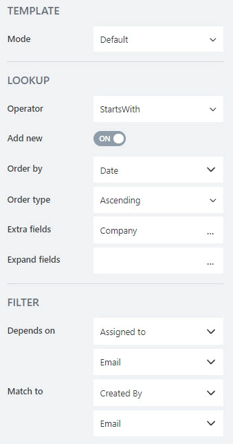
Lookup Column Properties
Define lookup column properties when the List or Library control is in inline editing mode. You can configure dynamic filtering for the lookup column, specify how search behaves, set up ordering, and more.
Find more details about the available properties on the Lookup field page.
JavaScript framework
In this section, you can find basic examples of how to work with the control using JavaScript.
If you are not familiar with the JavaScript framework, get started with the JavaScript basics.
Note
The control is only accessible once the form is rendered, so all calls to the control must be inside fd.spRendered event:
fd.spRendered(() => {
    // hide the control
    fd.control('Control1').hidden = true;
    // show the control
    fd.control('Control1').hidden = false;
});
Wait until control is ready
Wait until the control is loaded. The ready method returns a promise that is resolved when the control has been fully initialized and is ready to work with.
fd.spRendered(() => {
    fd.control('Control1').ready(dt => {
        // dt parameter is the same as fd.control('Control1')
        console.log('List or Library is initialized');
    });
    // or
    fd.control('Control1').ready().then(dt => {
        // dt parameter is the same as fd.control('Control1')
        console.log('List or Library is initialized');
    });
});
Handle edit event
Execute a function when a control is being edited.
editData passed as an argument to the handler. It is an object that contains fields and methods for manipulating controls of the current row:
formType — returns the type of the record.
‘New’ — adding a new item.
‘Edit’ — editing an existing item.
itemId — returns the ID of the current item.
field(‘InternalName’) — returns Vue-component of corresponding field control.
Example:
// prepopulating Title field of a new record
// in the List or Library control with the title
// of the parent item
fd.control('Control1').$on('edit', editData => {
    if (editData.formType === 'New') {
        console.log('editData.itemId');
        // set Title field value with the value from the parent
        editData.field('Title').value = fd.field('Title').value;
    }
});
More on that in Manipulate fields in inline editing mode article.
Handle change event
Execute a function when a control value has been changed. changeData passed as an argument to the handler. It is an object that contains information about the changes made:
type — returns type of changes made to related items.
‘add’ — new item has been created
‘addFolder’ — new folder has been created
‘edit’ — item has been changed
‘delete’ — item/file has been deleted
‘upload’ — file has been uploaded
itemId — returns the ID of the changed item
itemIds — returns an array of the modified items depending on the value of changeData.type
‘upload’ — returns the array of IDs of the uploaded files
‘delete’ — returns the array of IDs of the deleted files
anything else — returns ‘undefined’
// displays an alert message with IDs of the uploaded files
fd.control('Control1').$on('change', changeData => {
    if (changeData.type === 'upload') {
        alert(changeData.itemIds);
    }
});

// displays an alert message with ID of the changed item
fd.control('Control1').$on('change', changeData => {
    if (changeData.type === 'edit') {
        alert(changeData.itemId);
    }
});
Handle file upload event
Execute a function when the user uploads files to Document Library via the control.
itemIds is an array of IDs of uploaded files.
// log all uploaded files to console
fd.control('Control1').$on('filesUploaded', itemIds => {
    itemIds.forEach(item => {
        console.log(item);
    });
});
Handle linking items event
Execute a function when saving New Form that has items in Library or List control, that will be tied to the parent via lookup field.
handler function contains parameter object with the following properties:
itemIds is an array of IDs of uploaded files.
lookupField is a Lookup field on children items, that binds them to parent.
parentItemId is an ID of the newly saved Parent item.
Important
Asynchronous event! Can return a Promise and the corresponding operation will not continue until the promise is resolved.
// give an alert message when saving New Form
fd.control('Control1').beforeItemsAttach(async e => {
    let message = [
        `Item(s): ${e.itemIds.join()}`,
        `attached to Parent with ID: ${e.parentItemId}`,
        `via Lookup: ${e.lookupField}`
    ].join(' ');

    alert(message);

    // form will save after this completes
});
Refresh the control
Refresh the List or Library control. If any items or documents were changed, the data presented in List or Library will be updated.
fd.control('Control1').refresh();
Make control read-only
Make a control non-editable or editable again.
fd.control('Control1').readonly;
fd.control('Control1').readonly = true;
fd.control('Control1').readonly = false;
Make row read-only
Make a row read-only depending on the column value. Declare a function that returns true for a row that should be set to read-only.
row passed as an argument to the function and holds column values of the rows.
// disable rows with the status of Completed
fd.control('SPDataTable1').readonlyRow = row => {
        return row.Status === 'Completed';
};

// remove function
fd.control('SPDataTable1').readonlyRow = null;
Make items selection non-selectable
Make items non-selectable and selectable again.
fd.control('Control1').selectable;
fd.control('Control1').selectable = false;
fd.control('Control1').selectable = true;
Disable drag and fill
Remove drag and fill functionality from the control.
fd.control('Control1').allowDragAndFill;
fd.control('Control1').allowDragAndFill = false;
fd.control('Control1').allowDragAndFill = true;
Get selected items
Get an array of currently selected items. Can be used to retrieve items, but not to modify them.
let selected = fd.control('Control1').selectedItems;
Change uploading text
Change text that shows during upload, useful for localizations.
fd.control('Control1').uploadingText; // 'Uploading...' by default
fd.control('Control1').uploadingText = 'New text';
Configure dialog window
Modify Kendo UI Window configuration, such as width and height of the dialog window.
fd.control('Control1').dialogOptions.height; // returns height
fd.control('Control1').dialogOptions.width; // returns width

// set width and height:
fd.control('Control1').dialogOptions = {
    width: 1280,
    height: 720
};
Filter List or Library
Set CAML filtering for the control. It’s empty by default, but contains filter value if you choose Lookup Field in Data source editor.
Can also be used to apply custom filtering. Changes are applied dynamically to the control.
fd.control('Control1').ready(() => {
    fd.control('Control1').filter = '<Eq><FieldRef Name="Title"/><Value Type="Text">Test</Value></Eq>';
    fd.control('Control1').refresh();
});
More on that in the Filter related items or documents dynamically article.
Configure Root Folder
Change root folder of the control.
baseRootFolder property specifies starting folder for the control. User cannot go higher than this folder.
rootFolder property specifies current folder for the control.
fd.control('Control1').ready(() => {
    // set base root folder
    fd.control('Control1').baseRootFolder = 'My Folder';
    // set the current folder
    fd.control('Control1').rootFolder = 'My Folder';
});
More on that in Navigate to specific folder dynamically article.
Change source site
The property holds the server-relative URL of the site used as the source of the List or Library control. It can be used to define which SharePoint site will be used as the source.
// set the source site
fd.control('Control1').webUrl = '/sites/MainSite/SubSite';
Change source list
The property holds the server-relative URL of the list or library used as the source for the List or Library control. It can be used to define which SharePoint list or library will be used as the source.
// set the source list or library
fd.control('Control1').listUrl = 'Lists/List1';
Change view
You can switch between views of the source list by list view name or by view ID.
// set the list view by name
fd.control('Control1').viewName = 'All Items';

// set the list view by ID
fd.control('Control1').viewId = 'FEB4302C-617F-4B6B-86F2-9A3F718E4F58';
Customize view of columns
Use templates property that holds user-defined templates for specific columns of the control.
fd.control('Control1').templates = {
    // color Status column based on value
    Status: ctx => {
        if (ctx.row.Status === 'Unresolved') {
            return '<span style="color:red">' + ctx.row.Status + '</span>';
        } else if (ctx.row.Status === 'Resolved') {
            return '<span style="color:green">' + ctx.row.Status + '</span>';
        }
        return '<span>' + ctx.row.Status + '</span>';
    }
};
More on that in Customize view of columns article.
Configure widget
You can access the widget used by the control. The widget is based on Kendo UI Grid.
fd.control('Control1').widget;

// change the widget's configuration
fd.control('Control1').widgetOptions = {
    sortable: false
};
widgetOptions is the same as widget.setOptions({}) but can be defined before widget initialization.