Getting started
User guide
- Settings
- Form sets
- Containers
- Controls
- SharePoint fields
- Common fields
- JavaScript
- CSS
- Display mode: panel, dialog, fullscreen
- SharePoint web parts
- Microsoft Teams tab
- Forms versioning
Provisioning forms
- Provisioning setup
- Provisioning API
- Provisioning forms (samples)
- Provisioning Form sets and display settings (samples)
General
- YouTube
- Licensing
- Manage subscription
- Billing and payments
- Privacy policy
- Data protection and security
- Version history (Microsoft 365)
- Version history (SharePoint 2019/SE)
Multilingual support
Navigation between forms
Generating PDF documents
- Save SharePoint form as PDF
- Generate PDF from DOCX template with Plumsail Documents
- Generate PDF from DOCX template with Word Online (Business)
Power Automate
How to customize appearance of search results for lookup fields in SharePoint form
Plumsail Forms offer advanced customization for SharePoint lookup fields. Using JavaScript, you can achieve great results in the way lookups present information.
You are not limited to displaying just one field, multiple fields can be displayed at once and all of this can be customized to fit your needs.
In this article, we will show you an example with several fields displayed at once, including a picture, so it looks like this in the end:

Getting extra fields
By default, the Lookup only gets Id and Display column of the source list. In my case, I want to get Description text field, Price currency field, Image URL/Picture field and Category Lookup field.
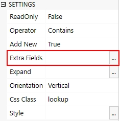
In order to do that, I need to edit Extra Fields property of the Lookup SETTINGS:

I add the following lines to it, it will retrieve the fields that I need:
Description
Price
Image
Category/Id
Category/Title
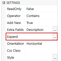
Now, once these fields are added, I will also need to use Expand property to get access to the Category field:

Here, I just need to add Internal Names of the fields that need to Expand, in this case:
Category
View configuration
Now, that this is available, we’ll need to customize lookup’s template in order to display retrieved fields. Lookup’s template is based on Kendo UI Combobox's Template. Please note that you can store the template in a separate script element inserted with an HTML-control and retrieve it in your code.
Note
You can use the same code for the Lookup control, just replace fd.field(‘Lookup’) part with fd.control(‘Lookup’) in your JavaScript code
In this example, I will use string within JavaScript editor to define template for selectable items:
fd.spBeforeRender(() => {
    let template = '';
    template += '# if (data.Image) { # <img src="#= data.Image.Url #" width="170" height="90" class="lookup-image" /> # } #';
    template += '<span class="lookup-col">';
    template += '<p class="lookup-title"> #: data.LookupValue # </p>';
    template += '<p class="lookup-desc"> #: data.Category ? data.Category.Title : "" #';
    template += '#: data.Description ? " - " + data.Description : "" #</p>';
    template += '<p class="lookup-price"> #: data.Price ? "$" + data.Price : "" # </p>';
    template += '</span>';
    fd.field('Lookup').widgetOptions = {
        template: template,
        height: 400,
        virtual: {
            itemHeight: 100
        },
        dataSource: {
            pageSize: 16
        }
    };
});
In this template, I’ve tried to structure everything clearly - starting from an image, going to the next column, wrapping some fields inside span - this will allow us to position fields in a column rather than line.
Important
When adjusting itemHeight, pageSize should also be adjusted to match new itemHeight, using this formula: ((height / itemHeight) * 4)
Finally, with the added classes, I add the following CSS inside CSS Editor:
.k-dropdown .k-dropdown-wrap .k-input{
    height: auto !important;
}

.lookup-col{
    flex-direction: column;
    margin-bottom: 5px;
    padding-top: 10px;
    margin-left: 10px;
}

.lookup-title{
    margin-bottom: 3px;
    font-size: 16px;
}

.lookup-desc{
    margin-bottom: 3px;
    font-size: 14px;
    color: gray;
}

.lookup-price{
    margin-bottom: 5px;
    font-size: 15px;
    font-weight: bold;
}

.lookup-image{
    margin: 5px;
}