 Likert Scale
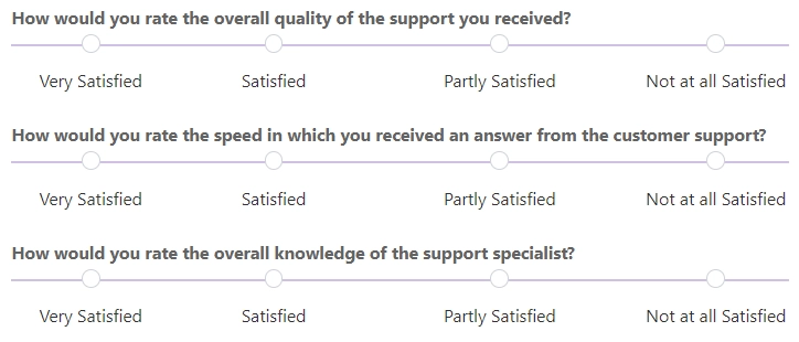
The Likert Scale is a control for measuring respondents’ level of agreement with various statements on a bipolar scale.
You can use the Likert Scale control to create different types of surveys, such as customer satisfaction surveys, employee engagement surveys, overall experience surveys, etc.
This page contains a detailed description of the control properties and JavaScript samples, which you can use with this control.
Properties
Here you can find properties available for the Likert Scale control.
Name
A unique identifier for the control.
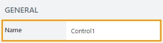
The Name property is used in JavaScript to select a specific control.
JavaScript
The Name property allows to work with the control via JavaScript code, like this:
fd.spRendered(() => {
    // can access the control using its Name:
    fd.control('Control1');
 });
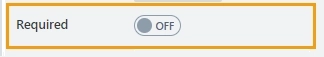
Required
Define whether the control will be required to submit the form or not:
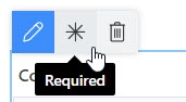
Required status can also be changed directly on the form via the Asterisk button:
JavaScript
This code allows you to get and set control’s required status
// returns the control's required status as true/false
fd.control('Control1').required;

// sets the control's required status
fd.control('Control1').required = true;
Type
Defines the type of answer input.
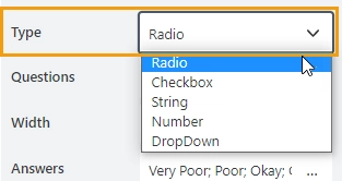
Select the input type from a dropdown:
Radio — allows a user to select only one option from the list of answers:
CheckBox — allows a user to select one or more options from the list of answers:
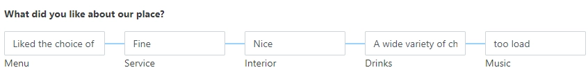
String — allows a user to write a comment for each answer option:
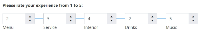
Number — allows a user to enter a number for each answer option:
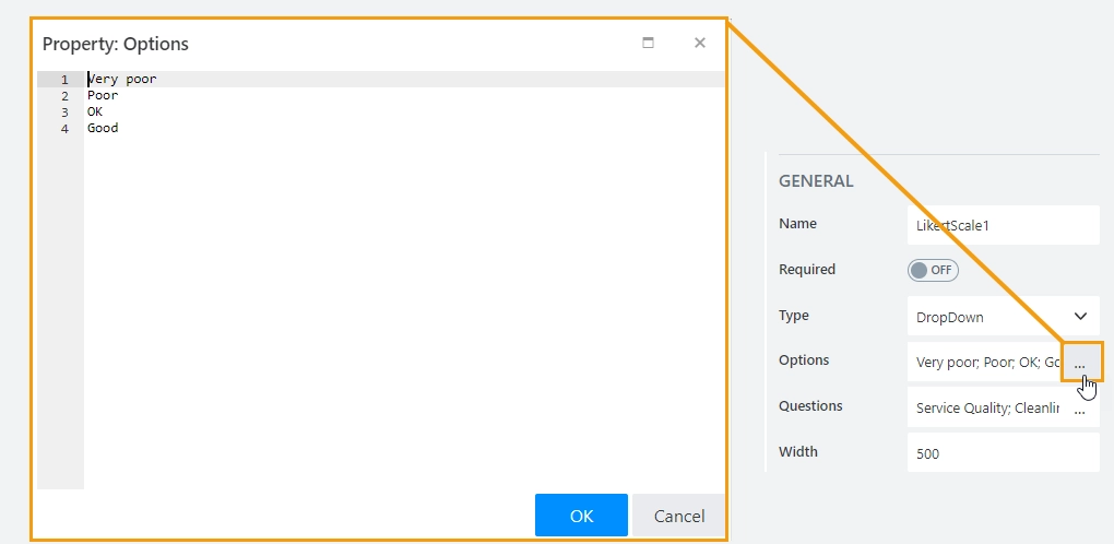
DropDown — allows a user to select an answer from a predefined list of options:
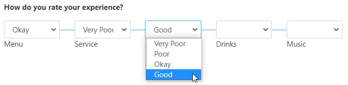
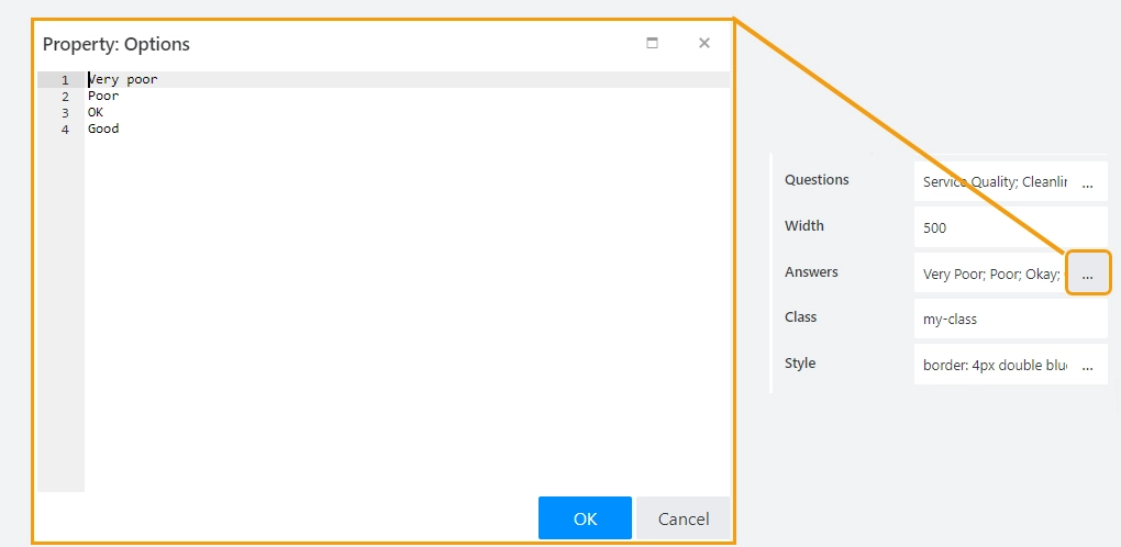
When you select the DropDown from the list, you will see the additional Options property.
Add a list of options to the Options property. Each option should be on a new line, as shown here:
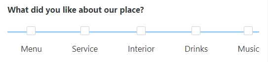
Questions
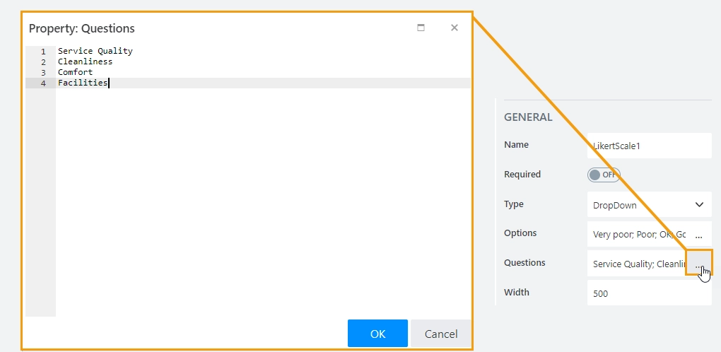
Stores a list of questions.
Add a list of questions to the Questions property. Each question should be on a new line, as shown here:
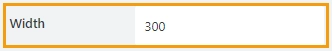
Width
The property defines the width of the control in pixels.
If left blank, the control takes up the entire available width in the current grid cell.
Answers
Stores a list of answers.
Add a list of answers to the Answers property. Each answer should be on a new line, as shown here:
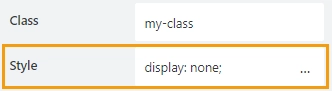
Class
Add a CSS class to the control, which comes in handy with CSS or even JavaScript code. This will work like class attribute for an HTML tag.
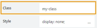
Same class can be applied to multiple controls, and then you can use CSS to modify the appearance of these controls.
Style
Add custom CSS style to the control. This will work like style attribute for an HTML tag.
You can apply different styles to the control. For example, the following style will add a shadow under the control:
box-shadow: 0 9px #999;
And this makes the control invisible to user (but still usable with JavaScript):
display: none;
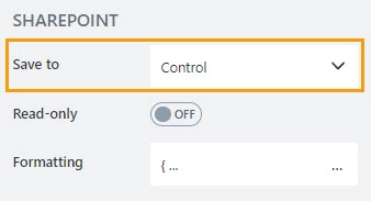
Save to
Select an existing Multiline Plain Text column or create a new one in the current SharePoint List to store control’s data. It will automatically render control in SharePoint list view.
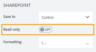
Read-only
Define whether a user can view or edit the contents of the control:
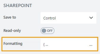
Formatting
The property contains a JSON object that defines how the data is displayed in the list view.
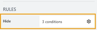
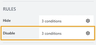
Hide
Define one or more conditions to hide this form element based on form state. To manage these no-code conditions, click the gear icon.
Disable
Define one or more conditions to disable this form element based on form state. To manage these no-code conditions, click the gear icon.
JavaScript framework
In this section, you can find basic examples of how to work with the control using JavaScript.
If you are not familiar with the JavaScript framework, get started with the JavaScript basics.
Note
The control is only accessible once the form is rendered, so all calls to the control must be inside fd.spRendered event:
fd.spRendered(() => {
    // hide the control
    fd.control('Control1').hidden = true;
    // show the control
    fd.control('Control1').hidden = false;
});
Get or set control value
If the answer type is Radio, the control value is stored as an array of strings.
The array length is equal to the number of questions.
Get or set the value using the code:
// get answers as an array of strings
fd.control('Control1').value;

// set Radio Type Likert scale value, which has five questions
fd.control('Control1').value = ['Good', 'Okay', 'Good', 'Superb', 'Awesome'];

// set Radio Type Likert scale value, which has three questions
fd.control('Control1').value = ['Good', 'Okay', 'Awesome'];
If the answer type is CheckBox, the control value is stored as a jagged array (array of arrays).
The array length is equal to the number of questions.
Get or set the value using the code:
// get answers as an array of arrays
fd.control('Control1').value;

// set Checkbox Type Likert scale value, which has two questions
fd.control('Control1').value = [
    ['Okay', 'Cool'],
    ['Cool'],
    ['Very Poor', 'Very Cool', 'Amazing'],
    ['Superb', 'Awesome']
];
If the answer type is String, Number or DropDown, the control value is stored as a jagged array (array of arrays).
The array length is equal to the number of questions. The member arrays length is equal to the number of answer options.
Get or set the value using the code:
// get answers as an array of arrays
fd.control('Control1').value;

// set String Type Likert scale value, which has two questions and four answer options
fd.control('Control1').value = [
    ['', 'Okay', 'Cool', ''],
    ['', '', 'Cool', 'Very Cool']
];

// set Number Type Likert scale value, which has five questions and three answer options
fd.control('Control1').value = [[2, 1, 2],[0, 5, 3],[0, 1, 0],[0, 0, 6],[1, 0, 0]];
Get HTML element
Access HTML element inside the control in order to modify it, hide it, or do something else.
// access control's HTML
const htmlControl = fd.control('Control1').$el;
Hide control
Hide a control from a user. The control value can still be accessed and changed with JavaScript.
// hide control
fd.control('Control1').hidden = true;

// show control
fd.control('Control1').hidden = false;
Clear answers
Clear the control value.
fd.control('Control1').clear();
Handle change event
Execute a function when a control value has been changed:
fd.control('Control1').$on('change', value => {
    // log changes to browser's console
    console.log('New value: ' + value);
});
Make control required
Make a control required or optional:
// make control required
fd.control('Control1').required = true;

// make control not required
fd.control('Control1').required = false;
Disable control
Disable the control. The control value can still be changed with JavaScript and saved.
// disable control
fd.control('Control1').disabled = true;

// enable control
fd.control('Control1').disabled = false;
Change questions
Get or set questions for the Likert Scale control. The questions are stored as an array of strings.
fd.control('Control1').questions = ['How do you rate your overall experience?', 'Will you recommend us to your friends?'];
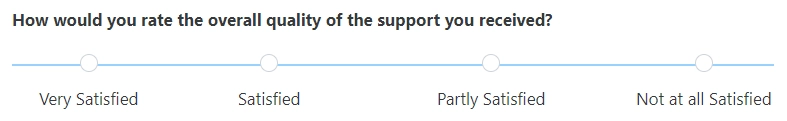
Change answers
Get or set answers for the Likert Scale control. The answers are stored as an array of strings.
fd.control('Control1').answers = ['Very Satisfied', 'Satisfied', 'Partly Satisfied', 'Not at all Satisfied'];
Hide/show lines
Define whether lines between answers should be displayed or not. By default, the lines are displayed.
// hide lines
fd.control('Control1').showConnectedLines = false;

// show lines
fd.control('Control1').showConnectedLines = false;