 Data Table
The Data Table is a control which allows you to add dynamic table to your forms.
You can set up how many columns the table has and their type, and the users will be able to add entries to this table.
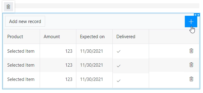
Most configuration for Data Table can be done by editing individual column settings. To add a new column, simply click on the plus symbol:
This page contains a detailed description of the control properties and JavaScript samples, which you can use with this control.
Properties
Here you can find properties available for the Data Table control.
Save to
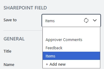
The property becomes available when the form is connected to SharePoint.
To save the content of the control to SharePoint, select an existing Multiple lines of text column or create a new one in the source SharePoint list:
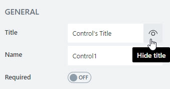
Title
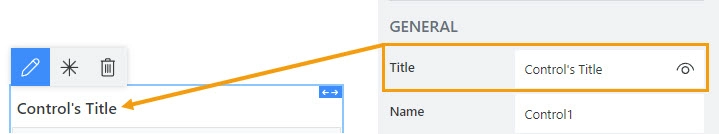
Specify text of the title that will appear next to the control.
Can also toggle Title’s visibility on/off:
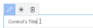
Title can be changed directly on the form after a double click:
JavaScript
This code will allow you to get or set the control’s title dynamically:
// returns the control's title as a string
fd.control('Control1').title;

// sets the control's title
fd.control('Control1').title = 'Last Name';
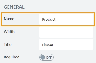
Name
A unique identifier for the control.
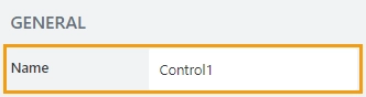
The Name property is used in JavaScript to select a specific control.
JavaScript
The Name property allows to work with the control via JavaScript code, like this:
fd.rendered(() => {
    // can access the control using its Name:
    fd.control('Control1');
 });
For Ink Sketch, Data Table, and Likert Scale controls, the Name property is used to store data from submissions, and in Power Automate or Zapier automations.
Important
Do not change control’s Name after the form has been in use, or you might lose saved data or break your automation.
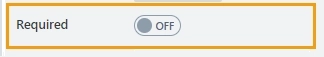
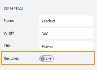
Required
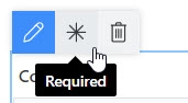
Define whether the control will be required to submit the form or not:
Required status can also be changed directly on the form via the Asterisk button:
JavaScript
This code allows you to get and set control’s required status
// returns the control's required status as true/false
fd.control('Control1').required;

// sets the control's required status
fd.control('Control1').required = true;
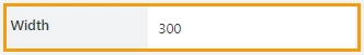
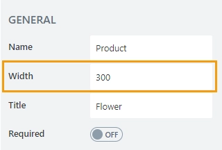
Width
The property defines the width of the control in pixels.
If left blank, the control takes up the entire available width in the current grid cell.
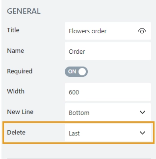
New Line
Allows to select where the new line will be added — at the Top or at the Bottom of the table.
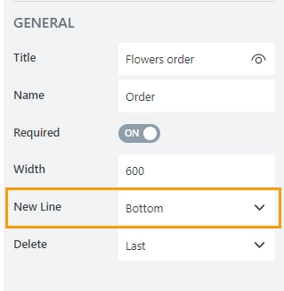
Delete
Allows to select where the delete button will appear — in the first or in the last column.
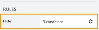
Hide
Define one or more conditions to hide this form element based on form state. To manage these no-code conditions, click the gear icon.
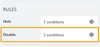
Disable
Define one or more conditions to disable this form element based on form state. To manage these no-code conditions, click the gear icon.
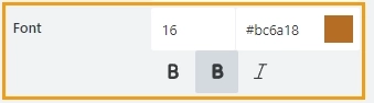
Title font
Change the formatting of the control’s title using these settings:
font size
font color; use the color picker or enter the hex color code
font style: normal, bold, or italic
Data Table column properties
Here you can find properties specifically related to the Data Table columns.
Name
A unique identifier for the column.
Important
Do not change a column’s name after the form has been in use, or you might lose saved data or break your automation.
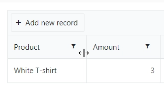
Width
Allows you to set the width of the column.
The column can be still resized manually on a form:
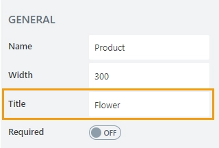
Title
Allows to set the title of the column.
Required
Allows to set the column as mandatory for the record to be added.
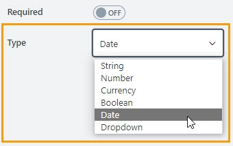
Type
The property defines the input type for the column. Available input types are:
String
Number
Currency
Boolean
Date
Date and Time
Dropdown
Masked Text
Total
Define an aggregation method for the column:
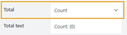
Available methods are:
Count: for all column types.
Sum, Min, Max, Average: for number and currency column types.
Total text
Specify the text to be shown in the total row:
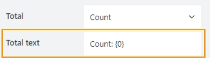
The {0} placeholder will be replaced with the calculated result based on the selected aggregation method.
Number column properties
Here you can find properties specifically related to the Number type columns.
Min/Max
Specify the minimum and maximum values that a user can enter:
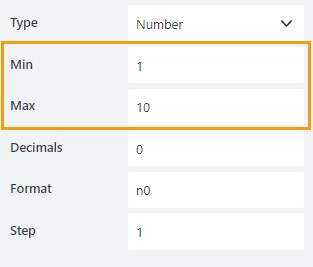
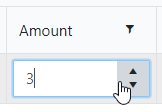
When a user enters a value outside the range, the value changes to the nearest valid value:
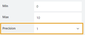
Precision
Specify the number of digits to the right of the decimal point a user can enter.
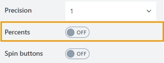
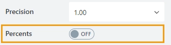
Percents
Specify whether to show the percent symbol next to the number:
Example:

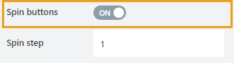
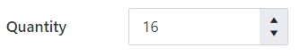
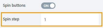
Spin buttons
Specify whether to show spin buttons for the control:
Example:
Spin step
Specify the interval for adjusting the current value when using the spin buttons:
You can enter either an integer or a decimal number.
Currency column properties
Here you can find properties specifically related to the Currency type columns.
Min/Max
Specify the minimum and maximum values that a user can enter:
When a user enters a value outside the range, the value changes to the nearest valid value:
Precision
Specify the number of digits to the right of the decimal point a user can enter.
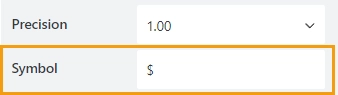
Symbol
Specify the currency symbol:
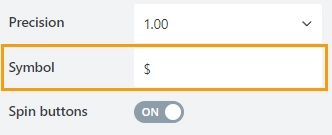
The Symbol property overwrites the form regional formatting.
Spin buttons
Specify whether to show spin buttons for the control:
Example:
Spin step
Specify the interval for adjusting the current value when using the spin buttons:
You can enter either an integer or a decimal number.
Date column properties
Here you can find properties specifically related to the Date type columns.
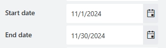
Start/End date
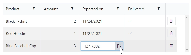
Set the minimum and maximum dates a user can enter:
Time column properties
Here you can find properties specifically related to the Time type columns.
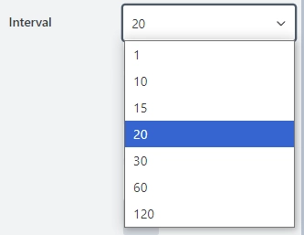
Interval
The property defines the minimum step by which the time can be changed in minutes:
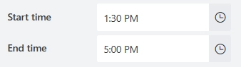
Start/End time
Set the minimum and maximum time a user can enter:
Date and Time column properties
Here you can find properties specifically related to the Date and Time type columns.
Interval
The property defines the minimum step by which the time can be changed in minutes:
Start/End date
Set the minimum and maximum dates a user can enter:
Start/End time
Set the minimum and maximum time a user can enter:
Dropdown column properties
Here you can find properties specifically related to the Dropdown type columns.
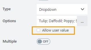
Multiple
Defines whether a user is allowed to select a single option or multiple options from the drop-down list:
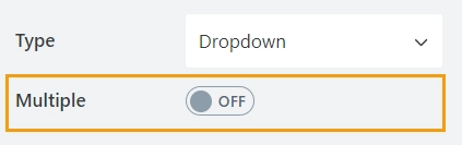
Single Selection allows a user to select only one option from the drop-down list:
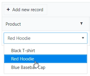
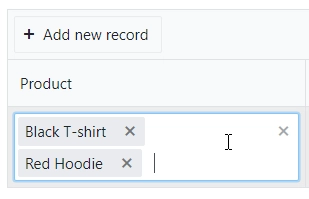
Multiple Selection allows a user to select multiple options from the drop-down list:
Note
In single selection mode the value is stored as a string.
In multiple selection mode the value is stored as an array of strings.
Source
Define the source from which the field fetches the list of options:
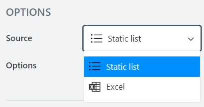
Static list—the list of options is static and stored in the form.
Excel—the list of options is populated from an Excel file stored in OneDrive
Static list
Here you can find properties specifically related to the Static list data source
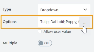
Options
The property holds options for the dropdown column:
This property allows to customize each option’s color and specify the default option:
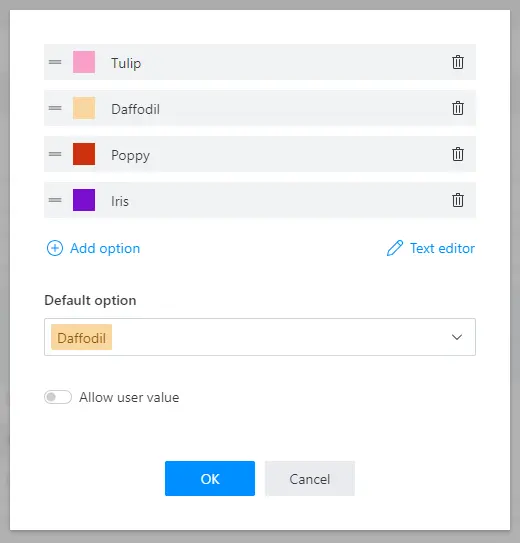
Allow user value
Enable Allow user value to allow users to enter a custom value that is not included in the list of options:
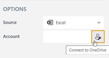
Excel
The list of options is populated from an Excel file stored in OneDrive. The Excel file holds static information or can be dynamically updated with data from a SharePoint list, a SQL database, Dynamics 365, or any other source using Power Automate (MS Flow).
To retrieve options from an Excel file:
Log in to your Microsoft account to connect to OneDrive:
Select the path to the Excel file in the File property:
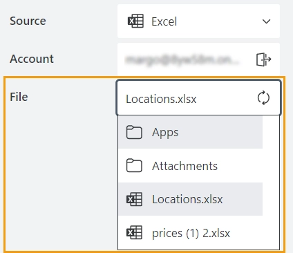
Other properties are not available until the file is selected.
If there are multiple sheets in the Excel file, you can select which sheet to use:
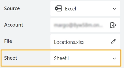
The first sheet is selected by default.
If the data is formatted as a table, select the table name in the Table property:
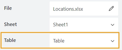
If there are no tables, leave the property empty.
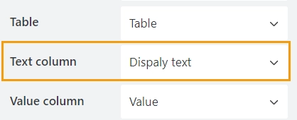
The display text and the actual value of the field may be different.
In the Text column property, select the column containing the values you want to display in the dropdown:
In the Value column property, select the column whose values will be saved when the form is submitted:
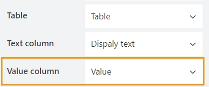
These values will be used in Power Automate (MS Flow) or Zapier.
In the Caching property, specify how long the data will be stored in the cache:
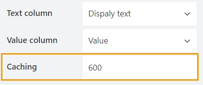
If the page with the form is refreshed within this time, new values will not be loaded.
By default, the data is stored for 600 seconds (10 minutes).
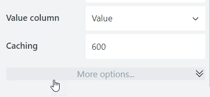
In the Extra columns property, specify what other columns you want to have retrieved from Excel. Click More options to see the property:
Select columns you want to be retrieved from Excel:
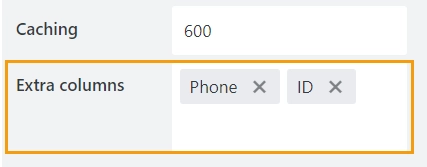
These columns won’t be visible on the form, but can be retrieved with JavaScript.
Masked Text column properties
Here you can find properties specifically related to the Masked Text type columns.
Mask
Specify the input mask:
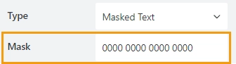
The following mask rules are supported:
0 - Digit. Accepts any digit between 0 and 9.
9 - Digit or space. Accepts any digit between 0 and 9, plus space.
# - Digit or space. Like 9 rule, but allows also (+) and (-) signs.
L - Letter. Restricts input to letters a-z and A-Z. This rule is equivalent to [a-zA-Z] in regular expressions.
? - Letter or space. Restricts input to letters a-z and A-Z. This rule is equivalent to [a-zA-Z] in regular expressions.
& - Character. Accepts any character. The rule is equivalent to S in regular expressions.
C - Character or space. Accepts any character. The rule is equivalent to . in regular expressions.
A - Alphanumeric. Accepts letters and digits only.
a - Alphanumeric or space. Accepts letters, digits and space only.
. - Decimal placeholder. The decimal separator will be gotten from the current culture.
, - Thousands placeholder. The display character will be gotten from the current culture.
$ - Currency symbol. The display character will be gotten from the current culture.
For more information and examples, check out Kendo MaskedTextBox rules.
Calculated column properties
Here you can find properties specifically related to the Calculated type columns.
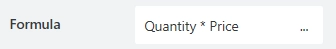
Formula
The property contains a formula for dynamic calculations:
The formula editor works in two modes:
Formula—calculation based on expression including other columns within the row.
JavaScript—calculation base on JavaScript code where the contexts of the current row and the entire form are available.
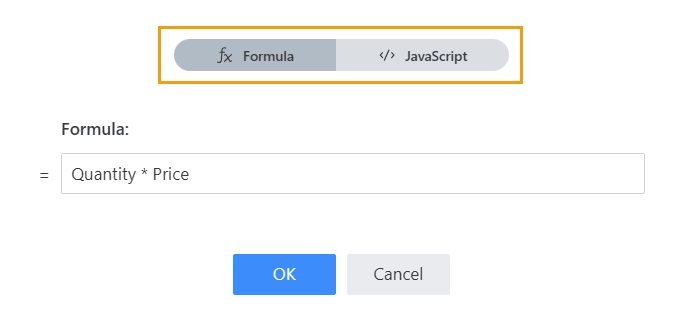
Formula mode
Create a formula using the column names.
The formula supports these operators:
Mathematical operators
Operator
Description
Example
+
Addition
Column1 + Column2
-
Subtraction
Column1 - Column2
*
Multiplication
Column1 * Column2
/
Division
Column1 / Column2
^
Exponentiation
Column1^2
roundTo(x, n)
Rounds x to n places after the decimal point
roundTo(Column1, 1)
String operators
Operator
Description
Example
||
Concatenation
Column1 || “ “ || Column2
join(sep, a, b, …)
Concatenate string with a separator
join(’ - ‘, Column2, Column1)
Date operators
Operator
Description
Example
date(a)
Converts string to a date
date(Column1)
today()
Returns the current date
today()
addDays(date, days)
Adds the specified number of days to the date
addDays(Column1, 2)
setHours(date, sourceDateWithTime)
Returns a new date object with replaced time part from another date object
setHours(Column1, date(‘09/19/22 13:55:26’))
isInDateRange(date,start date,end date)
Checks if the date is in the specified range; returns true or false
isInDateRange(today(), Column1, Column2)
isInTimeRange(date,start date,end date)
Checks if the time is in the specified range; returns true or false
isInTimeRange(today(), Column1, Column2)
isToday(date)
Checks if the date is today; returns true or false
isToday(Column1)
Logical operators
Operator
Description
Example
==, !=, >=, <=, >, <
Comparison operators, return true or false
Column1 != Column2
and
Logical AND
Column1 != Column2 and Column1 > 5
or
Logical OR
Column1 != Column2 or Column1 > 5
x ? y : z
Ternary conditional (if x then y else z)
Column1 === ‘Completed’ ? true : false
JavaScript mode
Allows you to create more complex and flexible calculations using JavaScript.
The following predefined variables can be used for dynamic calculations:
fd—provides access to all events, containers, controls, fields, validators, and data of the form.
// get value of the field on the form
fd.field('Field1').value;
data—provides access to data in other columns within the row.
// get value of the Column1
data.Column1;
The code must return calculated value:
if (fd.field('Field1').value === 'Option 1') {
    return data.Column1 * data.Column2;
} else {
    return data.Column1;
}
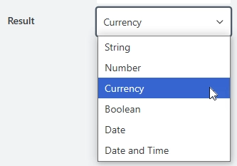
Result
After the calculation, the value is converted to the specified type. Available types are:
String
Number
Currency
Boolean
Date
Date and Time
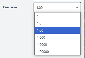
Precision
The property is available for the Number and Currency result type.
Specify the desired number of decimal places for rounding:
Percents
The property is available for the Number result type.
Specify whether to show the percent symbol next to the number:
Symbol
The property is available for the Currency result type.
Specify the currency symbol:
JavaScript framework
In this section, you can find basic examples of how to work with the control using JavaScript.
If you are not familiar with the JavaScript framework, get started with the JavaScript basics.
Note
The control is only accessible once the form is rendered, so all calls to the control must be inside fd.rendered event:
fd.rendered(() => {
    // hide the control
    fd.control('Control1').hidden = true;
    // show the control
    fd.control('Control1').hidden = false;
});
Get or set control value
Get or set the Data Table control value. The control value is stored as an array of JavaScript objects, with properties for each column.
fd.control('Control1').value; // returns an array

// set value with array of objects:
let records = [{Date: new Date(), Text: 'Item A', Cost: 100 }, {Date: new Date(), Text: 'Item B', Cost: 200 }];
fd.control('Control1').value = records;

// add new record to the Data Table using columns' InternalNames:
let record = {Date: new Date(), Text: 'Item C', Cost: 300 };
fd.control('Control1').value.push(record);
Get aggregation results
Get the aggregation results. Returns an object containing total calculations for all columns where the total method is specified.
// get aggregates for all columns as an object
fd.control('Control1').aggregates;

// get the sum for Column1
fd.control('Control1').aggregates.Column1.sum;
Get HTML element
Access HTML element inside the control in order to modify it, hide it, or do something else.
// access control's HTML
let htmlControl = fd.control('Control1').$el;
Hide/show control
Hide a control from a user. The control value can still be accessed and changed with JavaScript.
// hide control
fd.control('Control1').hidden = true;

// show control
fd.control('Control1').hidden = false;
Handle control events
Use the $on() function of the DataTable control to execute code in response to the control events. The available events are:
Before edit
Edit
Change
Remove
Sort
Save
Before edit
Execute a function when the user tries to edit or create a row in the DataTable control. Use this event to allow or prevent editing according to any custom logic. The function receives an event object e as a parameter, which can be used to access more information about the event or prevent the creation/modification of the data:
e.model is the data item that is about to be edited. The e.model.isNew() returns true if the data item is being created or false if it’s being edited.
e.preventDefault() prevents the creation of the item editor.
e.isDefaultPrevented() returns true if the creation of the editor was prevented and false if it wasn’t.
e.sender is an instance of the widget that triggered the event.
const dt = fd.control('Control1');

dt.$on('beforeEdit', e => {
    if (!e.model.isNew()) {
        e.preventDefault(); // prevent modifying existing rows, only allowing for adding new ones
    }
});
Edit
Execute a function when the item editor is created and the user can start editing the data. The function receives an event object e as a parameter, which can be used to get more information about the event or access the edit container:
e.container is the jQuery object of the edit container element, which wraps the editing UI. Depending on the Grid edit mode, the container is different: in the “incell” edit mode the container element is a table cell, in the “inline” mode it’s a table row, and in the “popup” mode it’s a Kendo UI Window element, which provides an easy way to obtain a reference to the Window widget object, e.g. to attach additional events.
e.model is the data item that is about to be edited. The e.model.isNew() returns true if the data item is being created or false if it’s being edited.
e.sender is an instance of the widget that fired the event.
const dt = fd.control('Control1');

dt.$on('edit', e => {
    let container = e.container;
    if (dt._editMode === 'incell') container.css('background-color', '#90EE90'); // highlight the edited cell
});
Change
Execute a function once the control value has been changed. The function receives an array e, which contains the new control value.
const dt = fd.control('Control1');

dt.$on('change', e => {
    if (e.length > 10) {
        dt.disabled = true; // disable the control if there are more than 10 rows in the table
    }
});
Remove
Execute a function after the user clicks the trashcan icon and confirms the delete operation. If the delete operation is canceled, this event won’t be fired. The function receives an event object e as a parameter, which can be used to get more information about the event or access the row that is being removed:
e.model is the data item that is being deleted.
e.row is the jQuery object representing the current table row.
e.sender is the widget instance that fired the event.
const dt = fd.control('Control1');

let removedItems = [];

dt.$on('remove', e => {
    removedItems.push(e.model); // add all removed items to an array
});
Sort
Execute a function when the user attempts to change the sorting settings of the control. The function receives an event object e as a parameter, which can be used to access more information about the new sorting order or prevent it from being applied:
e.sort stores the new sort descriptors.
e.preventDefault() prevents the new filtering from being applied.
e.sender is the widget instance that fired the event.
const dt = fd.control('Control1');

dt.$on('sort', e => {
    if (e.sort.field === 'Name') {
        alert('Sorting by name is disabled');
        e.preventDefault(); // prevent sorting by a certain field
    }
});
Save
Execute a function before the edits to the control are saved. The function receives an event object e as a parameter, which can be used to access more information about the data being saved or prevent saving altogether:
e.model is the data item to which the table row is bound. If e.model.id is an empty string, that means a newly created row is being saved.
e.container is the jQuery object of the edit container element, which wraps the editing UI. Depending on the Grid edit mode, the container is different: in the “incell” edit mode the container element is a table cell, in the “inline” mode it’s a table row, and in the “popup” mode it’s a Kendo UI Window element, which provides an easy way to obtain a reference to the Window widget object, e.g. to attach additional events.
e.values holds the values entered by the user. Available only for “incell” editing.
e.preventDefault() prevents the save action. In the “incell” editable.mode the edited table cell will exit edit mode. In the “inline” and “popup” edit modes, the edit form will remain open.
e.sender is the widget instance that fired the event.
dt.$on('save', e => {
    if (!e.model.id && e.values.Name === 'New') e.preventDefault(); // prevent changing the status of an existing item to 'New'
});
Configure widget
You can access the widget used by the control. The widget is based on Kendo UI Grid.
// get the widget
fd.control('Control1').widget;

// change the widget's configuration
fd.control('Control1').widgetOptions = {
    sortable: false
};
widgetOptions is the same as widget.setOptions({}) but can be defined before widget initialization.
Filter control values
It is possible to filter displayed values dynamically with the following code:
fd.control('Control1').widget.dataSource.filter({
    field: 'Column1',
    operator: 'eq',
    value: 'Test'
});
The supported operators are:
eq (equal to)
neq (not equal to)
isnull (is equal to null)
isnotnull (is not equal to null)
lt (less than)
lte (less than or equal to)
gt (greater than)
gte (greater than or equal to)
startswith
doesnotstartwith
endswith
doesnotendwith
contains
doesnotcontain
isempty
isnotempty
The last eight are supported only for string fields.
Based on Kendo’s dataSource filter property, check it out for more options.
Make control required
Make a control required or optional:
// make control required
fd.control('Control1').required = true;

// make control not required
fd.control('Control1').required = false;
Data Table validation
You can add a validation for a Data Table to verify the control’s data.
For instance, to make sure that a user has not added more than 10 records to the Data Table:
fd.control('Control1').addValidator({
    name: 'Control1 validator',
    error: 'No more than 10 records are allowed',
    validate: value => {
        // change this number to allow more/less records
        if (value.length > 10) {
            return false;
        }

        return true;
    }
});
Note
You can adjust the number in the code to allow more records or add other conditions for a more complex validation.
Column validation
You can add a validation for a Data Table column to verify the input data.
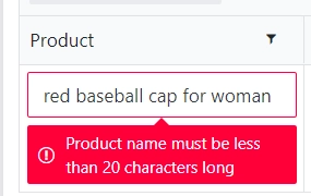
For instance, to limit the number of characters a user can enter:
fd.control('Control1').addColumnValidator('Column1', {
    error: 'No more than 20 characters are allowed',
    validate: value => {
        return (value.length <= 20)
    }
})
Note
You can adjust the number in the code to make more/less characters required or add other conditions for a more complex validation.
Populate Data Table with static data
To populate Data Table control with rows of data, use the following code:
// select the Data Table control to populate
const dt = fd.control('Control1');

// specify information for rows using columns' Name property
let dtRows = [{
        Product: 'Forms for SharePoint Online',
        Price: 599,
        Subscription: true,
        Date: new Date()
    },
    {
        Product: 'Charts for Office365',
        Price: 399,
        Subscription: false,
        Date: new Date()
    }
];

// assign rows to Data Table
dt.value = dtRows;
Populate Data Table from external data source
You can populate the data table from a file that is publicly available:
async function externalFile() {
    const data = $.get('https://plumsail.com/assets/forms/data/source.json')
    return data;
}
externalFile().then(data => {
    fd.control('Control1').value = JSON.parse(data)
})
The same way, you can populate the control from any external data source: a web service or a file.
Populate column value for new row
To populate column values for each new row in a Data Table control, use the following code:
// select the Data Table control to automatically populate new rows
const dt = fd.control('Control1');

dt.widget.bind('beforeEdit', e => {
    let model = e.model;
    if (model.isNew()) {
        model.set('Name', 'John Smith');
        model.set('Email', 'jsmith@mycompany.com');
    }
});
Populate Dropdown column options
To populate dropdown column of a Data Table control dynamically, use the code:
const dt = fd.control('Control1');

const populateDropDown = widget => widget.setDataSource({
    data: ['Apple', 'Banana', 'Pear']
})

dt.$on('edit', e => {
    const editMode = e.sender.getOptions().editable.mode;
    // populate drop-down in a pop-up window for mobile devices
    if (editMode === 'popup') {
        const dropDown = e.container.find('input[name=Column1]').data('kendoDropDownList');
        populateDropDown(dropDown);
        // populate drop-down for desktop/tablet
    } else {
        if (e.column.field === 'Column1') {
            populateDropDown(e.widget);
        }
    }
})
Retrieve extra columns from the Excel data source
Use the following code to retrieve Extra column values from Excel for the selected option in the dropdown column:
const dt = fd.control('Control1');
// get column values of the first row
let row1 = dt.value[0];
// get extra columns value in single selection mode
row1.__ColumnName.props.ExtraColumnName;
// get extra columns value in multiple selection mode
row1.__ColumnName[0].props.ExtraColumnName;
To populate other columns with extra columns value, use this code:
const dt = fd.control('Control1');
dt.$on('change', value => {
    if (value) {
        for (let i = 0; i < value.length; i++) {
            value[i].set('Column1', value[i].__ColumnName.props.ExtraColumnName || 0);
        }
    }
});
Set fields based on other fields
Sometimes, you might want to set fields automatically, without direct user input:
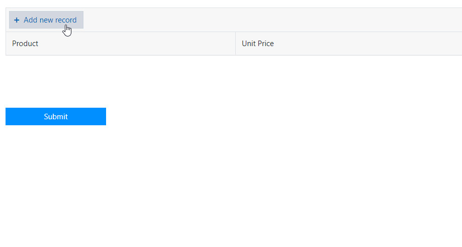
For example, the product prices are not something a user should be able to change. Instead, they can be set dynamically, depending on the selected product.
We’ll use a simple JS Object to store product prices, and automatically set unit price on product selection. Here is the code:
// we store prices in JS object
let merch = {};
// use bracket notation to accurately copy dropdown values
merch['Baseball cap'] = 9.99;
merch['T-shirt'] = 19.99;
merch['Key chain'] = 4.99;

const dt = fd.control('Control1');

// get a column by its name
const unitPriceColumn = dt.columns.find(c => c.field === 'UnitPrice');
// make column read-only
unitPriceColumn.editable = () => false;

dt.$on('change', value => {
    if (value) {
        for (let i = 0; i < value.length; i++) {
            // populate UnitPrice column
            value[i].set('UnitPrice', merch[value[i].Product] || 0);
        }
    }
});
Calculate total for an entire table
Calculate total for the Amount and Line Total columns:
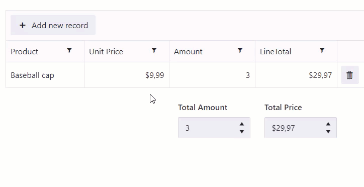
 // make TotalPrice fields read-only
fd.field('TotalPrice').disabled = true;

 const dt = fd.control('Control1');

 dt.$on('change', value => {
     // set the TotalPrice fields to the calculated sum
     fd.field('TotalPrice').value = dt.aggregates.LineTotal.sum;
 });
Add a button to duplicate row
You can add a button to Data Table rows, which will allow you to duplicate them, like this:
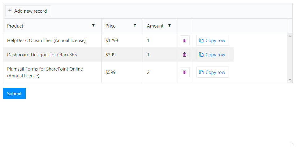
Use the following code:
// select the Data Table control to add new column to
const dt = fd.control('Control1');
let columns = dt.widget.options.columns;
let customRowDataItem = null;
let isCustomAdd = false;

// specify what the column will be like
columns.push({
    command: {
        text: 'Copy row',
        iconClass: 'k-icon k-i-copy',
        click: function(e) {
            e.preventDefault();
            customRowDataItem = this.dataItem($(e.currentTarget).closest('tr'));
            isCustomAdd = true;
            this.addRow();
        }
    }
});
dt.widget.setOptions({
    columns: columns
});
dt.widget.bind('edit', e => {
    if (isCustomAdd && e.model.isNew()) {
        isCustomAdd = false;
        for (let i = 0; i < columns.length; i++) {
            let field = columns[i].field;
            if (field) {
                e.model.set(field, customRowDataItem[field]);
            }
        }
        e.sender.closeCell(e.container);
    }
});