Toolbar actions in Plumsail Forms web editor
When editing your forms you often need to use the toolbar. This article covers its functionality and dives deeper into several actions available in the toolbar, such as form export, additional views, and form preview.
Save button
Use this button to save the form. Make sure to give your form a name before saving.

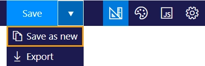
Once saved, you can use the Save as new option to create a copy of the form.
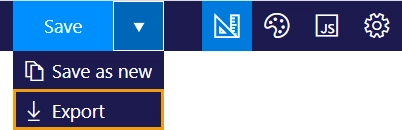
You can also export the form and save it as a file on your computer.
Mode buttons
These buttons let you switch between different editors.
Design mode
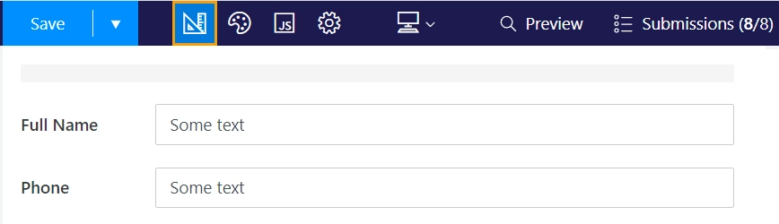
This button opens the design mode. Drag and drop different elements onto the form, configure their properties, and edit your theme to design your form.
CSS editor
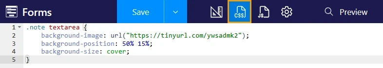
This button opens the CSS editor, which lets you create a custom CSS style for your form.
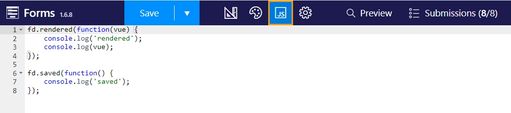
JavaScript editor
This button opens the JavaScript editor.
Refer to the JavaScript documentation to learn about events, properties and methods available in the Plumsail Forms API.
Settings
This button opens the form settings.

Undo/Redo
These buttons let you revert your actions in design mode or restore them.

Tip
Use Ctrl+Z to undo or Ctrl+Y to redo.
Additional views
Plumsail Forms is built to be responsive. Additionally, you can design separate views for phone and tablet devices to optimize layouts for each device type.
Each view has its own layout, which you can customize in design mode. This way, when a user opens the form, the matching view automatically loads for their device.
Note
All views share the same custom CSS and JavaScript.
To enable additional views for the first time, open the view dropdown in the toolbar and select Phone, Tablet, or both:
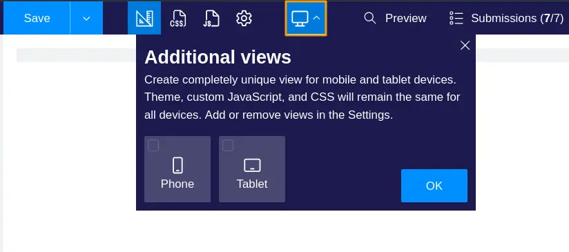
Once you enable at least one additional view, the dropdown is replaced by view icons. Use them to switch between views:

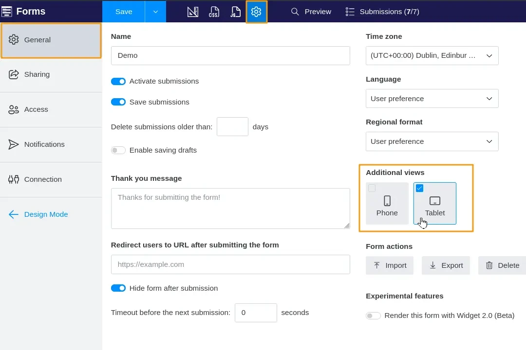
To delete or add another view, open the form settings and toggle the view:
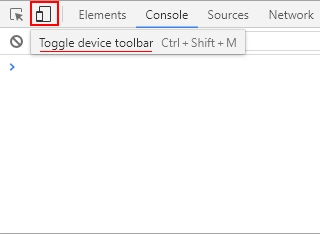
To check how your form looks on different devices, open the form preview or use your browser’s Developer Tools. For example, Chrome Developer Tools provide a special device mode to emulate different device sizes and user agents:
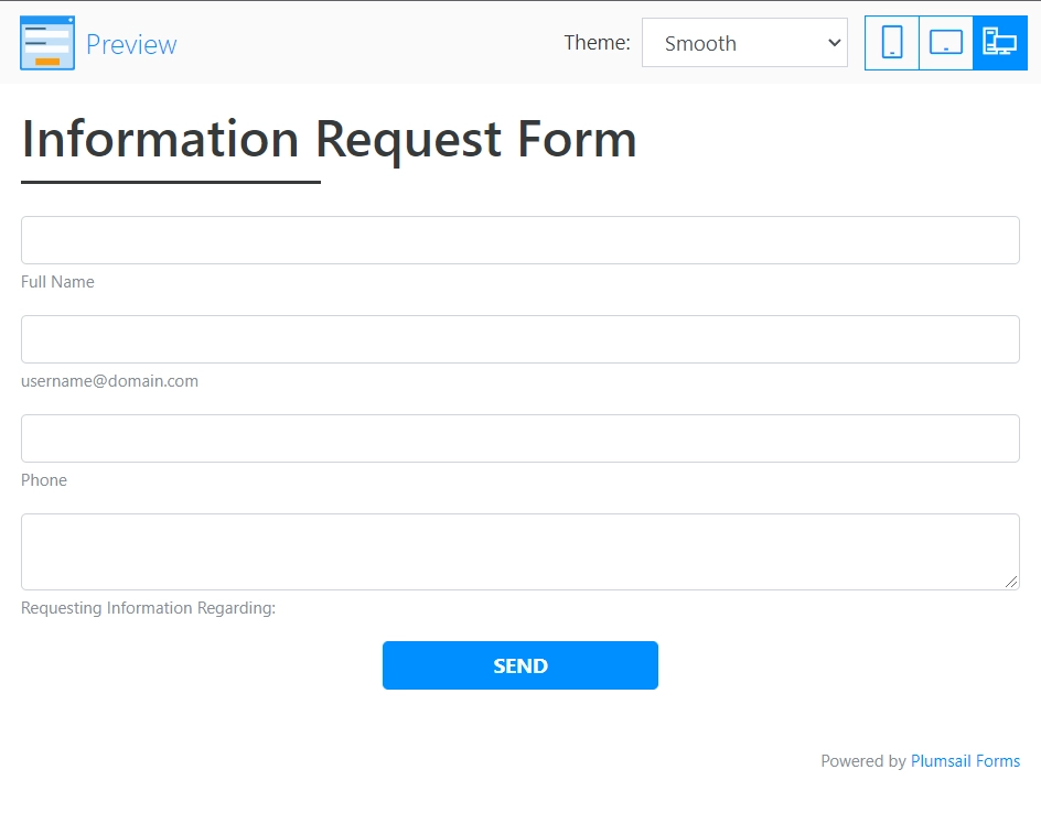
Preview
This button opens a preview of your form:

Form preview lets you test how the form functions:
Submissions
This button opens the list of form submissions in a new tab.

Tip
There are two numbers: the first represents the number of unviewed submissions, and the second shows the total number of submissions.