Configuring theme for online forms designed with Plumsail Forms
In this section you will find how to configure themes and apply CSS styles to the form.
Configure a theme
Using themes is an easy and quick way to change coloring scheme for all Fields, Controls and Containers, as well as default font, and field borders.
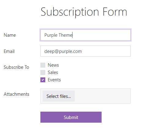
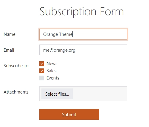
Here’s an example of the same form with different themes:
Select one of default or create your own custom theme via Theme Settings:
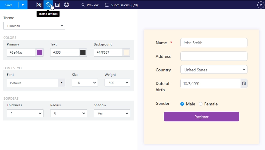
In order to apply a theme, don’t forget to Save the form!
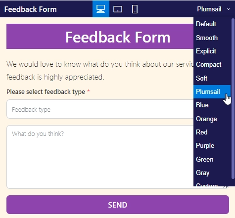
There is an option to compare different themes in Form Preview to see how they would look on the form, including your own custom theme:
Tip
Switch between themes using the code:
// switch to Plumsail theme
fd.theme = 'Plumsail'
Apply CSS styles
You can always use additional CSS to add more changes to the form and to further customize it for your needs.
Add border to specific elements
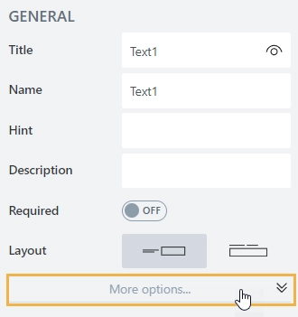
First of all, to select a specific element, you need to add a CSS class to it. Expand more options for the element:
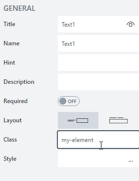
Then, add the name of your class:
Now, you can target only elements with this class. The following code will add a black border to them:
/* changes tabs background color */
.fd-form .my-element {
    border: 1px solid #000000;
}
Change background of specific fields
First of all, to select a specific element, you need to add a CSS class to it. Expand more options for the element:
Then, add the name of your class:
Now, you can target only elements with this class. The following code will change the background inside of the field’s control:
.my-element input{
    background: darkblue;
    color: yellow;
}
Warning
This will only work for some types of fields.
Change colors of Tabs
The following code will change the color of tabs:
/* changes tabs background color */
.fd-form .nav-tabs .nav-link {
    background-color: red;
}
/* change active tab background color */
.fd-form .nav-tabs .active.nav-link {
    background-color: yellow;
}
You can target only specific Tabs container by adding it a CSS class and using it in your code:
/* change tabs background color */
.fd-form .my-element .nav-tabs .nav-link {
    background-color: red;
}
/* change active tab background color */
.fd-form .my-element .nav-tabs .active.nav-link {
    background-color: yellow;
}
Change colors of Accordion
The following code will change the color of accordion panels:
/* style all panels */
.fd-form .accordion-button.collapsed {
    font-weight: bold !important;
    color: white !important;
    background: #1f5945 !important;
}

/* style opened panel */
.fd-form .accordion-button {
    font-weight: bold !important;
    color: black !important;
    background: #f39b07 !important;
}
You can target only specific Accordion container by assigning it a CSS class and using it in your selectors:
/* style all panels */
.fd-form .my-element .accordion-button.collapsed {
    font-weight: bold !important;
    color: white !important;
    background: #1f5945 !important;
}

/* style opened panel */
.fd-form .my-element .accordion-button {
    font-weight: bold !important;
    color: black !important;
    background: #f39b07 !important;
}
Apply styles for a specific screen size
You can apply styles based on the screen size. For example, the following code will only work if the screen width is larger than 1600px:
@media  screen and (min-width: 1600px) {
    .fd-form .container-fluid {
        width: 800px !important;
    }
}
Or you can also check if it’s smaller:
@media  screen and (max-width: 800px) {
    .fd-form .container-fluid {
        width: 400px !important;
    }
}