 Heading
The Heading control is used to add visually appealing headings and titles to the form. Choose the appearance of the header from a predefined list or style it to your liking using CSS.
This page contains a detailed description of the control properties and JavaScript samples which you can use with this control.
Properties
Here you can find properties available for the Heading control.
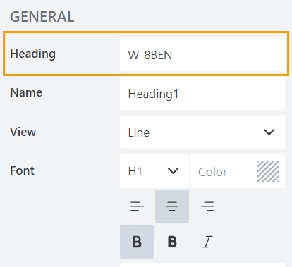
Heading
The property holds the text to be displayed on the form:
Name
A unique identifier for the control.
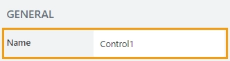
The Name property is used in JavaScript to select a specific control.
JavaScript
The Name property allows to work with the control via JavaScript code, like this:
fd.rendered(() => {
    // can access the control using its Name:
    fd.control('Control1');
 });
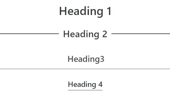
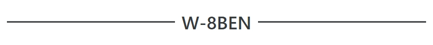
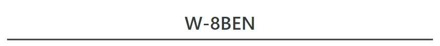
View
The property defines the appearance of the heading on the form:
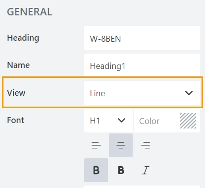
You can choose from the list of predefined options:
Normal

Line
Underline 1
Underline 2

Font
The property defines the style of the text:
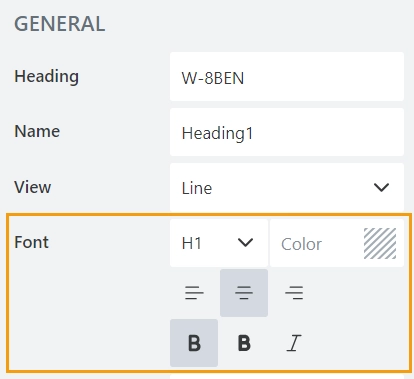
You can define:
the ranking level of the heading from H1 to H4,
the color of the text,
the aligmnet,
the text style.
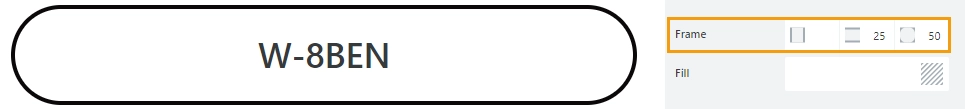
Frame
The property defines the horizontal and vertical padding (extra space) and border radius (roundness) of the control:
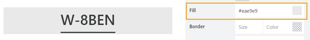
Fill
The property defines the background color of the control:
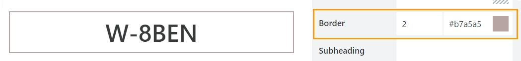
Border
The property defines the width and the color of the control’s border:
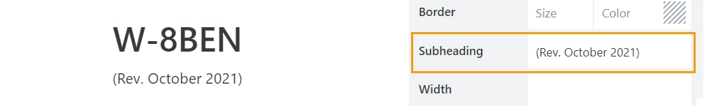
Subheading
The property stores the text of the subheading:
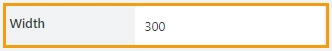
Width
The property defines the width of the control in pixels.
If left blank, the control takes up the entire available width in the current grid cell.
Class
Add a CSS class to the control, which comes in handy with CSS or even JavaScript code. This will work like class attribute for an HTML tag.
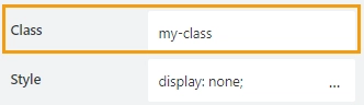
Same class can be applied to multiple controls, and then you can use CSS to modify the appearance of these controls.
Style
Add custom CSS style to the control. This will work like style attribute for an HTML tag.
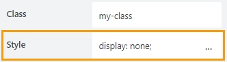
You can apply different styles to the control. For example, the following style will add a shadow under the control:
box-shadow: 0 9px #999;
And this makes the control invisible to user (but still usable with JavaScript):
display: none;
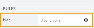
Hide
Define one or more conditions to hide this form element based on form state. To manage these no-code conditions, click the gear icon.
JavaScript framework
In this section, you can find basic examples of how to work with the control using JavaScript.
If you are not familiar with the JavaScript framework, get started with the JavaScript basics.
Note
The control is only accessible once the form is rendered, so all calls to the control must be inside fd.rendered event:
fd.rendered(() => {
    // hide the control
    fd.control('Control1').hidden = true;
    // show the control
    fd.control('Control1').hidden = false;
});
Get or set text of heading
Get or set the text of the heading with the following property:
// get the heading as a string
fd.control('Control1').heading;

// set the heading
fd.control('Control1').heading = 'New text for the heading';
Get or set text of subheading
Get or set the text of the subheading with the following property:
// get the subheading as a string
fd.control('Control1').subheading;

// set the subheading
fd.control('Control1').subheading = 'New text for the subheading';
Get HTML element
Access HTML element inside the control in order to modify it, hide it, or do something else.
// access control's HTML
let htmlControl = fd.control('Control1').$el;
Hide/show control
Hide a control from a user. The control value can still be accessed and changed with JavaScript.
// hide control
fd.control('Control1').hidden = true;

// show control
fd.control('Control1').hidden = false;
Set frame of control
Set vertical, horizontal and round (border-radius) frame of the control:
// set padding in pixels
fd.control('Control1').frame.horizontal = 100;
fd.control('Control1').frame.vertical = 100;

// set border-radius
fd.control('Control1').frame.radius = 100;
Set border of control
Set border color and width of the control:
// set border color with a valid color name
fd.control('Control1').border.color = 'red';

// set border color with a HEX value
fd.control('Control1').border.color = '#009688';

// set border color with an RGB value
fd.control('Control1').border.color = 'rgb(255,0,0)';

// set border width in pixels
fd.control('Control1').border.width = 3;
Set background of control
Set the background color of the control:
// with a valid color name
fd.control('Control1').fill = 'red';

// with a HEX value
fd.control('Control1').fill = '#009688';

// with an RGB value
fd.control('Control1').fill = 'rgb(255,0,0)';
Set ranking level of heading
Set the ranking level of the heading from H1 to H4:
fd.control('Control1').size = 'H4';
Set view of heading
Set the appearance of the heading on the form:
fd.control('Control1').view = 'Underline2';