 Submit
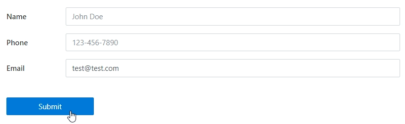
The Submit control allows you to add Submit buttons to your forms. Works exactly as the Button control, but already has the code to submit a form.
A Submit control is added automatically to the form when you add any other element.
This page contains a detailed description of the control properties and JavaScript samples which you can use with this control.
Properties
Here you can find properties available for the Submit control.
Name
A unique identifier for the control.
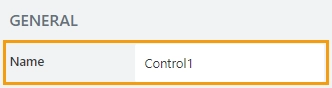
The Name property is used in JavaScript to select a specific control.
JavaScript
The Name property allows to work with the control via JavaScript code, like this:
fd.rendered(() => {
    // can access the control using its Name:
    fd.control('Control1');
 });
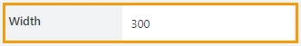
Width
The property defines the width of the control in pixels.
If left blank, the control takes up the entire available width in the current grid cell.
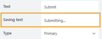
Text
Allows you to type in or copy in the exact text the submit button will display on the form:
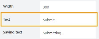
Saving text
Holds the text that will be displayed when the form is saving.
Type
Allows you to select a type of a button from available types in Bootstrap buttons:
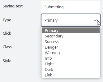
The color and the appearance of the submit button will change depending on its type.
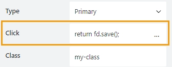
Click
Add JavaScript to execute when the submit button is clicked. With this property empty, the button won’t do anything.
Automatically has the following code on a submit button, you can add some code to run before it:
return fd.save();
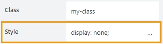
Class
Add a CSS class to the control, which comes in handy with CSS or even JavaScript code. This will work like class attribute for an HTML tag.
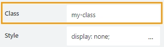
Same class can be applied to multiple controls, and then you can use CSS to modify the appearance of these controls.
Style
Add custom CSS style to the control. This will work like style attribute for an HTML tag.
You can apply different styles to the control. For example, the following style will add a shadow under the control:
box-shadow: 0 9px #999;
And this makes the control invisible to user (but still usable with JavaScript):
display: none;
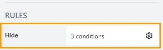
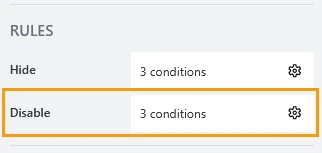
Hide
Define one or more conditions to hide this form element based on form state. To manage these no-code conditions, click the gear icon.
Disable
Define one or more conditions to disable this form element based on form state. To manage these no-code conditions, click the gear icon.
JavaScript framework
In this section, you can find basic examples of how to work with the control using JavaScript.
If you are not familiar with the JavaScript framework, get started with the JavaScript basics.
Note
The control is only accessible once the form is rendered, so all calls to the control must be inside fd.rendered event:
fd.rendered(() => {
    // hide the control
    fd.control('Control1').hidden = true;
    // show the control
    fd.control('Control1').hidden = false;
});
Get or set text
Get or set the text of the button with the following property:
// get the text as a string
fd.field('Control1').text;

// set the text
fd.control('Control1').text = 'New text for the submit button';
Get HTML element
Access HTML element inside the control in order to modify it, hide it, or do something else.
// access control's HTML
let htmlControl = fd.control('Control1').$el;
Hide/show control
Hide a control from a user. The control value can still be accessed and changed with JavaScript.
// hide control
fd.control('Control1').hidden = true;

// show control
fd.control('Control1').hidden = false;
Get or set script that runs on click
Property that holds JavaScript that is executed when the submit button is clicked:
// get the script that runs on click
fd.control('Control1').onclick;

// set the script that runs on click
fd.control('Control1').onclick = 'alert("Submit is clicked!"); return fd.save();';

// trigger the code to run with JavaScript
fd.control('Control1').click();