 Ink Sketch
Allows a user to leave a drawing or handwritten note. Use the control to collect signatures, drawings, diagrams, schemes, or notes on an image.
This page contains a detailed description of the control properties and JavaScript samples, which you can use with this control.
Properties
Here you can find properties available for the Ink Sketch control.
Save to
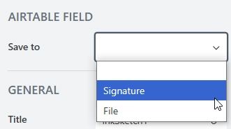
The property becomes available when the form is connected to Airtable or SharePoint.
To save the content of the control to Airtable, select a column of type Attachment from the drop-down:
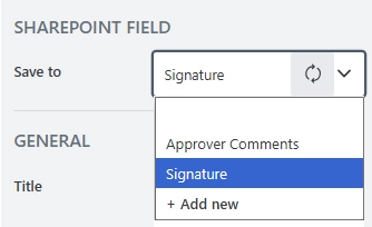
To save the content of the control to SharePoint, select an existing Multiple lines of text column or create a new one in the source SharePoint list. The content will be saved as a string of Base64-encoded image data.
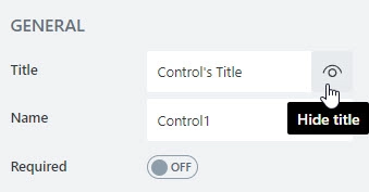
Title
Specify text of the title that will appear next to the control.
Can also toggle Title’s visibility on/off:
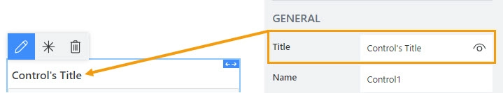
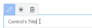
Title can be changed directly on the form after a double click:
JavaScript
This code will allow you to get or set the control’s title dynamically:
// returns the control's title as a string
fd.control('Control1').title;

// sets the control's title
fd.control('Control1').title = 'Last Name';
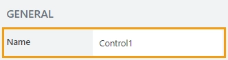
Name
A unique identifier for the control.
The Name property is used in JavaScript to select a specific control.
JavaScript
The Name property allows to work with the control via JavaScript code, like this:
fd.rendered(() => {
    // can access the control using its Name:
    fd.control('Control1');
 });
For Ink Sketch, Data Table, and Likert Scale controls, the Name property is used to store data from submissions, and in Power Automate or Zapier automations.
Important
Do not change control’s Name after the form has been in use, or you might lose saved data or break your automation.
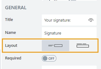
Layout
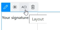
Define whether the Title will appear to the left of the control or directly above it:
Orientation can also be changed directly in the context menu of the selected control:
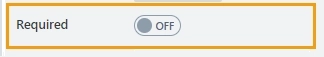
Required
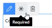
Define whether the control will be required to submit the form or not:
Required status can also be changed directly on the form via the Asterisk button:
JavaScript
This code allows you to get and set control’s required status
// returns the control's required status as true/false
fd.control('Control1').required;

// sets the control's required status
fd.control('Control1').required = true;
Width/Height
The properties define the width and height of the canvas in pixels.
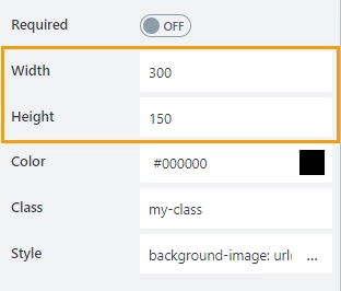
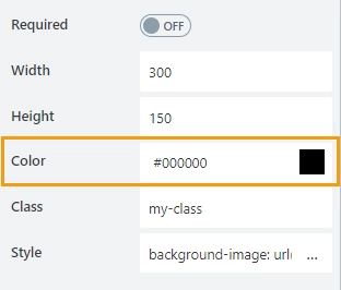
Color
Defines the ink color.
Class
Add a CSS class to the control, which comes in handy with CSS or even JavaScript code. This will work like class attribute for an HTML tag.
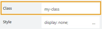
Same class can be applied to multiple controls, and then you can use CSS to modify the appearance of these controls.
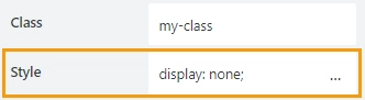
Style
Add custom CSS style to the control. This will work like style attribute for an HTML tag.
You can apply different styles to the control. For example, the following style will add a shadow under the control:
box-shadow: 0 9px #999;
And this makes the control invisible to user (but still usable with JavaScript):
display: none;
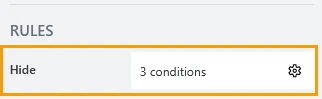
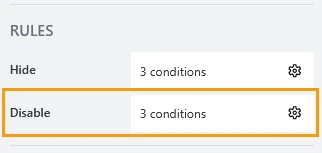
Hide
Define one or more conditions to hide this form element based on form state. To manage these no-code conditions, click the gear icon.
Disable
Define one or more conditions to disable this form element based on form state. To manage these no-code conditions, click the gear icon.
Title width
Specifies width of the control’s title in pixels.
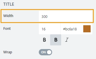
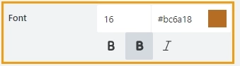
Title font
Change the formatting of the control’s title using these settings:
font size
font color; use the color picker or enter the hex color code
font style: normal, bold, or italic
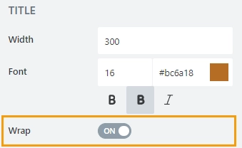
Title wrap
Defines whether title wrapping is enabled:
If wrapping is enabled, title text is split in multiple lines if it doesn’t fit in one line.
If wrapping is disabled, title text is shortened with ellipsis until it fits
JavaScript framework
In this section, you can find basic examples of how to work with the control using JavaScript.
If you are not familiar with the JavaScript framework, get started with the JavaScript basics.
Note
The control is only accessible once the form is rendered, so all calls to the control must be inside fd.rendered event:
fd.rendered(() => {
    // hide the control
    fd.control('Control1').hidden = true;
    // show the control
    fd.control('Control1').hidden = false;
});
Get or set control value
Get or set the Ink Sketch control value. The control value is stored as a Base64 string.
// get control value as a Base64 string
fd.control('Control1').value;
Get HTML element
Access HTML element inside the control in order to modify it, hide it, or do something else.
// access control's HTML
let htmlControl = fd.control('Control1').$el;
Hide/show control
Hide a control from a user. The control value can still be accessed and changed with JavaScript.
// hide control
fd.control('Control1').hidden = true;

// show control
fd.control('Control1').hidden = false;
Clear canvas
Clear the control value.
fd.control('Control1').clear();
Handle change event
Execute a function when a control value has been changed:
fd.control('Control1').$on('change', value => {
    // log changes to browser's console
    console.log('New value: ' + value);
});
Make control required
Make a control required or optional:
// make control required
fd.control('Control1').required = true;

// make control not required
fd.control('Control1').required = false;
Disable control
Disable the control. The control value can still be changed with JavaScript and saved.
// disable control
fd.control('Control1').disabled = true;

// enable control
fd.control('Control1').disabled = false;
Change canvas size
Define the canvas dimensions in pixels.
// define canvas width
fd.control('Control1').width = 300;

// define canvas height
fd.control('Control1').height = 300;
Set ink color
Set the ink color. Define the color in the text, hex, or RGB format.
// set the ink color to red
fd.control('Control1').inkColor = 'red';

// set the ink color to black
fd.control('Control1').inkColor = 'rgb(0,0,0)';

// set the ink color to blue
fd.control('Control1').inkColor = '#0000FF';