Layout
Layout settings helps you manage how the organizational hierarchy is displayed in the chart. Different layouts improve readability for large organizations, wide team structures, and smaller screens.
View layout
For each view, use the Layout type selector to choose how the hierarchy is displayed.
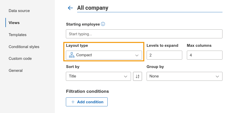
Depending on the selected layout, you can also configure:
Levels to expand: controls how many hierarchy levels are expanded by default.
Max columns: limits the number of horizontal columns before boxes begin stacking vertically (available only for Compact layout).
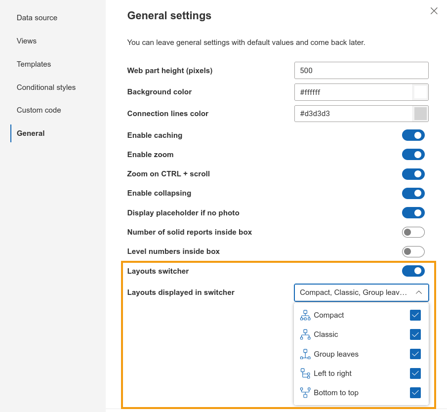
Layouts switcher
Users can switch between available layouts to view the chart in a way that best fits their screen size or navigation preferences. This choice will be remembered for the current user only and will not affect others.
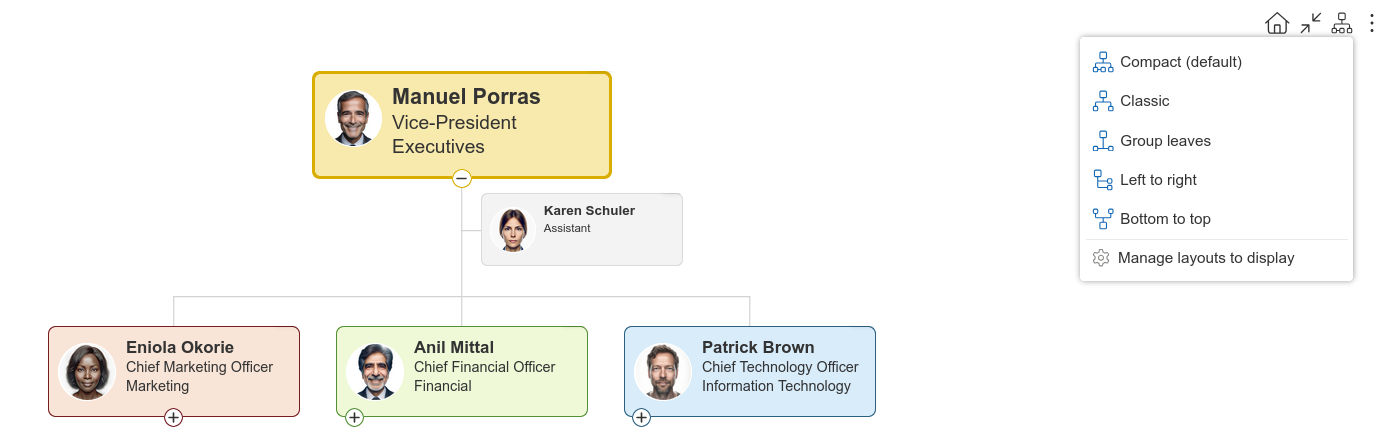
In case you want to restrict this option, you can either hide the switcher completely or limit available options from the General setting panel.
Types
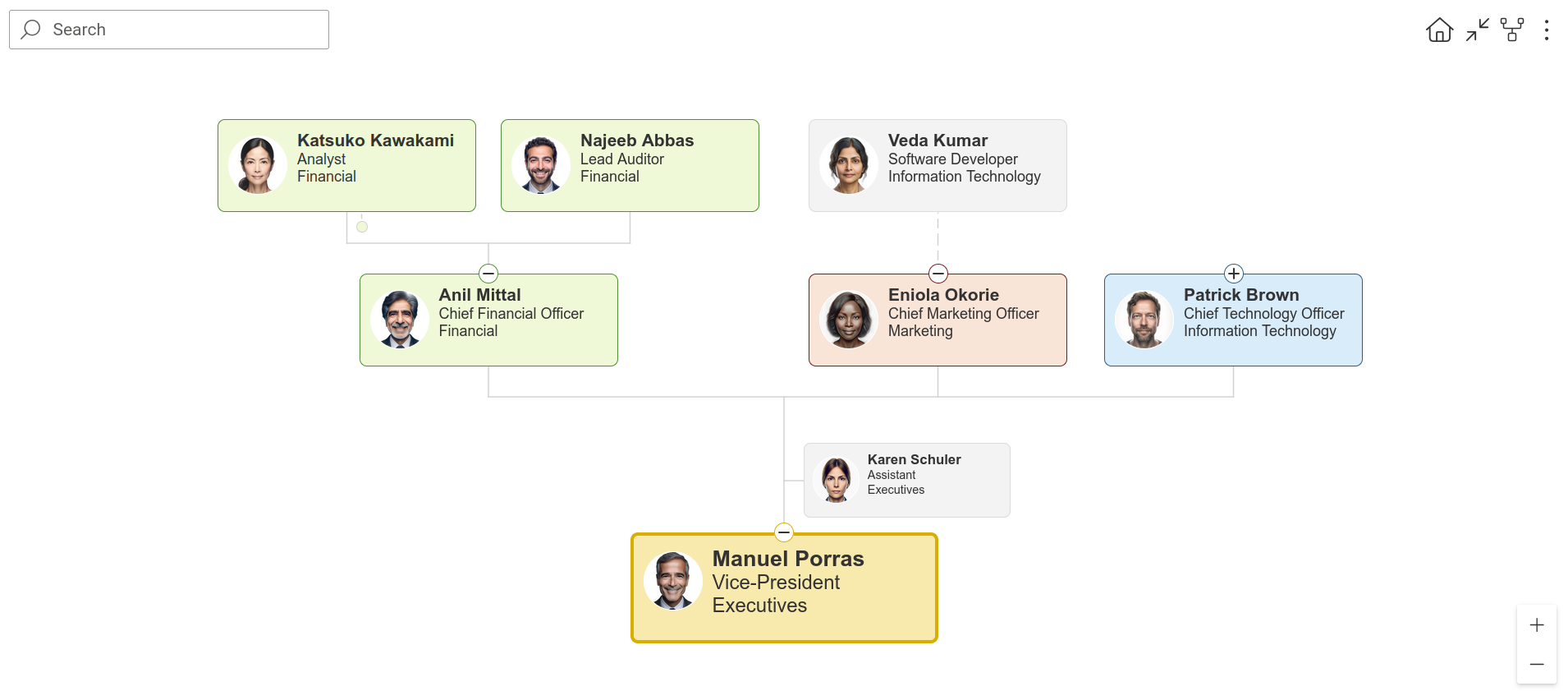
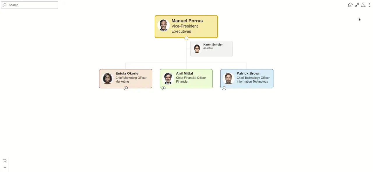
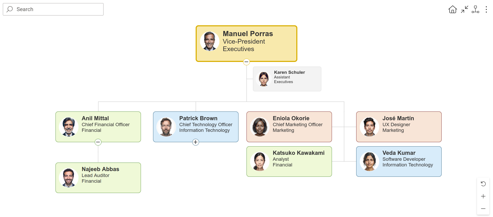
Compact
Being the default layout, Compact keeps a top-to-bottom structure while reducing horizontal space usage. It is useful for wide organizational charts with many departments or teams.
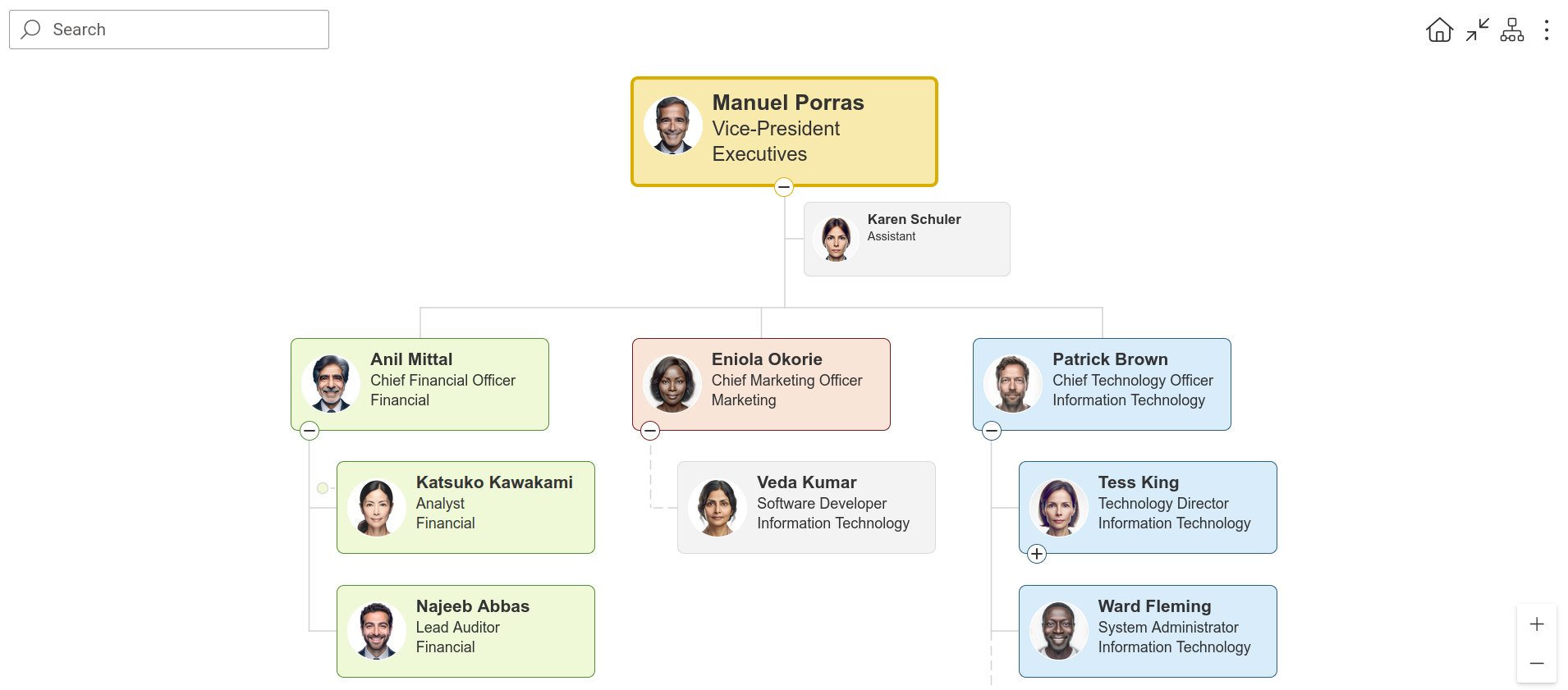
Use Max columns to control how many columns can appear before boxes begin stacking vertically. By default, boxes from the third level onward are stacked beneath second-level boxes to maintain a fixed chart width.
You can also change their orientation for individual boxes directly in the chart.
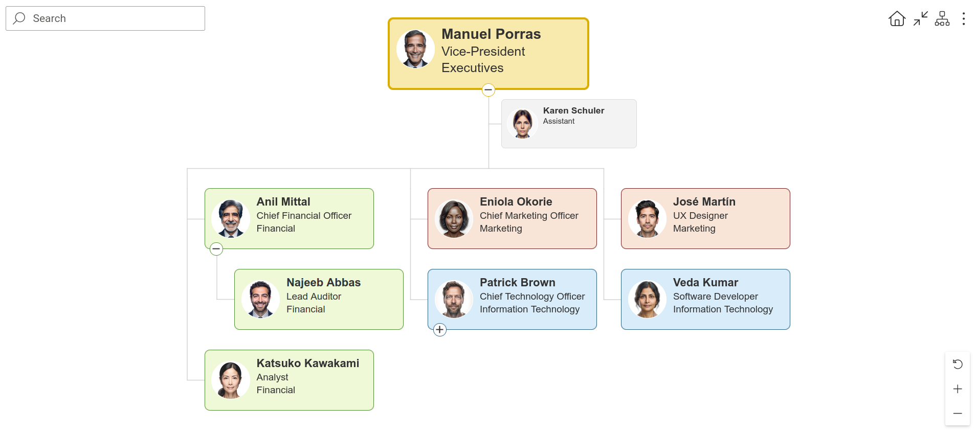
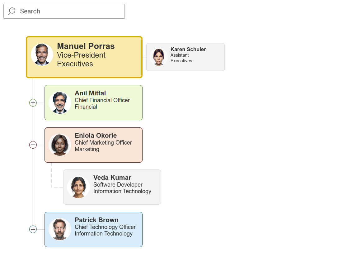
Classic
Classic displays the hierarchy in a traditional top-to-bottom structure and is suitable for standard charts.
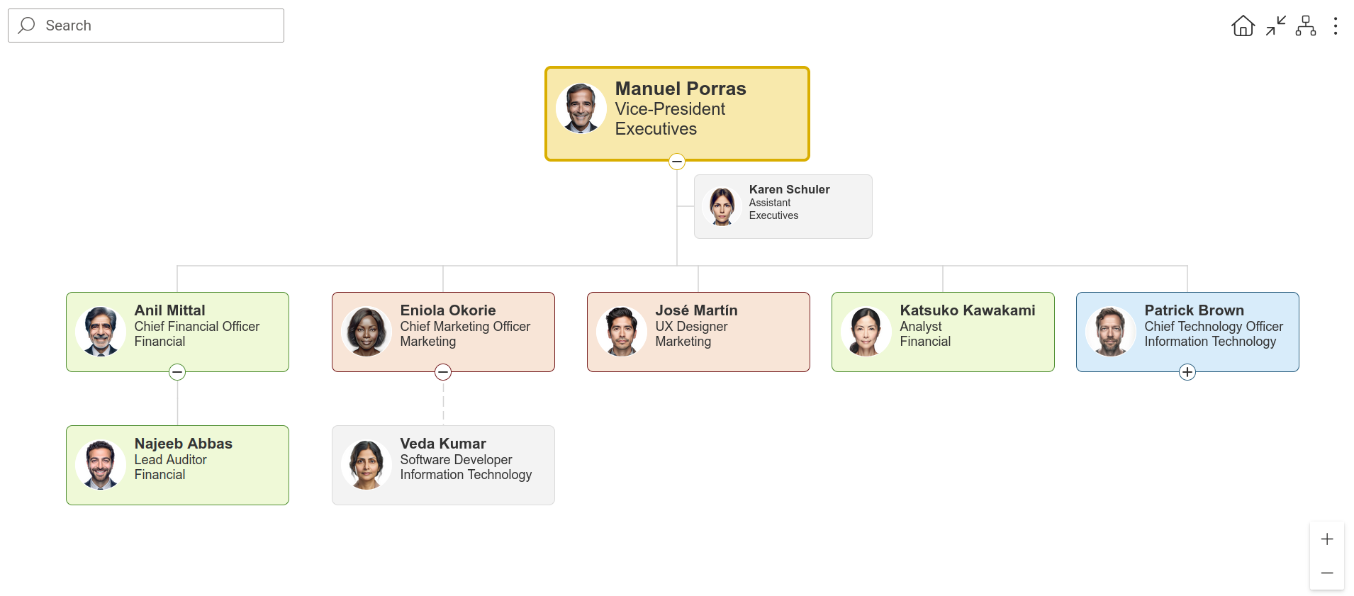
Group leaves
Group leaves is a variation of the classic top-to-bottom layout where employees without subordinates are grouped into two columns on the right side of the chart.
Left to right
Left to right displays the hierarchy horizontally with vertically stacked child items, similar to a file explorer structure.
Bottom to top
Bottom to top is an inverted version of the top-to-bottom layout where the root item appears at the bottom of the chart.