Default Layout (SharePoint Server 2019/SE)
Select default layout
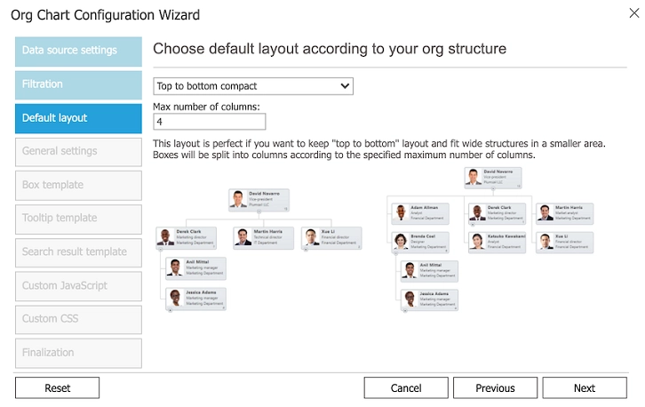
At this step you can choose a default layout that will be displayed for all the users when they open the page with the Org Chart web part for the first time.
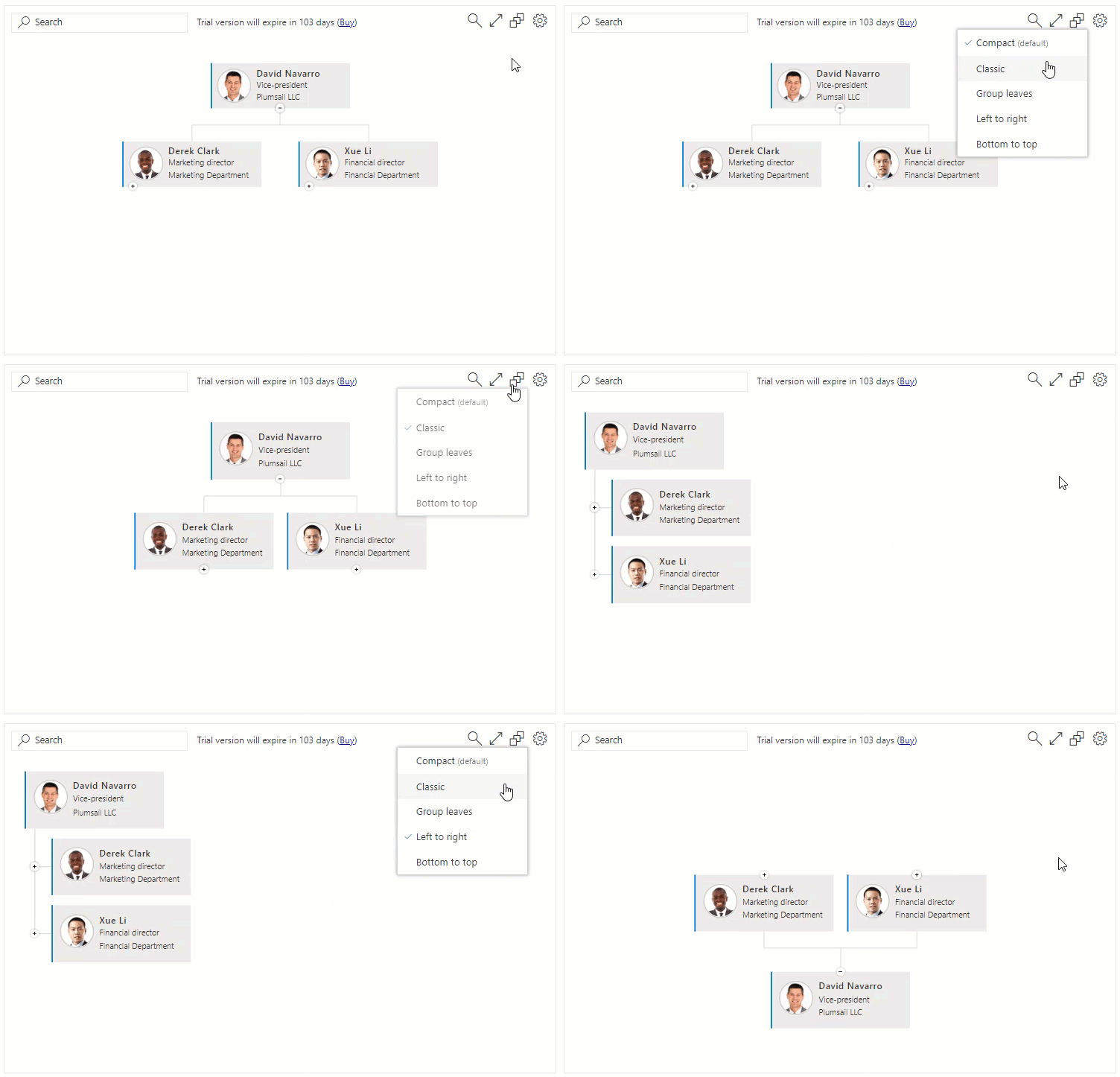
Your users can choose a different layout to get a better visualization for their needs. This choice will be remembered for the current user only and will not affect other users.
Note
The default layout (the one specified in the configuration wizard) is a global setting. If the default layout is selected then it takes layout settings from the settings wizard and doesn’t store the selection in the browser. Thus, if a user selects this (default) layout and then the administrator changes the layout in the configuration wizard, it will affect the user. If the user selects a non-default layout then it’s stored locally for the user and changes in the configuration wizard’s layout tab will not affect them.
Available layouts
Top to bottom compact
This layout is perfect if you want to keep “top to bottom” layout and fit wide structures in a smaller area. You can set the maximum number of columns you want your Org Chart to fit. If the number of boxes on the second level exceeds the maximum, the boxes will be stacked. The boxes on the third and subsequent levels are always stacked under the corresponding boxes on the second level to keep the fixed width of the structure.
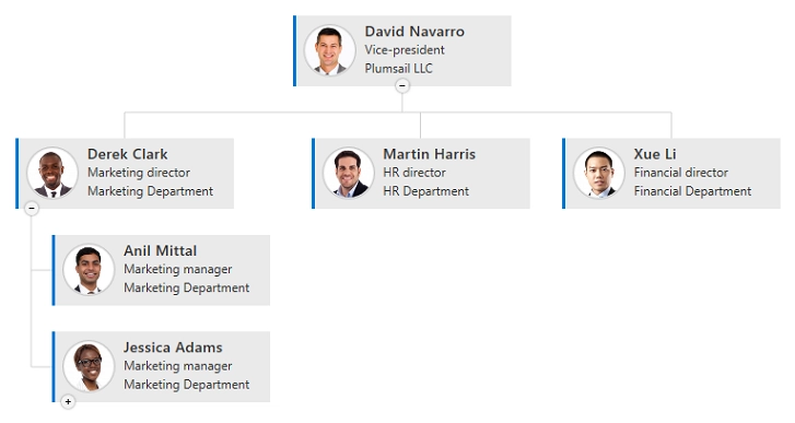
In this example, the maximum number of columns is set to three. If the number of boxes on the second level is equal to or less than three, the level lines up horizontally:
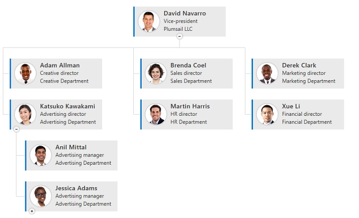
If the number of boxes on the second level is greater than three, the boxes are stacked in three columns:
Top to bottom with grouping of leaf boxes
This is a modification of a classic “top to bottom” layout. The only difference is that all leaf boxes (employees without subordinates) are joined into a two column group on the right-hand side.
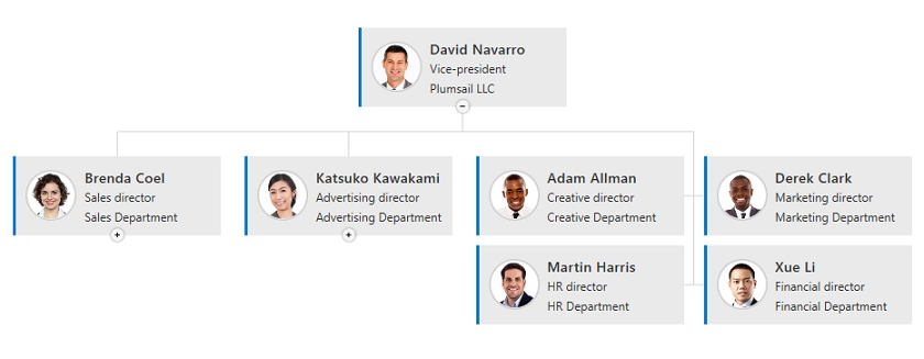
Top to bottom classic
Top to bottom is a classic tree org chart layout.
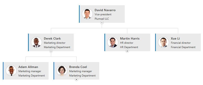
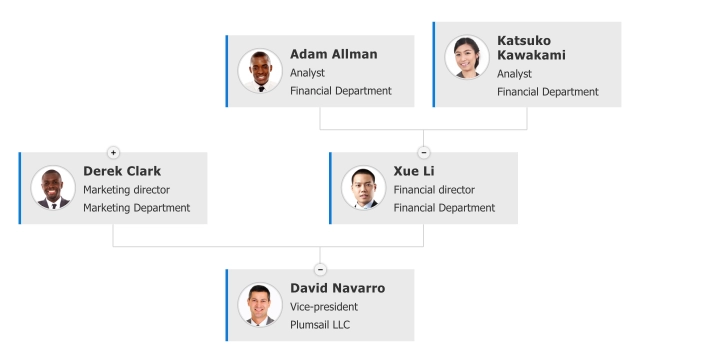
Bottom to top
The inverted version of the Top to bottom layout. The root item is displayed on the bottom of the Chart.
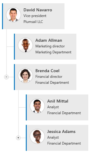
Left to right layout
Left to right layout is good when you want to display all boxes stacked as a file system tree.
Changing orientation for specific boxes
Note
This option is only available in the Top to bottom compact layout. Changing the settings for the Top to bottom compact layout will affect all the users who use the layout.
You can change the layout behavior to combine both horizontal and stacked orientations to better reflect your organization structure:
Open your page in edit mode
If the Top-to-bottom compact layout is chosen, you will see a gear icon in the top-left corner of each box on the second level. Click on it to select the orientation.
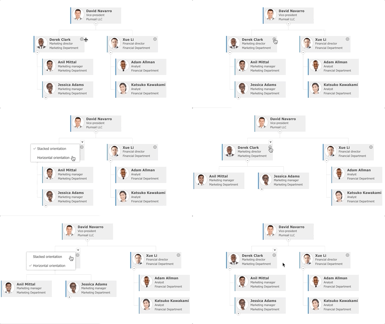
You can drill down to any box by clicking on the down-arrow icon that appears on top of each box when you hover with a cursor. Then you can change the orientation for any box that is now on the second level too. This orientation will be saved for the current box.