Customize box HTML template and CSS styles in Org Chart (version 3.x.x and on-premises)
In this article I will show how to customize box template for Plumsail Org Chart. This works for all editions of SharePoint SE / 2019 including Foundation as well as for SharePoint Online in Microsoft 365. Christmas and New Year are coming. That is why I decided to implement such interactive behavior for org chart. This is just a show case and you can use this approach to create your own box templates.
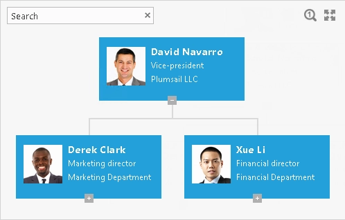
This is how it looked before customization:
Starting from the version 1.7.1, SharePoint OrgChart allows to customize templates for boxes, tooltips and search results using Handlebars templating framework. It supports conditions, iterators and can be extended by own helpers. You can play around with template in this tester.
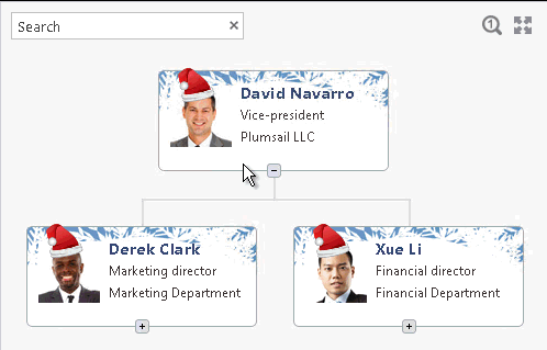
As you see I changed color schema and background of boxes as well as added Santa’s cap and beard.
The customization can be done in three steps:
To change org chart skin
To customize box template – I will add Santa’s cap and beard to the box template at this step.
To customize CSS styles – I will set background, specify position for cap and beard and finally add dynamics to beard. So, that it will appear on mouse over.
I will not describe in detail how to change skin. It is quite easy. Just open the configuration wizard, switch to General settings step, change the skin and finish the wizard. I used “Light gray” skin.
How to customize box template
Firstly, I uploaded images of cap, beard and box background to document library. I used “PublishingImages” document library, but you can use any other path. In this case you will need to change path to pictures in HTML template and CSS styles below. You can download archive with pictures at the end of this article.
You need to open the configuration wizard to customize HTML template for box. Then switch to the Box template step and click HTML mode. The Org Chart will convert template from visual editor to HTML template and you will be able to edit it.
I added two div tags with images. The first one contains image of Santa’s cap:
The second one contains image of beard:
The result template looks like this:
<div class="pl-item-photo">
  {{#if PhotoUrl}}
    <div class="santa-cap">
      <img src="../PublishingImages/santa-cap.png"/>
    </div>
    {{#detailsTooltipLink}}
      {{safeImage PhotoUrl}}
    {{/detailsTooltipLink}}
    <div class="santa-beard">
      <img src="../PublishingImages/beard.png"/>
    </div>
  {{/if}}
</div>
<div class="pl-item-fields">
  <div class="field-container header-field">
    {{#detailsTooltipLink}}
    {{Title}}
    {{/detailsTooltipLink}}
  </div>
  <div class="field-container ">
    {{JobTitle}}
  </div>
  <div class="field-container ">
    {{Department}}
  </div>
</div>
As you see the template contains multiple tokens which allow to display properties from the data source.
There are also helpers like detailsTooltipLink which renders the link to show tooltip on click.
You can find more information in the documentation.
You can include additional fields from data source into template. Just add {{Field}}, where Field is an internal name of a field from a data source.
How to customize CSS styles
Now when we added required HTML tags into template we need to display them correctly. Below you can find complete CSS style which changes background for boxes, specifies position and size for cap and beard. It also sets animation delay for beard and shows it on hover. All of this done by CSS styles. You can set them in the configuration wizard at General settings step.
I used following selectors in my CSS:
.pl-item-template – I used it to change background for boxes.
.santa-cap – Take a look at the HTML template. I added
santa-capclass to the newdivtag. I used this selector to set position of Santa’s cap..santa-cap img – I used it to specify size of cap.
.santa-beard – Take a look at the HTML template. This class was also added to the new
divtag which contains the image of beard. I used this selector to set position for beard as well as set animation delay and hide it by default.
As you can see I used multiple transition styles to ensure that it will work in different browsers. - .santa-beard:hover – This selector was used to show beard on hover. - .santa-beard img – I used this selector to set size of beard.
You can find complete CSS style below. It contains multiple comments which will help you to understand how it works:
/*Change box background*/
.pl-item-template {
  background-image: url('../PublishingImages/box-background.png')!important;
  background-color: white!important;
}

/*Set position for Santa's cap*/
.santa-cap {
  position: absolute;
  top: -6px;
  left: 16px;
  -webkit-transform: rotate(-13deg);
}

/*Set size for Santa's cap*/
.santa-cap img {
  width: 38px;
}

/*Set position and initial state for beard*/
.santa-beard {
  position: absolute;
  bottom: 11px;
  left: 22px;

/*Set animation delay for beard in all browsers*/
  -webkit-transition: margin 1s ease;
  -moz-transition: margin 1s ease;
  -o-transition: margin 1s ease;
  -ms-transition: margin 1s ease;
  transition: opacity .5s ease-in-out;

/*Hide beard by default*/
  opacity: 0;
}

/*Show beard on hover*/
.santa-beard:hover{
   opacity: 1;
}

/*Set size for beard*/
 .santa-beard img {
   width: 32px;
}
Conclusion
That is all. The org chart is ready for Christmas and New Year. In this article I showed how to customize HTML template for boxes of organization chart. I added CSS styles to change background of boxes and animate beard on hover. This is just a proof of concept. You can complicate it by additional HTML and CSS styles. You even can add custom JavaScript to modify boxes or tooltips dynamically.