HTML templating syntax description (SharePoint Server 2019/SE)
Introduction
We use Handlebars templating engine to render boxes, tooltips and search results. You can specify custom HTML templates using Handlebars syntax to change look and feel of the Org Chart.
Find a detailed description of Handlebars syntax on the official site. In this instruction, we covered only frequently used blocks and our custom blocks, developed for the Org Chart especially.
Handlebars template look like regular HTML, with embedded handlebars expressions.
{{Department}}
A handlebars expression is a {{, some contents, followed by a }}. In the example above you see {{Department}} expression. It allows rendering of the value of the field with internal name “Department”.
Example of the template
This is an example of the box template. To understand the meaning of different blocks read description below.
<div class="pl-item-photo">
  {{#if PictureURL}}
    {{#detailsTooltipLink}}
      {{safeImage PictureURL}}
    {{/detailsTooltipLink}}
  {{/if}}
</div>
<div class="pl-item-fields">
  <div class="field-container header-field">
    {{#detailsTooltipLink}}
      {{PreferredName}}
    {{/detailsTooltipLink}}
  </div>
  <div class="field-container">{{Title}}</div>
  <div class="field-container">{{Department}}</div>
</div>
The if block helper
You can use the if helper to conditionally render a block. If its argument returns false, undefined, null, empty string or empty array (a “false” value), Handlebars will not render the block.
<div>
  {{#if PictureURL}}
  <img src="{{PictureURL}}" alt="" />
  {{/if}}
</div>
If you need to build if/else behavior you can add else block like this:
<div>
  {{#if PictureURL}}
  <img src="{{PictureURL}}" alt="" />
  {{else}}
  No picture
  {{/if}}
</div>
The unless block helper
You can use the unless helper as the inverse of the if helper.
Its block will be rendered if the expression returns a false value.
{{#unless PictureURL}}<h3>WARNING: Picture not found!</h3>{{/unless}}
Displaying of raw HTML content
Handlebars template engine escapes HTML tags by default. In the case you want to add to the box template a property which contains the ones, you should enclose it in triple braces.
{{{AboutMe}}}
For example, you want to display the “About me” property from SharePoint user profiles on the tooltip. If you just add it to the tooltip template, you will get an alike result with escaped HTML tags.
In this case, you need to enclose the AboutMe token into triple braces.
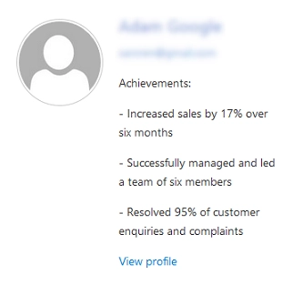
As a result, the mark-up of the content will be properly processed:
Additional block helpers
We added two new helpers into Handlebars framework.
The safeImage block allows inserting of an img tag into HTML markup which will handle broken pictures and hide them.
This is how you can use it:
{{safeImage PictureURL}}
Where PictureURL is an internal name of a field with URL.
The detailsTooltipLink block allows wrapping of some HTML content with a tag which will show details tooltip once you click on it.
We use this block in the box template.
{{#detailsTooltipLink}}
  {{PreferredName}}
{{/detailsTooltipLink}}
Where PreferredName could be an internal name of a field.
You also can add other HTML content inside this block:
{{#detailsTooltipLink}}
  Some HTML content
{{/detailsTooltipLink}}
Structure of the context object
Handlebars template receives context object, the object which represents data to render. This context object is used to resolve values in the template. The context object is a plain object with multiple fields from a data source:
{
  FieldInternalName1: "FieldValue1",
  FieldInternalName2: "FieldValue2",
  ...
  FieldInternalNameN: "FieldValueN",
}
Thus, you can access the value of the field with internal name FieldInternalName1 using such Handlebars expression:
{{FieldInternalName1}}