 Text
Text
The Text field is the most commonly used field type. It is used to collect short data, such as a name or zip code. To determine the input type select an existing pattern type or create a new one.
This page contains a detailed description of the field properties and JavaScript samples which you can use with this field.

Common Properties
General |
Title |
Control |
|---|---|---|
General
Title
Control
Text Properties
Here you can find properties specifically related to the Text field.
Pattern
This section allows you to configure advanced validation for a field. For instance, you can check if a value is a valid e-mail address or a phone number. If the value doesn’t fit the pattern, a corresponding error occurs.
Type
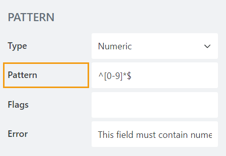
Select the Type of the Text, this will automatically apply a regex pattern to it. Several types are available, such as Email, Phone, Numeric, etc. This will determine what type of text can be input, and will give field a validator to make sure that the input is correct.

Pattern
A regex pattern which the field has to follow. You can either input your own, or select one of the available Types and it will be automatically set for you.

Flags
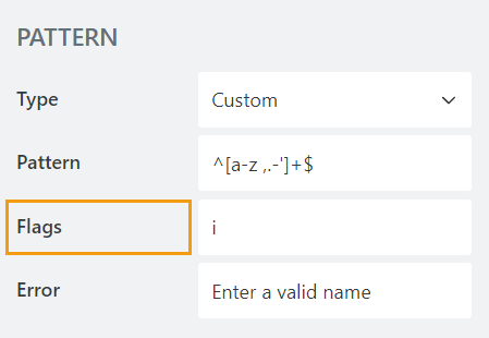
The flags modify the meaning of the given regex pattern. Each flag is denoted by a single alphabetic character, and serves different purposes in modifying the expression’s searching behavior.

Error
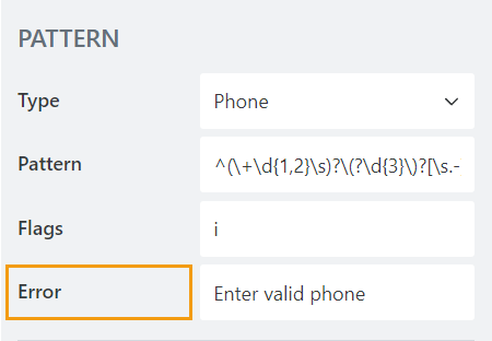
The error message which is displayed when the input field value doesn’t match the regex pattern.

JavaScript framework
In this section, you can find basic examples of how to work with the field using JavaScript.
For more examples, check out Working with form fields in JavaScript article. If you are not familiar with the JavaScript framework, get started with the JavaScript basics.
Note
The field is only accessible once the form is rendered, so all calls to the field must be inside fd.rendered event:
fd.rendered(() => {
    // make field required
    fd.field('Field1').required = true;
});
Get or set field value
Access and change field value with the following property:
// get field value
let text = fd.field('Field1').value;

// set field value
fd.field('Field1').value = 'Some text';
Handle change event
Execute a function when a field value has been changed:
fd.field('Field1').$on('change', value => {
    // log changes to browser's console
    console.log('New value: ' + value);
});
Make field required
Make a field required or optional:
// make field required
fd.field('Field1').required = true;

// make field not required
fd.field('Field1').required = false;
Disable field
Make a field non-editable. The field value can still be changed with JavaScript and saved:
// disabled field
fd.field('Field1').disabled = true;

// enable field
fd.field('Field1').disabled = false;
Get HTML element
Access HTML element inside the field in order to modify it, hide it, or do something else.
// access field's control
let htmlElement = fd.field('Field1').$el;

// access field's block, which includes title and control
let htmlParentElement = fd.field('Field1').$parent.$el;
Hide field
Hide a field from a user. The field value can still be accessed and changed with JavaScript:
// hide field
fd.field('Field1').hidden = true;

// show field
fd.field('Field1').hidden = false;