 Date and Time
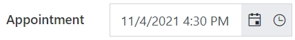
The Date and Time field is used to collect date and time information.
This page contains a detailed description of the field properties and JavaScript samples which you can use with this field.
Common Properties
Date and Time Properties
Here you can find properties specifically related to the Date and Time field.
Start/End date
Set the minimum and maximum dates a user can enter:
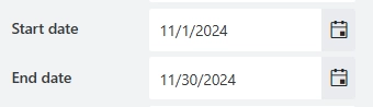
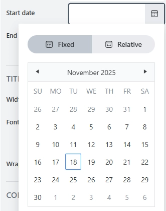
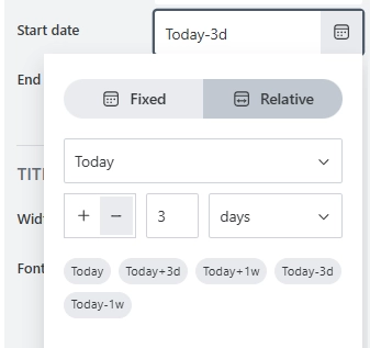
You can define static or relative dates:
Fixed: Choose a specific, static date using the calendar.
Relative: Set a date that is calculated based on the current date or another date field on the form.
Tip
You can also define date range with JavaScript.
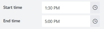
Start/End time
Set the minimum and maximum time a user can enter:
JavaScript framework
In this section, you can find basic examples of how to work with the field using JavaScript.
For more examples, check out Working with form fields in JavaScript article. If you are not familiar with the JavaScript framework, get started with the JavaScript basics.
Note
The field is only accessible once the form is rendered, so all calls to the field must be inside fd.rendered event:
fd.rendered(() => {
    // make field required
    fd.field('Field1').required = true;
});
Get or set field value
Get or set the Date and Time field value.
// get field value as a string
fd.field('Field1').value;

// set the field value to the current date
fd.field('Field1').value = new Date();

// set the field value to the specific date and time
fd.field('Field1').value = new Date(2021, 11, 24, 10, 33, 30, 0);
Handle change event
Execute a function when a field value has been changed:
fd.field('Field1').$on('change', value => {
    // log changes to browser's console
    console.log('New value: ' + value);
});
Make field required
Make a field required or optional:
// make field required
fd.field('Field1').required = true;

// make field not required
fd.field('Field1').required = false;
Disable field
Make a field non-editable. The field value can still be changed with JavaScript and saved:
// disabled field
fd.field('Field1').disabled = true;

// enable field
fd.field('Field1').disabled = false;
Get HTML element
Access HTML element inside the field in order to modify it, hide it, or do something else.
// access field's control
let htmlElement = fd.field('Field1').$el;

// access field's block, which includes title and control
let htmlParentElement = fd.field('Field1').$parent.$el;
Hide field
Hide a field from a user. The field value can still be accessed and changed with JavaScript:
// hide field
fd.field('Field1').hidden = true;

// show field
fd.field('Field1').hidden = false;
Configure widget
You can access the widget used by the field. The widget is based on Kendo UI DateTimePicker.
// get the widget
fd.field('Field1').widget;

// change the widget's configuration
fd.field('Field1').widgetOptions = {
    min: new Date()
};
widgetOptions is the same as widget.setOptions({}) but can be defined before widget initialization.
Calendar start view
Specify the initial view of the calendar:
fd.field('Field1').widgetOptions = {
    start: 'decade'
};
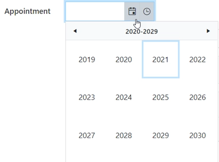
The following settings are available for the start property:
‘month’ - Shows the days of the month.
‘year’ - Shows the months of the year.
‘decade’ - Shows the years of the decade.
‘century’ - Shows the decades from the century.
Disable dates in the calendar
An array or a function that will be used to determine which dates to be disabled for selection by the widget.
// disables certain week days in the calendar
fd.field('Field1').widgetOptions = {
    disableDates: ['we', 'th', 'mon']
};

// disables specific dates
fd.field('Field1').widgetOptions = {
    disableDates: [new Date(2024, 6, 1), new Date(2024, 7, 1)]
};

// disables specific dates and certain week days
fd.field('Field1').widgetOptions = {
    disableDates: date => {
        // dates to disable
        let dates = [
            new Date(2024, 6, 1),
            new Date(2024, 7, 1),
            new Date(2024, 9, 28)
        ];
        if (date) {
            // disable Sunday (0), Saturday (6) and specified dates
            return (
                date.getDay() === 0 ||
                date.getDay() === 6 ||
                dates.map(Number).indexOf(+date) >= 0
            );
        }
    }
};
Date format
Specify the format, which is used to format the value of the Date field:
fd.field('Field1').widgetOptions = {
    format: 'yyyy/MM/dd'
};
For more information on date formats, please refer to Date Formatting.
Calendar date range
Specify the date range that can be selected in the calendar:
let today = new Date();
let minDate = today.setDate(today.getDate() + 2);
let maxDate = today.setDate(today.getDate() + 30);

fd.field('Field1').widgetOptions = {
    min: new Date(minDate),
    max: new Date(maxDate)
};
Tip
You can also set the date range using the Start/End date properties in the field settings.
Week number
Display a week of the year on the left side of the calendar:
fd.field('Field1').widgetOptions = {
    weekNumber: true
};
Time interval
Specify the interval between the time values in the popup list in minutes:
// set the 20 minutes time interval
fd.field('Field1').widgetOptions = {
    interval: 20
};