 Toggle
The Toggle field is used to collect Yes/No, or other boolean types of responses.
Depending on the field’s mode, the field can be displayed as a checkbox, a small toggle or a toggle with text:

This page contains a detailed description of the field properties and JavaScript samples which you can use with this field.
Common Properties
General |
Title |
Control |
|---|---|---|
General
Title
Control
Toggle Properties
Here you can find properties specifically related to the Toggle field.
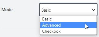
Mode
Defines how the field control is displayed:

Three options are available:
Basic

Advanced. Specify text in the On/Off - text properties.

Checkbox

Label
Add text next to the toggle field.

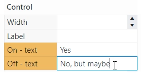
On/Off - text
Text for the Toggle in the On/Off state in Advanced mode:

JavaScript framework
In this section, you can find basic examples of how to work with the field using JavaScript.
For more examples, check out Working with form fields in JavaScript article. If you are not familiar with the JavaScript framework, get started with the JavaScript basics.
Note
The field is only accessible once the form is rendered, so all calls to the field must be inside fd.rendered event:
fd.rendered(() => {
    // make field required
    fd.field('Field1').required = true;
});
Get or set field value
Access and change field value with the following property:
// get field value
let text = fd.field('Field1').value;

// set field value to On:
fd.field('Field1').value = true;
// set field value to Off:
fd.field('Field1').value = false;

// toggle field to the opposite state:
fd.field('Field1').value = !fd.field('Field1').value;
Get or set label
Access and change field’s label with the following property:
// get field label
let label = fd.field('Field1').label;

// set field label
fd.field('Field1').label = 'We agree to terms and conditions';
Handle change event
Execute a function when a field value has been changed:
fd.field('Field1').$on('change', value => {
    // log changes to browser's console
    console.log('New value: ' + value);
});
Make field required
Make a field required or optional:
// make field required
fd.field('Field1').required = true;

// make field not required
fd.field('Field1').required = false;
Disable field
Make a field non-editable. The field value can still be changed with JavaScript and saved:
// disabled field
fd.field('Field1').disabled = true;

// enable field
fd.field('Field1').disabled = false;
Get HTML element
Access HTML element inside the field in order to modify it, hide it, or do something else.
// access field's control
let htmlElement = fd.field('Field1').$el;

// access field's block, which includes title and control
let htmlParentElement = fd.field('Field1').$parent.$el;
Hide field
Hide a field from a user. The field value can still be accessed and changed with JavaScript:
// hide field
fd.field('Field1').hidden = true;

// show field
fd.field('Field1').hidden = false;
Configure widget
You can access the widget used by the field. The widget is based on Kendo UI Switch.
// get the widget
fd.field('Field1').widget;

// change the widget's configuration
fd.field('Field1').widget.setOptions({
    width: 140
});