Common field properties
This article covers common field properties, shows their location in web editor’s UI, and provides examples of how to use them in custom JavaScript.
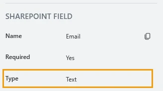
SharePoint field
These read-only properties are only available for fields from the connected SharePoint list.
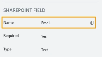
Name
The internal name of the SharePoint column.
JavaScript
Use this property to reference fields in custom JavaScript:
fd.rendered(() => {
   // access the field using its Name:
   fd.field('Title').value = 'Project Delta';
});
Important
The Internal name can’t be changed. You can only change the display name of the column.
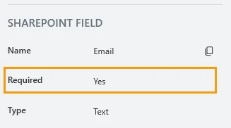
Required
Indicates whether the field is required.
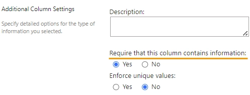
You can change this property in the SharePoint column settings:
Or using the JavaScript:
// returns the field's required status as true/false
fd.field('Text1').required;

// sets the field's required status
fd.field('Text1').required = true;
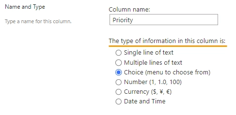
Type
Indicates the column type.
You can change the column type in the SharePoint column settings:
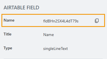
Airtable field
These read-only properties are only available for fields from the connected Airtable table.
Name
The internal name of the Airtable field. This field is read-only and can’t be changed.
JavaScript
Use this property to reference fields in custom JavaScript:
fd.rendered(() => {
   // set the field's title using its name
   fd.field('FieldName').title = 'Last Name';
});
Title
Field title provided by Airtable. To change it, modify the corresponding column name in Airtable.
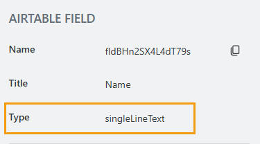
Type
Field type provided by Airtable. This property is read-only and can’t be changed.
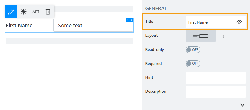
General
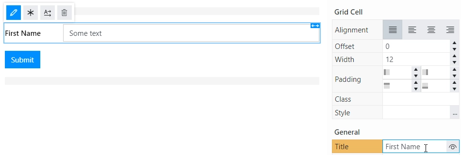
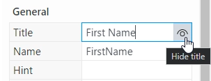
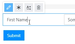
Title
Specify text of the title that will appear next to the field.
Toggle Title’s visibility on/off:
Title can be changed directly on the form after a double click:
JavaScript
Use this code to get or set the field’s title dynamically:
// returns the field's title as a string
fd.field('Text1').title;

// sets the field's title
fd.field('Text1').title = 'Last Name';
Name
Note
This property is only available for regular fields. See the read-only equivalent:
A unique identifier for the field.
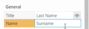
With Name, you can:
Identify the field in form submissions
Read the field’s value in Power Automate, Zapier, or Make automated workflows
Select the field in custom JavaScript
fd.rendered(() => {
    // Surname is the field's Name property:
    fd.field('Surname').value = 'John Doe';
});
Important
Do not change field’s Name after the form has been in use, or you might lose saved data or break your automation.
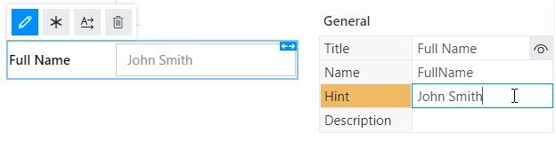
Hint
Note
This property is only available for Single-line Text, Multi-line Text, Number, Drop Down, Date and Time, and Date fields.
Defines a placeholder text that appears in the input box before a user starts typing:
JavaScript
Use this code to get or set the field’s placeholder text dynamically:
// sets the field's Hint
fd.field('FieldName').placeholder = 'Enter your name';
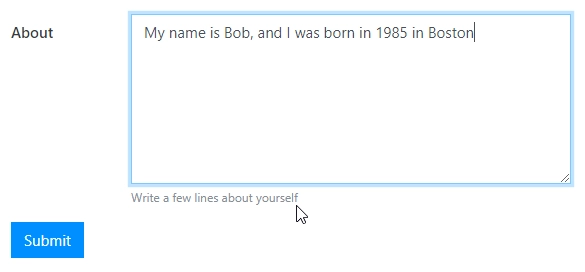
Description
Add a description to the field.
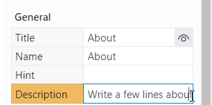
It appears as small text right under the field.
JavaScript
Use this code to get or set the field’s description dynamically:
// returns the field's description as a string
fd.field('Text1').description;

// sets the field's description
fd.field('Text1').description = 'New description';
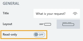
Read-only
Note
This property is only available for SharePoint and Airtable fields.
Define whether a user can view or edit the contents of the field:
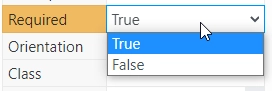
Required
Note
This property is only available for regular and Airtable fields. See the read-only equivalent for SharePoint fields
Define if a user needs to fill this field to submit a form.
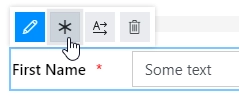
Required status can also be changed directly on the form via the Asterisk button:
JavaScript
Use this code to get and set field’s required status
// returns the field's required status as true/false
fd.field('Text1').required;

// sets the field's required status
fd.field('Text1').required = true;
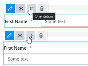
Layout
Select if the title appears to the left of the field, or right above it.
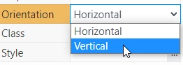
Layout can also be changed directly in the context menu of the selected field:
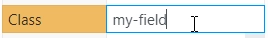
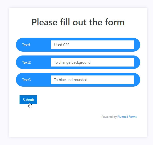
Class
Add a CSS class to the field, which comes in handy with CSS or even JavaScript code. This will work like class attribute for an HTML tag.
You can add the same class to multiple fields, and use a single CSS rule to modify their appearance.
For example, add the following code in the CSS editor to give fields with my-class a blue background, white text,
rounded corners, and a little bit of padding:
.my-class {
    color: #FFFFFF;
    padding: 10px;
    background-color: #1E90FF;
    border-radius: 30px;
}
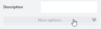
To access this property, click the “More options” bar at the bottom of General category.
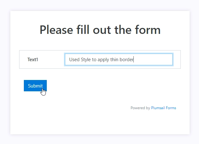
Style
Add custom CSS style to the field. This works like style attribute for an HTML tag.
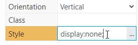
For example, make the field invisible to users, while keeping it usable in JavaScript:
display: none;
As another example, add a thin gray border around the field:
padding: 10px;
border: 1px solid #CED4DA;
To access this property, click the “More options” bar at the bottom of General category.
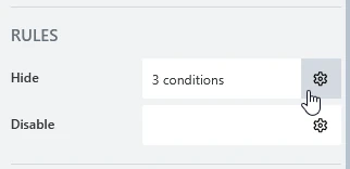
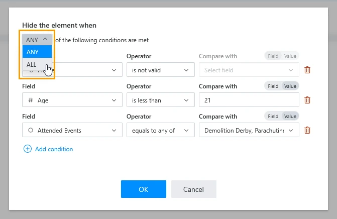
Rules
Add a set of conditions to hide or disable the form element based on form state. Click the gear icon inside the respective property to manage them:
Each condition consists of a field to check, the check to perform, and optionally another field or value to check against. These conditions fall under the following categories:
Checking whether a field is valid or empty
Comparing a field value with another field or a fixed value
Checking whether a field value matches any of the given values
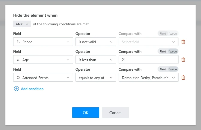
Select whether ANY or ALL conditions should be met to hide or disable the form element:
For more complex conditional logic, use the custom JavaScript framework.
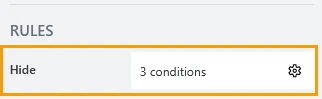
Hide
Define one or more conditions to hide this form element based on form state. To manage these no-code conditions, click the gear icon.
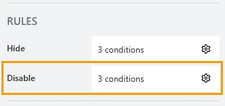
Disable
Define one or more conditions to disable this form element based on form state. To manage these no-code conditions, click the gear icon.
Title
These properties allow you to customize appearance of the field’s title.
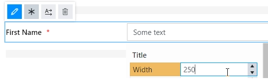
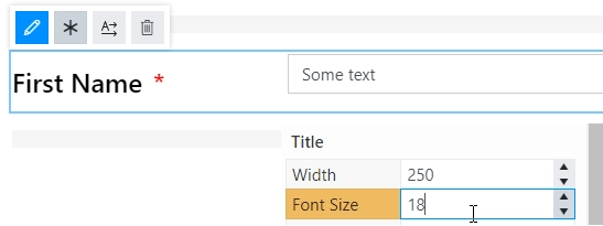
Width
Specify in pixels how much space should the field’s title take.
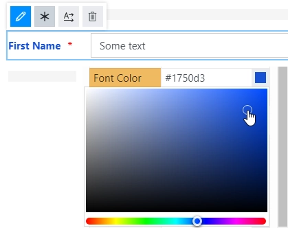
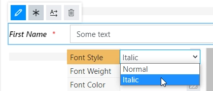
Font
Change the formatting of the field’s title using these settings:
font size:
font color. Use the color picker or enter the hex color code:
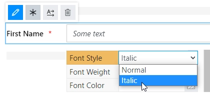
font style: normal, bold, or italic:
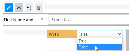
Wrap
Select if the title’s text should wrap in multiple lines when there is not enough space, or just be shortened until it fits (with dots… at the end).
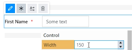
Control
These properties allow you to customize appearance of the field’s main area.
Width
Specify in pixels how much space should the field’s input box take.
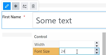
Font
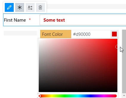
Change the formatting of the field’s input box using these settings:
font size:
font color. Use the color picker or enter the hex color code:
font style: normal, bold, or italic: