 Masked Input
The Masked Input field allows to restrict what the user can input. User simply won’t be able to enter anything that doesn’t match the mask.
This page contains a detailed description of the field properties and JavaScript samples which you can use with this field.

Common Properties
General |
Title |
Control |
|---|---|---|
General
Title
Control
Masked Input Properties
Here you can find properties specifically related to the Masked Input field.
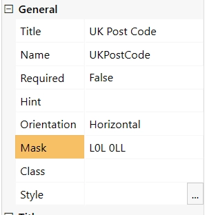
Mask
Specifies the input mask. The following mask rules are supported:
0 - Digit. Accepts any digit between 0 and 9.
9 - Digit or space. Accepts any digit between 0 and 9, plus space.
# - Digit or space. Like 9 rule, but allows also (+) and (-) signs.
L - Letter. Restricts input to letters a-z and A-Z. This rule is equivalent to [a-zA-Z] in regular expressions.
? - Letter or space. Restricts input to letters a-z and A-Z. This rule is equivalent to [a-zA-Z] in regular expressions.
& - Character. Accepts any character. The rule is equivalent to S in regular expressions.
C - Character or space. Accepts any character. The rule is equivalent to . in regular expressions.
A - Alphanumeric. Accepts letters and digits only.
a - Alphanumeric or space. Accepts letters, digits and space only.
. - Decimal placeholder. The decimal separator will be gotten from the current culture.
, - Thousands placeholder. The display character will be gotten from the current culture.
$ - Currency symbol. The display character will be gotten from the current culture.

For more information and examples, check out Kendo MaskedTextBox rules.
JavaScript framework
In this section, you can find basic examples of how to work with the field using JavaScript.
For more examples, check out Working with form fields in JavaScript article. If you are not familiar with the JavaScript framework, get started with the JavaScript basics.
Note
The field is only accessible once the form is rendered, so all calls to the field must be inside fd.spRendered event:
fd.spRendered(() => {
    // make field required
    fd.field('Field1').required = true;
});
Get or set field value
Access and change field value with the following property:
// get field value
let text = fd.field('Field1').value;

// set field value to something, ignores the mask
fd.field('Field1').value = 'L2H 3J3';
Handle change event
Execute a function when a field value has been changed:
fd.field('Field1').$on('change', value => {
    // log changes to browser's console
    console.log('New value: ' + value);
});
Make field required
Make a field required or optional:
// make field required
fd.field('Field1').required = true;

// make field not required
fd.field('Field1').required = false;
Disable field
Make a field non-editable. The field value can still be changed with JavaScript and saved:
// disabled field
fd.field('Field1').disabled = true;

// enable field
fd.field('Field1').disabled = false;
Get HTML element
Access HTML element inside the field in order to modify it, hide it, or do something else.
// access field's control
let htmlElement = fd.field('Field1').$el;

// access field's block, which includes title and control
let htmlParentElement = fd.field('Field1').$parent.$el;
Hide field
Hide a field from a user. The field value can still be accessed and changed with JavaScript:
// hide field
fd.field('Field1').hidden = true;

// show field
fd.field('Field1').hidden = false;
Configure widget
You can access the widget used by the field. The widget is based on Kendo UI MaskedTextBox.
// get the widget
fd.field('Field1').widget;

// change the widget's configuration
fd.field('Field1').widget.setOptions({
    promptChar: '*'
});
Get or set field mask
Access and change field Mask with the following property:
// get current field Mask
let text = fd.field('Field1').mask;

// set field value to something
fd.field('Field1').mask = "AAA AAA"