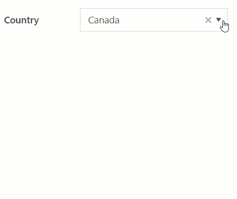
 Drop Down
Allows users to choose from a predefined list of options. Use the Drop Down field when you want a user to select from a large list of options without cluttering your form.
This page contains a detailed description of the field properties and JavaScript samples which you can use with this field.
Common Properties
Drop Down Properties
Here you can find properties specifically related to the Drop Down field.
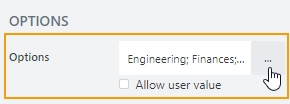
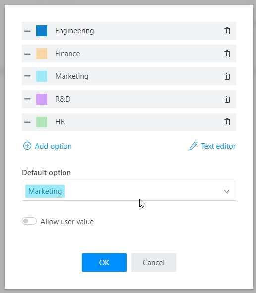
Options
Stores a list of options:
Allows to customize each option’s color and specify the default option:
Selection
Defines whether a user is allowed to select a single option or multiple options from the drop-down list:
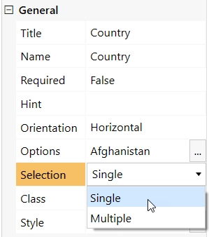
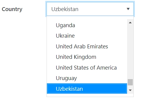
Single Selection allows a user to select only one option from the drop-down list:
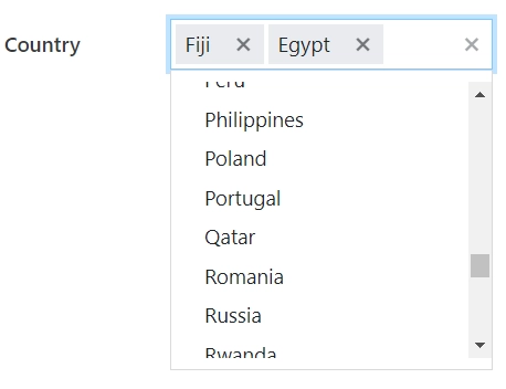
Multiple Selection allows a user to select multiple options from a drop-down list:
Note
In single selection mode, the value is stored as a string.
In multiple selection mode, the value is stored as an array of strings.
JavaScript framework
In this section, you can find basic examples of how to work with the field using JavaScript.
For more examples, check out Working with form fields in JavaScript article. If you are not familiar with the JavaScript framework, get started with the JavaScript basics.
Note
The field is only accessible once the form is rendered, so all calls to the field must be inside fd.spRendered event:
fd.spRendered(() => {
    // make field required
    fd.field('Field1').required = true;
});
Get or set field value
Get or set the field value in a single selection mode:
// get field value as a string
fd.field('Field1').value;

// set field value
fd.field('Field1').value = 'Item 1';
Get or set the field value in a multiple selection mode:
// get field value as an array of string
fd.field('Field1').value;

// set field value
fd.field('Field1').value = ['Item 1', 'Item 2'];
Handle change event
Execute a function when a field value has been changed:
fd.field('Field1').$on('change', value => {
    // log changes to browser's console
    console.log('New value: ' + value);
});
Make field required
Make a field required or optional:
// make field required
fd.field('Field1').required = true;

// make field not required
fd.field('Field1').required = false;
Disable field
Make a field non-editable. The field value can still be changed with JavaScript and saved:
// disabled field
fd.field('Field1').disabled = true;

// enable field
fd.field('Field1').disabled = false;
Get HTML element
Access HTML element inside the field in order to modify it, hide it, or do something else.
// access field's control
let htmlElement = fd.field('Field1').$el;

// access field's block, which includes title and control
let htmlParentElement = fd.field('Field1').$parent.$el;
Hide field
Hide a field from a user. The field value can still be accessed and changed with JavaScript:
// hide field
fd.field('Field1').hidden = true;

// show field
fd.field('Field1').hidden = false;
Configure widget
You can access the widget used by the field. The widget is based on Kendo UI DropDownList in regular mode, with allow user value option enabled it is based on Kendo UI ComboBox, and in multiple selection mode it is based on Kendo UI MultiSelect.
// get the widget
fd.field('Field1').widget;

// change the widget's configuration
fd.field('Field1').widgetOptions = {
    template: '<span style="font-weight: bold">#: data #</span>'
};
widgetOptions is the same as widget.setOptions({}) but can be defined before widget initialization.
Allow custom values
Check whether a user is allowed to enter a custom value that is not included in the list of options.
// returns true or false
fd.field('Field1').allowUserValue;
Change field options
Change the Drop Down field options:
fd.field('Field1').widget.setDataSource(['New option A', 'New option B', 'New option C']);
Get or set option colors
If you want to change option colors without changing the options, use the following, just replace Your option with actual value:
// get option colors
fd.field('Field1').optionsColors['Your option'].backgroundColor;
fd.field('Field1').optionsColors['Your option'].textColor;

// set option colors:
fd.field('Field1').setOptionColors('Your option', {
    textColor: '#ffffff',
    backgroundColor: '#ebb65e'
});
Limit number of selectable options
For multiple selection mode, you can limit the number of selectable options with field validation:
// prevent user from selecting more than 3 options
fd.field('Field1').addValidator({
    name: 'Field1 options validation',
    error: 'No more than 3 options',
    validate: value => {
        if (value.length > 3) {
            return false;
        }
        return true;
    }
});