 Currency
Allows a user to enter a numeric value formatted as a currency.
This page contains a detailed description of the field properties and JavaScript samples which you can use with this field.

Common Properties
General |
Title |
Control |
|---|---|---|
General
Title
Control
Currency Properties
Here you can find properties specifically related to the Currency field.
Min/Max
Specify the minimum and maximum values that a user can enter:
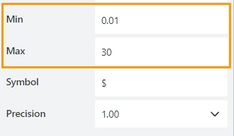
When a user enters a value outside the range, the value changes to the nearest valid value:

Symbol
Specify the symbol to be displayed next to the number:
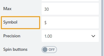
The Symbol property overwrites the SharePoint site’s Regional Settings.
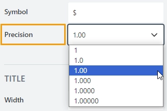
Precision
Specify the number of digits to the right of the decimal point a user can enter. By default, the number has two decimal points.
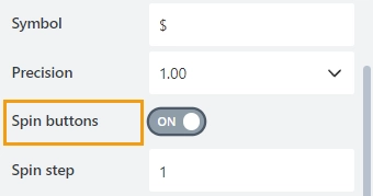
Spin step
Specify the interval for adjusting the current value when using the spin buttons:
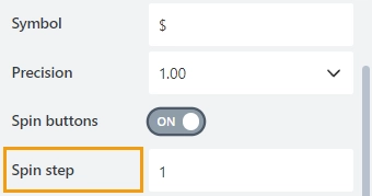
You can enter either an integer or a decimal number.
JavaScript framework
In this section, you can find basic examples of how to work with the field using JavaScript.
For more examples, check out Working with form fields in JavaScript article. If you are not familiar with the JavaScript framework, get started with the JavaScript basics.
Note
The field is only accessible once the form is rendered, so all calls to the field must be inside fd.spRendered event:
fd.spRendered(() => {
    // make field required
    fd.field('Field1').required = true;
});
Get or set field value
Get or set the Number field value:
// get field value
fd.field('Field1').value;

// set field value
fd.field('Field1').value = 152;
Handle change event
Execute a function when a field value has been changed:
fd.field('Field1').$on('change', value => {
    // log changes to browser's console
    console.log('New value: ' + value);
});
Make field required
Make a field required or optional:
// make field required
fd.field('Field1').required = true;

// make field not required
fd.field('Field1').required = false;
Disable field
Make a field non-editable. The field value can still be changed with JavaScript and saved:
// disabled field
fd.field('Field1').disabled = true;

// enable field
fd.field('Field1').disabled = false;
Get HTML element
Access HTML element inside the field in order to modify it, hide it, or do something else.
// access field's control
let htmlElement = fd.field('Field1').$el;

// access field's block, which includes title and control
let htmlParentElement = fd.field('Field1').$parent.$el;
Hide field
Hide a field from a user. The field value can still be accessed and changed with JavaScript:
// hide field
fd.field('Field1').hidden = true;

// show field
fd.field('Field1').hidden = false;
Configure widget
You can access the widget used by the field. The widget is based on Kendo UI NumericTextBox.
// get the widget
fd.field('Field1').widget

// change the widget's configuration
fd.field('Field1').widgetOptions = {
    spinners: false
}
widgetOptions is the same as widget.setOptions({}) but can be defined before widget initialization.
Number of decimal places
Specify the number of decimal places to which the number will be rounded:
fd.field('Field1').widgetOptions = {
    decimals: 3
}
Displayed number format
Specify the number format that is applied when a user leaves the control.
The number format is made up of format specifier and the number of decimals places. E.g. n3, c2.
Available format specifiers:
‘n’ — Renders a number.
‘c’ — Renders a currency value.
‘p’ — Renders a percentage (number is multiplied by 100).
‘e’ - Renders exponential values.
fd.field('Field1').widgetOptions = {
    format: 'n2'
}
Learn more about the available number formats in the Kendo UI documentation.
Limit the range of number
Specify the minimum and maximum values that a user can enter:
fd.field('Field1').widgetOptions = {
    min: 5,
    max: 99
}
Restrict decimals
Specify whether the decimals length should be restricted during typing. The number of decimal places is defined by the decimals property value.
fd.field('Field1').widgetOptions = {
    decimals: 3,
    restrictDecimals: true
}
Rounded
Specify whether the value should be rounded or truncated. The default property value is true.
fd.field('Field1').widgetOptions = {
    round: false
}
Step
Specify the interval for adjusting the current value when using up and down arrows. The default property value is 1.
fd.field('Field1').widgetOptions = {
    step: 0.01
}
