Charts in XLSX templates
With the XLSX templating engine, you can generate charts from dynamic data.
This article shows how to create several chart types using template tables and JSON data, including:
In each example, the chart is created in the template and automatically populated with dynamic data during document generation.
Pie charts
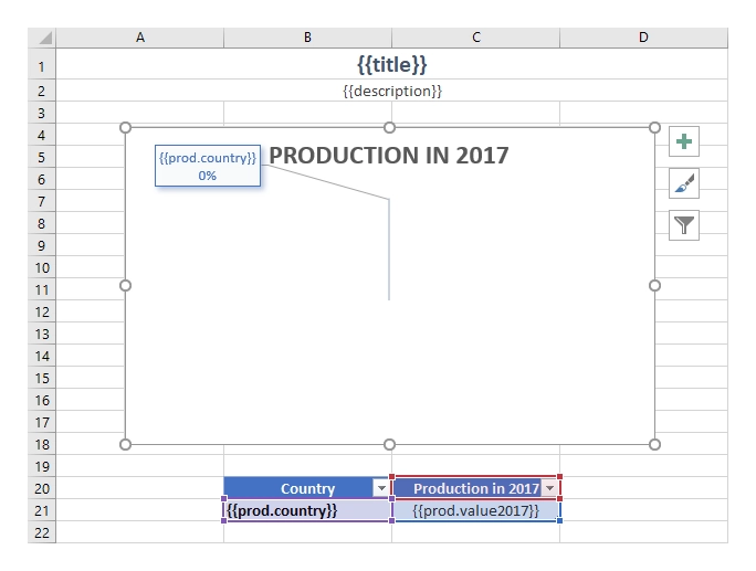
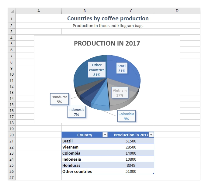
In this example, we will create a pie chart showing coffee production by country.
The source data contains a collection of countries and their annual production values. We will display production for 2017 in a table and use that table as the chart data source.
The resulting document looks like this:

You can download both the source template and generated document from the pie and clustered column charts demo.
JSON representation of the object:
[
    {
        "title": "Countries by coffee production",
        "description": "Production in thousand kilogram bags",
        "prod": [
            {
                "country": "Brazil",
                "value2015": 37600,
                "value2016": 43200,
                "value2017": 51500
            },
            {
                "country": "Vietnam",
                "value2015": 22000,
                "value2016": 27500,
                "value2017": 28500
            },
            {
                "country": "Colombia",
                "value2015": 11300,
                "value2016": 13500,
                "value2017": 14000
            },
            {
                "country": "Indonesia",
                "value2015": 14000,
                "value2016": 11000,
                "value2017": 10800
            },
            {
                "country": "Honduras",
                "value2015": 7500,
                "value2016": 5800,
                "value2017": 8349
            },
            {
                "country": "Other countries",
                "value2015": 37358,
                "value2016": 44229,
                "value2017": 51000
            }
        ]
    }
]
Create a table that displays the country name and 2017 production value using:
{{prod.country}}{{prod.value2017}}
Add {{title}} and {{description}} to display the chart title and description from the source data.
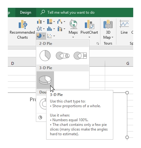
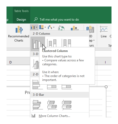
Once the table is ready, insert a 3D pie chart from the Insert tab.
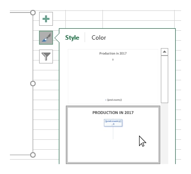
Optionally, apply a chart style:
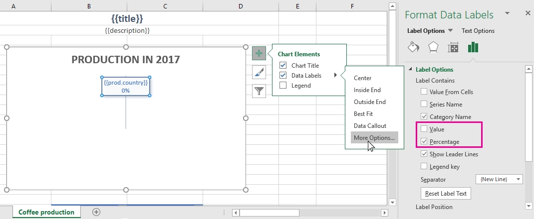
Or configure from Data Label to display Percentages instead of raw values:
When the document is generated, the table is populated automatically and the chart updates with the generated data.
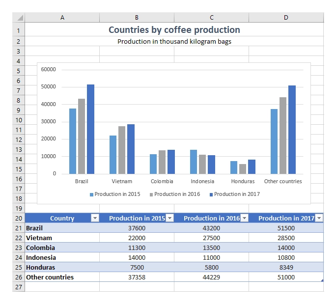
Clustered column charts
This example uses the same data source as the pie charts example above but displays production across multiple years. Instead of showing a single value per country, the chart compares production in 2015, 2016, and 2017.
The resulting document looks like this:

You can download both the source template and generated document from the pie and clustered column charts demo.
JSON representation of the object:
[
    {
        "title": "Countries by coffee production",
        "description": "Production in thousand kilogram bags",
        "prod": [
            {
                "country": "Brazil",
                "value2015": 37600,
                "value2016": 43200,
                "value2017": 51500
            },
            {
                "country": "Vietnam",
                "value2015": 22000,
                "value2016": 27500,
                "value2017": 28500
            },
            {
                "country": "Colombia",
                "value2015": 11300,
                "value2016": 13500,
                "value2017": 14000
            },
            {
                "country": "Indonesia",
                "value2015": 14000,
                "value2016": 11000,
                "value2017": 10800
            },
            {
                "country": "Honduras",
                "value2015": 7500,
                "value2016": 5800,
                "value2017": 8349
            },
            {
                "country": "Other countries",
                "value2015": 37358,
                "value2016": 44229,
                "value2017": 51000,
            }
        ]
    }
]
Create a table containing:
{{prod.country}}{{prod.value2015}}{{prod.value2016}}{{prod.value2017}}
Add {{title}} and {{description}} to display information from the source data.
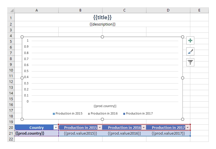
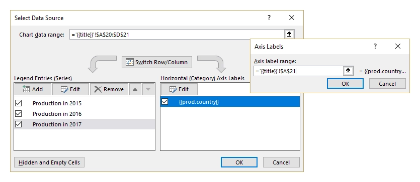
Use the Insert tab to add a clustered column chart and configure it to use all three production columns as separate series.
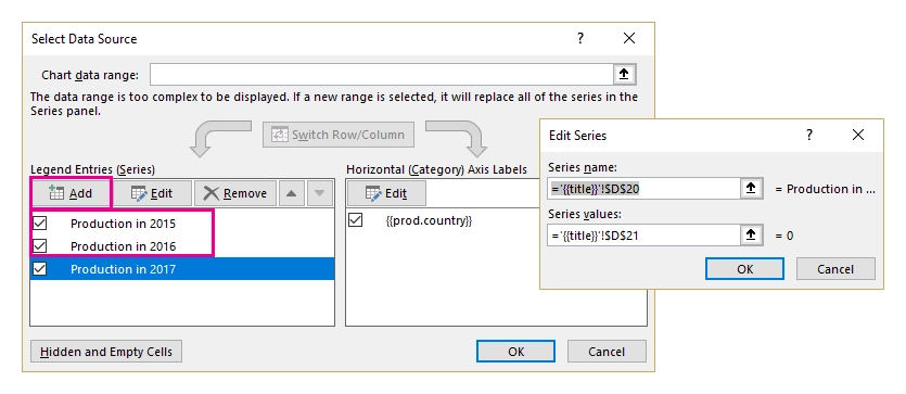
Now edit the chart data that will be visible in the chart. Select the chart, click the Filter icon, and then click the Select data link. Add entries for production in 2015 and 2016, using the Production in 2017 entry as a reference:
Then edit the horizontal axis labels so they display only the text from the first column:
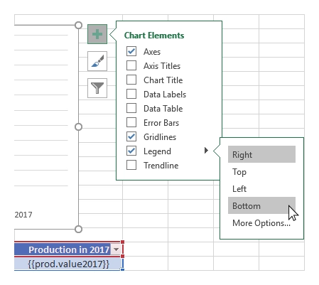
The template is now ready. You can still change the colors and add a legend under the chart:
When the document is generated, the templating engine creates rows automatically and builds the chart from the generated data:
Charts on multiple worksheets
In the examples above, we created a single chart from a single array. In this section, we show how to create charts on multiple worksheets in one file.
You can download the source document and the result document for this example charts on multiple worksheets demo.
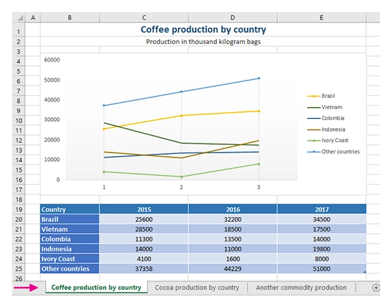
Let us take an object containing coffee, cocoa, and another commodity. Each item contains yearly production values per country, along with general metadata. We want to display each product in a line chart on a separate worksheet.
The resulting document looks like this:
JSON representation of the object:
[
    {
        "title": "Coffee production by country",
        "description": "Production in thousand kilogram bags",
        "prod": [
            {
                "Brazil": {
                    "value1": 25600,
                    "value2": 32200,
                    "value3": 34500
                },
                "Vietnam": {
                    "value1": 28500,
                    "value2": 18500,
                    "value3": 17500
                },
                "Colombia": {
                    "value1": 11300,
                    "value2": 13500,
                    "value3": 14000
                },
                "Indonesia": {
                    "value1": 14000,
                    "value2": 11000,
                    "value3": 19800
                },
                "IvoryCoast": {
                    "value1": 4100,
                    "value2": 1600,
                    "value3": 8000
                },
                "OtherCountries": {
                    "value1": 37358,
                    "value2": 44229,
                    "value3": 51000
                }
            }
        ]
    },
    {
        "title": "Cocoa production by country",
        "description": "Production in 1000 tonnes",
        "prod": [
            {
                "Brazil": {
                    "value1": 256,
                    "value2": 140,
                    "value3": 180
                },
                "Vietnam": {
                    "value1": 34,
                    "value2": 12,
                    "value3": 6
                },
                "Colombia": {
                    "value1": 0,
                    "value2": 0,
                    "value3": 0
                },
                "Indonesia": {
                    "value1": 777,
                    "value2": 600,
                    "value3": 500
                },
                "IvoryCoast": {
                    "value1": 1345,
                    "value2": 1200,
                    "value3": 1448
                },
                "OtherCountries": {
                    "value1": 1834,
                    "value2": 1789,
                    "value3": 1085
                }
            }
        ]
    },
    {
        "title": "Another commodity production",
        "description": "Production in some units",
        "prod": [
            {
                "Brazil": {
                    "value1": 106,
                    "value2": 158,
                    "value3": 80
                },
                "Vietnam": {
                    "value1": 34,
                    "value2": 56,
                    "value3": 10
                },
                "Colombia": {
                    "value1": 33,
                    "value2": 48,
                    "value3": 65
                },
                "Indonesia": {
                    "value1": 98,
                    "value2": 105,
                    "value3": 80
                },
                "IvoryCoast": {
                    "value1": 23,
                    "value2": 30,
                    "value3": 41
                },
                "OtherCountries": {
                    "value1": 151,
                    "value2": 184,
                    "value3": 216
                }
            }
        ]
    }
]
Now take a look at the source template:
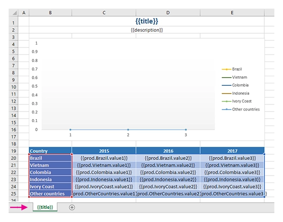
Just type the {{title}} tag into the tab name field. The templating engine uses it to render a separate sheet for each table of data and a chart based on it.
The same {{title}} tag is also used at the top of the sheet, where it appears as a bold Excel cell with a larger font size.
We created a table containing information about the yearly production of a product by country.
In our template, we can refer to properties inside simple objects and collections, as well as properties in nested structures. To select properties inside the array, use dot notation:
{{prod.Brazil.value1}},{{prod.Colombia.value2}},{{prod.Indonesia.value3}}.
These tags tell the engine which country values to render, so it automatically creates a separate table for each product and displays each table on a separate sheet.
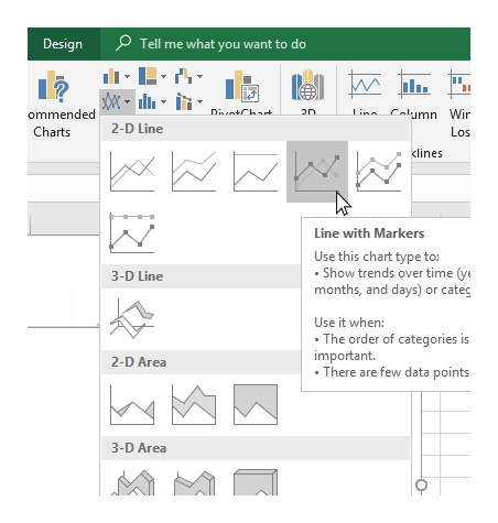
Now select the template table, navigate to the Insert tab in the top ribbon, and choose a line chart:
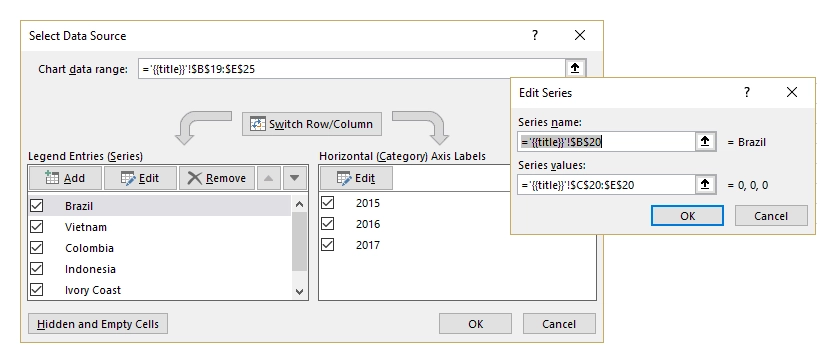
We need to edit the data that will be visible in our chart. To do that, select the chart, click the Filter icon, and then click the Select data link:
At this point, the template is ready. You can change the colors and add a legend to the right side of the chart.
Our result file includes the automatically-created tables and charts on separate worksheets: