Charts in PPTX templates
With help of the templating engine, you can create different types of charts based on differently structured data.
Charts in PowerPoint are spreadsheet files that are embedded within the zip. During analysis our engine will drill down into embedded XLSX file for tags.
Let us check a few examples.
Pie charts
In this section, we will see how to build a pie chart in a MS PowerPoint presentation. The chart will be based on the data from a JSON object rendered in an embedded XLSX table.
Let us take an object containing statistics of coffee production by country. We want to build a simple pie chart with percentage value for each country.
You can download the source and result files for this example in the pie charts demo. Description of the example is below.
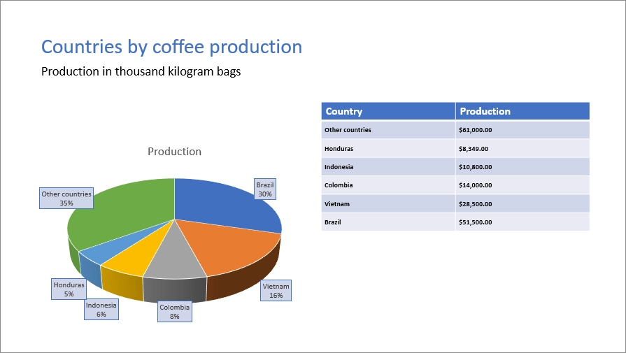
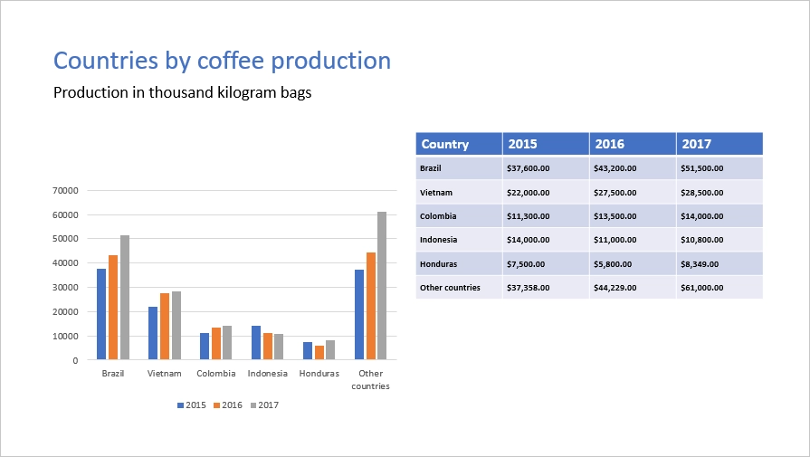
This is how our result file will look like:
JSON representation of the object:
[
    {
        "title": "Countries by coffee production",
        "description": "Production in thousand kilogram bags",
        "prod": [
            {
                "country": "Brazil",
                "value2017": 51500
            },
            {
                "country": "Vietnam",
                "value2017": 28500
            },
            {
                "country": "Colombia",
                "value2017": 14000
            },
            {
                "country": "Indonesia",
                "value2017": 10800
            },
            {
                "country": "Honduras",
                "value2017": 8349
            },
            {
                "country": "Other countries",
                "value2017": 61000
            }
        ]
    }
]
Now, let us take a look at the source template:
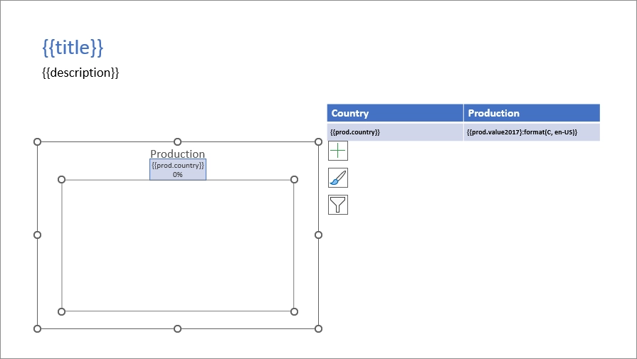
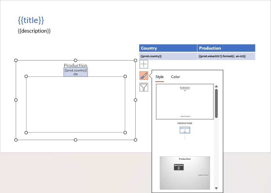
We add {{title}} and {{description}} tags to the top of the slide to let the engine know that we want to render the corresponding properties.
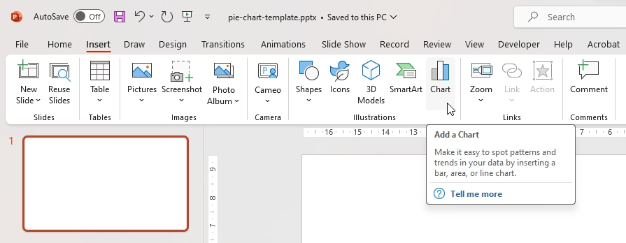
To create a chart in MS PowerPoint we navigate to the Insert tab on the top ribbon, click Chart, choose a type for our chart and click OK:
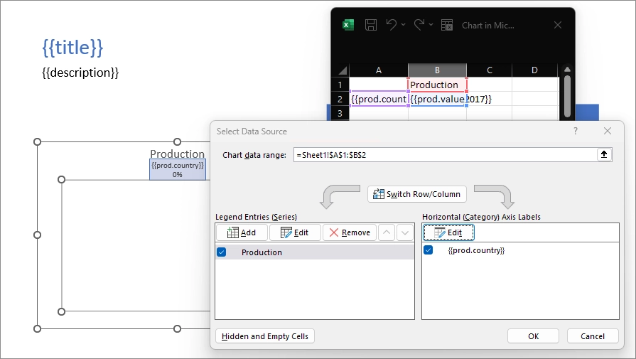
We have to let the engine know what data needs to be rendered.
We select the chart, click the Filter icon and click Select data link.
Then we edit the embedded spreadsheet file adding {{prod.country}} and {{prod.value2017}} tags to refer the properties inside our JSON objects and series and labels settings in the Select Data Source dialog box:
Basically, the template for the chart is ready. We just want to change the design a bit and add percentage values to the data labels. We apply one of the default styles:
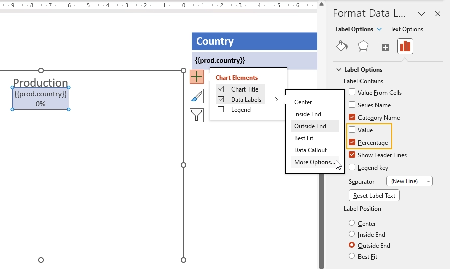
Then, we open Data Label settings, check the Percentage checkbox and uncheck the Value one:
We also added a simple table beside the chart. You may find instructions how to work with the tables in the tables section of the documentation.
Let us have a look at the result of rendering another time. The templating engine automatically created rows with production data in the embedded spreadsheet and built a chart based on it:
Clustered column charts
In this section, we will create a table with countries coffee production by years and build a clustered column chart.
Let us have a look at an example. You can download the source and result files for this example in clustered column charts demo.
This is how our result file will look like:
JSON representation of the object:
[
    {
        "title": "Countries by coffee production",
        "description": "Production in thousand kilogram bags",
        "prod": [
            {
                "country": "Brazil",
                "value2015": 37600,
                "value2016": 43200,
                "value2017": 51500
            },
            {
                "country": "Vietnam",
                "value2015": 22000,
                "value2016": 27500,
                "value2017": 28500
            },
            {
                "country": "Colombia",
                "value2015": 11300,
                "value2016": 13500,
                "value2017": 14000
            },
            {
                "country": "Indonesia",
                "value2015": 14000,
                "value2016": 11000,
                "value2017": 10800
            },
            {
                "country": "Honduras",
                "value2015": 7500,
                "value2016": 5800,
                "value2017": 8349
            },
            {
                "country": "Other countries",
                "value2015": 37358,
                "value2016": 44229,
                "value2017": 61000
            }
        ]
    }
]
Now, let us take a look at the source template:
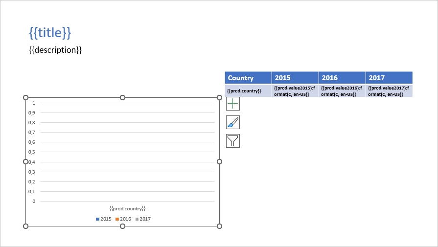
We add {{title}} and {{description}} tags to the top of the slide to let the engine know that we want to render the corresponding properties.
To create the chart we navigate to the Insert tab in the top ribbon, click Chart and choose a clustered column chart.
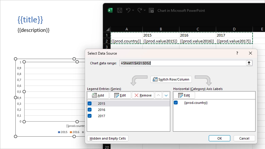
We add {{prod.country}} and {{prod.value2015}}, {{prod.value2016}}, {{prod.value2017}} tags to the embedded spreadsheet file to refer the properties inside our objects.
The templating engine will iterate through all objects in the array to render them and add the rows automatically.
Series and labels settings in the Select Data Source dialog box are set automatically and look like this:
If required, we change the colors and the template is ready.
Let us have a look at the result of rendering another time. The templating engine automatically created rows with production data in the embedded spreadsheet and built a chart based on it: