Reports
The Reports feature provides visibility into team efficiency and performance. You can generate charts and graphics using data from your tickets, requesters, and agents.
This feature helps you:
Measure the efficiency of your HelpDesk usage.
Check the personal productivity of each agent.
Identify your most active requesters.
By analyzing these data points and more, you can make informed, data-driven decisions to improve your support workflow.
Get started
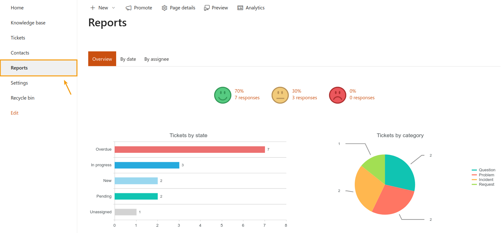
Navigate to Reports using the left navigation bar.
On almost every page (except Overview), you can quickly adjust the displayed data using the date filters.
See tickets from the last 7 days, 30 days, 6 months, or the entire year with a single click.

Moreover, you can use the Dashboard Designer to modify them based on your specific needs. Learn more on how to customize reports.
Note
Dashboard Designer is another separate product by Plumsail with its own pricing.
Overview
The Overview tab is your central dashboard—it’s designed to give you an immediate look at your HelpDesk status.
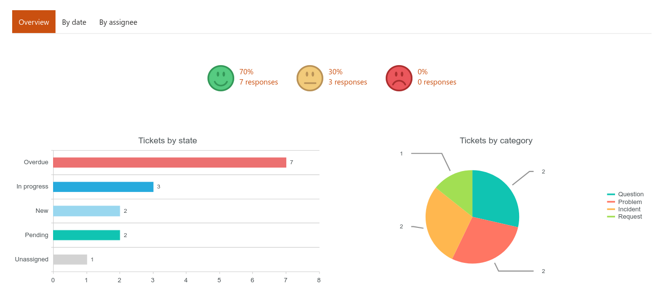
Customer satisfaction surveys
This section shows your overall customer satisfaction score.

For more information, just click on any of the rating options (happy, neutral, sad) to see which tickets received that rating, read the specific comments left by the user, and more.
Charts
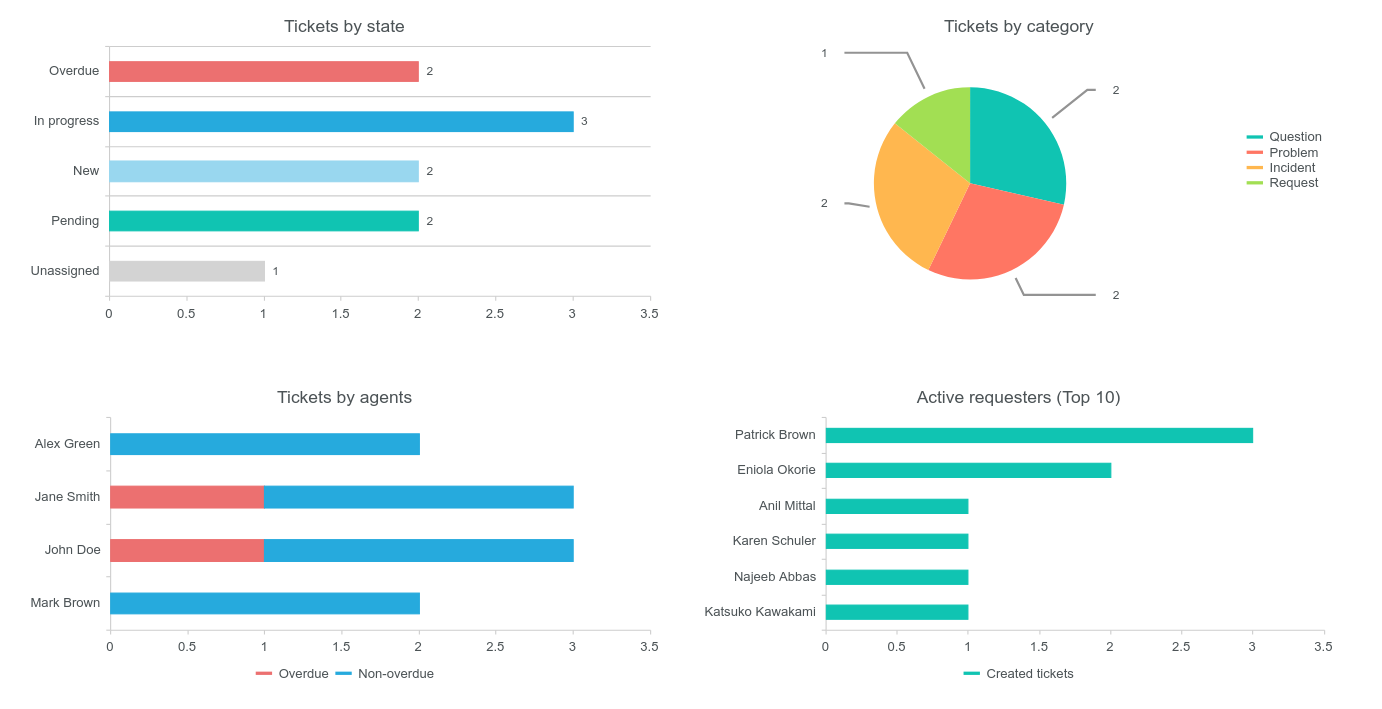
This dashboard features four key charts that help you get a pulse on the current situation:
Tickets by state: A count of unassigned, overdue, in progress, pending, and newly created tickets.
Tickets by category: How many tickets fall into each specific category.
Tickets by agents: The count of overdue and non-overdue tickets currently assigned to each agent.
Active requesters (Top 10): Users who have created the most tickets.
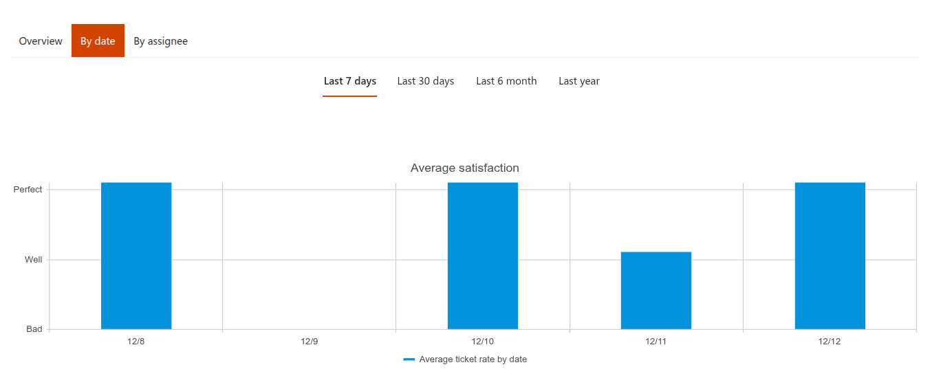
Track ticket activity by date
Visualize progress and workload over a specific period of time.
You’ll see two helpful timelines where the vertical axis represents the number of tickets and the horizontal axis tracks the date of creation.
Average satisfaction
Shows how your support team’s work was rated, day by day. This helps you correlate satisfaction dips with high-volume days.
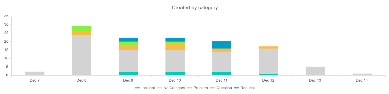
Created by category
Shows the amount of tickets created over time, broken down by category.
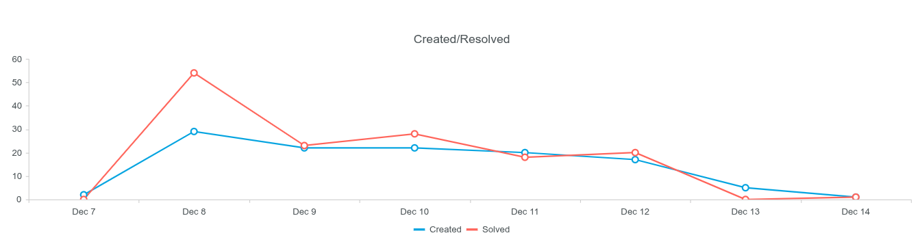
Created/Resolved
This comparison shows the total tickets created versus the total tickets successfully resolved within the chosen interval.
Analyze performance by assignee
These charts provide important metrics related to your agents to check in on individual performance.
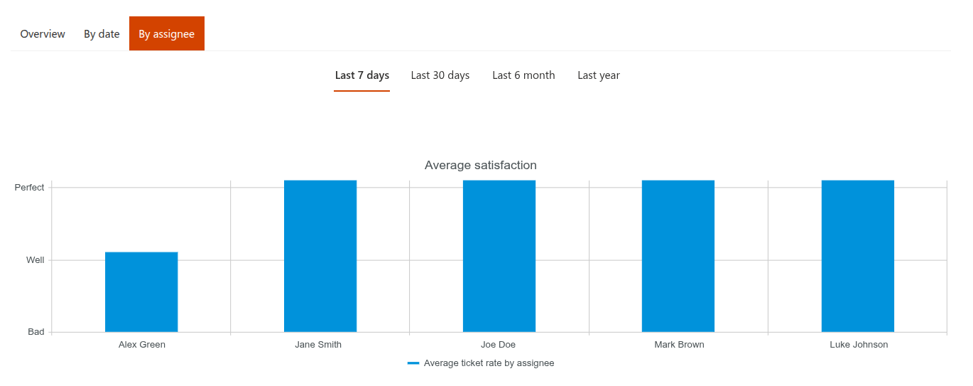
Average satisfaction
This combines the average satisfaction rating for the agent and the total number of users who provided a vote for their service.
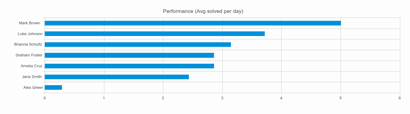
Performance (Avg solved per day)
A metric that shows the average number of tickets each agent resolves per day within the specified timeframe.
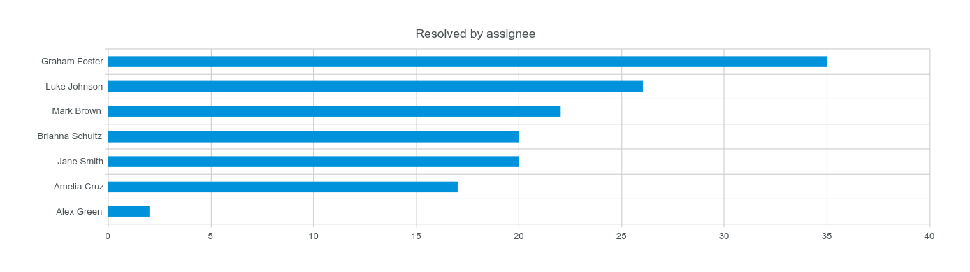
Resolved by assignee
A straightforward count of the total number of tickets resolved by each agent during the interval.
Custom reports in Power BI
The built-in reports cover the most common metrics for tickets, agents, and requesters. If you need more flexible analytics, you can connect the HelpDesk SharePoint lists to Power BI and build your own reports.
This lets you analyze tickets by additional dimensions, such as product, root cause, customer segment, custom categories, or any other fields added to the Tickets list.
See Analyze HelpDesk tickets in Power BI for a step-by-step example.