 Accordion
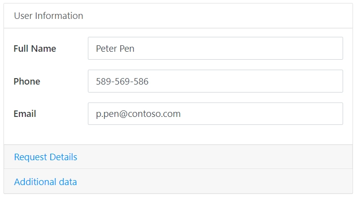
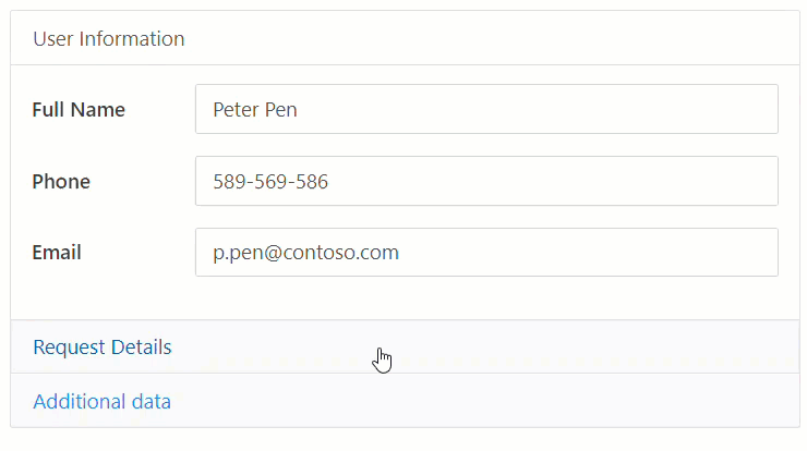
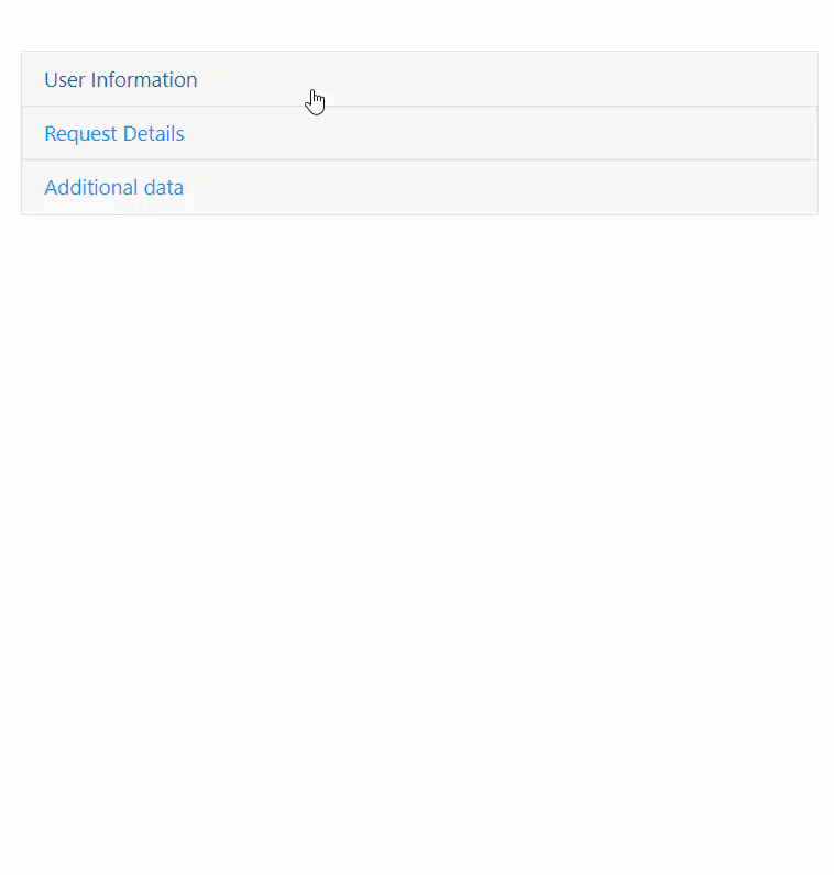
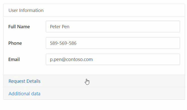
The Accordion container organizes form content within horizontally collapsible panels.
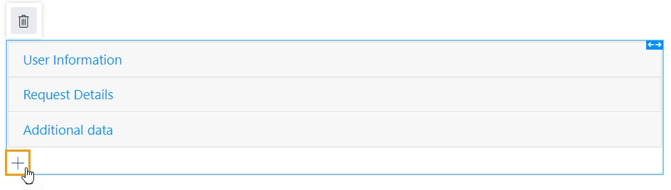
You can add as many panels as you need. To add a new panel, simply click on the plus symbol:
This page contains a detailed description of the container properties and JavaScript samples that you can use with this container.
Accordion Properties
Here you can find properties specifically related to the Accordion container.
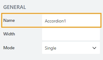
Name
A unique identifier for the container.
JavaScript
The Name property allows to work with the container via JavaScript code, like this:
fd.rendered(() => {
   // hide container
   fd.container('Accordion1').hidden = true;
});
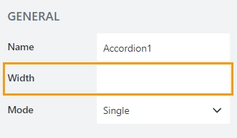
Width
The property defines the width of the container in pixels.
If left blank, the container takes up the entire available width in the current grid cell.
Mode
The property defines the number of panels that can be expanded at a time:
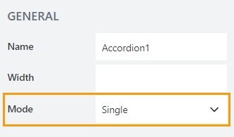
Single — only one panel can be opened at a time.
Multiple — multiple panels can be opened at a time, and all can be closed.
Collapsible
The property is available for the Accordion in a Single mode:
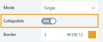
When enabled a user can close all panels:
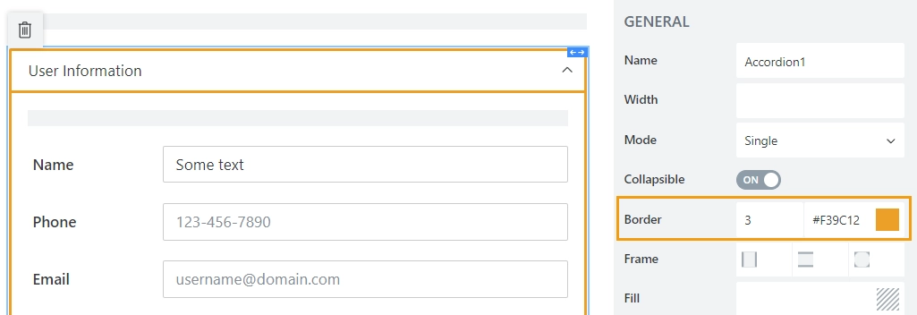
Border
The property defines the panels’ border width and color:
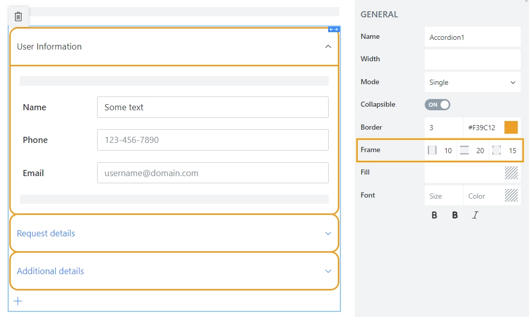
Frame
The property defines the horizontal and vertical padding (extra space) and border radius (roundness) of the panels:
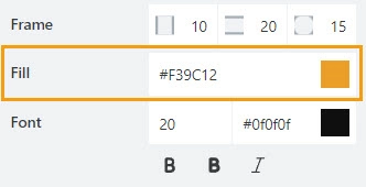
Fill
The property defines the background color of the panels:
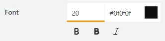
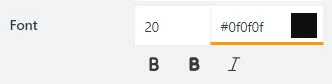
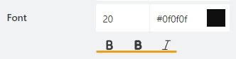
Font
Format panels’ titles using these settings:
font size:
font color; use the color picker or enter the Hex color code:
font style: Normal, Bold or Italic:
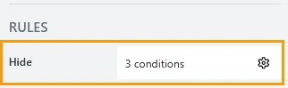
Hide
Define one or more conditions to hide this form element based on form state. To manage these no-code conditions, click the gear icon.
Accordion Panel Properties
Here you can find properties specifically related to the Accordion panel.
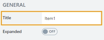
Title
The property defines the header of the panel.
Expanded
Defines the panel that will be expanded on form load.
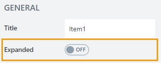
By default, the property is set to False for all panels. So on form load, the first panel is expanded. In a Multiple mode, you can set the property to True for multiple panels.
JavaScript framework
In this section, you can find basic examples of how to work with the containers using JavaScript.
If you are not familiar with the JavaScript framework, get started with the JavaScript basics.
Note
The container is only accessible once the form is rendered, so all calls to the containers must be inside fd.rendered event:
fd.rendered(() => {
    // hide the container
    fd.container('Container1').hidden = true;
    // show the container
    fd.container('Container1').hidden = false;
});
Get HTML element
Access HTML element inside the container.
// access container's HTML
let htmlcontainer = fd.container('Container1').$el;
Hide container
Hide a container from a user.
// hide container
fd.container('Container1').hidden = true;

// show container
fd.container('Container1').hidden = false;
Mode
The property holds the current mode of the Accordion container.
Available modes:
One — Single mode, one panel is always open.
ZeroOrOne — SingleCollapsable mode; only one panel can be open, but it can also be closed.
ZeroOrMultiple — Multiple mode; multiple panels can be open, and all can be closed.
To change the Accordion mode dynamically, the mode property should be used with the toggle() method:
// set mode to Single:
fd.container('Container1').mode = "One";
// open the first panel:
fd.container('Container1').$children[0].toggle();
Accordion panels
The property holds panels of the container as an array of objects. Can be used to get panels and their methods.
fd.container('Container1').$children;
Change panel header
Get or set the panel header.
// returns the first panel header as a string
fd.container('Container1').$children[0].header;

// change the second panel header
fd.container('Container1').$children[1].header = 'New Header';
Disable panel
Disable or enable a panel:
// disable the second panel
fd.container('Container1').$children[1].disabled = true;

// enable the second panel
fd.container('Container1').$children[1].disabled = false;
Hide panel
Hide or show a panel:
// hide the second panel
fd.container('Container1').$children[1].$el.hidden = true;

// show the second panel
fd.container('Container1').$children[1].$el.hidden = false;
Open/Close panel
The property checks if the panel is open or closed. Returns a boolean.
It can also be used to open or close a panel ignoring the current mode of the Accordion.
// returns true if a panel is open; false if closed
fd.container('Container1').$children[0].open;

// open the first panel
fd.container('Container1').$children[0].open = true;

// close the second panel
fd.container('Container1').$children[0].open = false;
Toggle between panels
The method that toggles the panel state between open and closed. The method considers the current Accordion mode.
// toggles the second panel from one state to another
fd.container('Container1').$children[1].toggle();

// opens the first panel if it is closed
if (!fd.container('Container1').$children[0].open) {
    fd.container('Container1').$children[0].toggle();
}