Grid
Grid
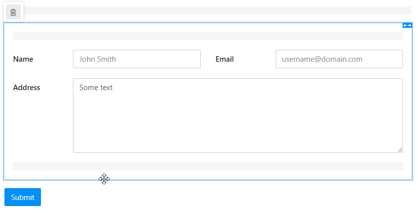
The Grid container is the most basic element of Plumsail Forms. By default, every form already has a grid.
But you are not limited to one grid per Form. By placing Grid container inside the form, you are technically inserting one grid within another and then can lay out elements within the second grid, which will be constrained by its own Parent Grid.
So, despite Parent grid only having 12 options for Width property, you can adjust your layout precisely by using multiple grid containers.
Our Grid is based on Bootstrap Grid.
Grid Cell Properties
Since the Grid is the base container, every element on the form has the following properties. Changing these properties affects a specific grid cell, not a specific field or control.
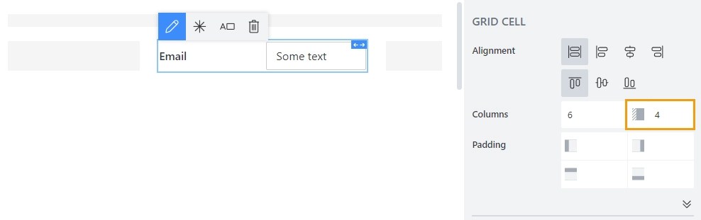
Alignment
Determines how to align elements inside the grid cell. You can align the content vertically and horizontally:
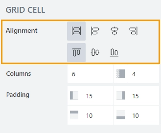
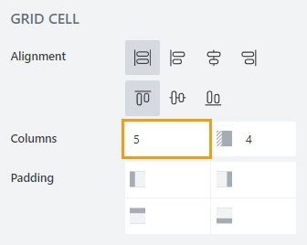
Columns
Determines the position of the element and is defined by two parameters: width and offset.
Width determines how much of the total grid space an element takes, where 12 is full grid and other values represent smaller portions of the grid. Setting the width of an element affects the total available width for other elements in the same row.
Offset determines how much of an offset element gets from the left. The offset number also determines how much of the total grid space offset takes, where 6 is equal to half the grid. Setting offset will also affect total available Width for the element, and if not enough space left, it will automatically adjust to be smaller.
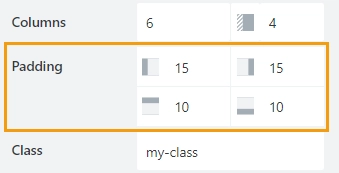
Padding
Allows you to give extra padding to a particular element from any side, Padding is set in pixels.
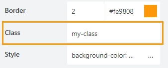
Class
Add a CSS class to the grid cell, which comes in handy with CSS or even JavaScript code. This will work as a class attribute for an HTML tag.
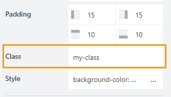
Be careful with setting a class to a grid cell, as it’s set specifically for the cell itself. If you move the element inside the cell, the class will remain with the Grid Cell. It’s better to set the Class directly to a field or a control.
Here’s an example CSS code that you can use in Theme Settings → Custom CSS to give cells with your class a thin black border:
.my-class {
    border: 1px solid black;
}
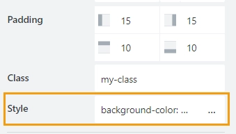
Style
Add custom CSS style to the grid cell. This will work as a style attribute for an HTML tag.
Be careful with setting a style directly to a grid cell, as it’s set specifically for the cell itself. If you move the element inside the cell, the style will remain with the Grid Cell. It’s better to apply the Style property directly to a field or a control.
You can apply different styles to the cell, for example, the following style will add a light blue background to the grid cell:
background-color: #008EFF;
Grid Properties
Here you can find properties related to the Grid container.
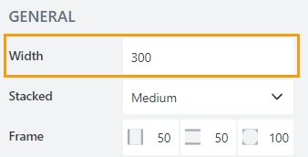
Width
The grid takes all available space in the grid cell. But you can specify the Width of the grid in pixels:
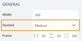
Stacked
Defines at what screen size items get stacked inside the grid:
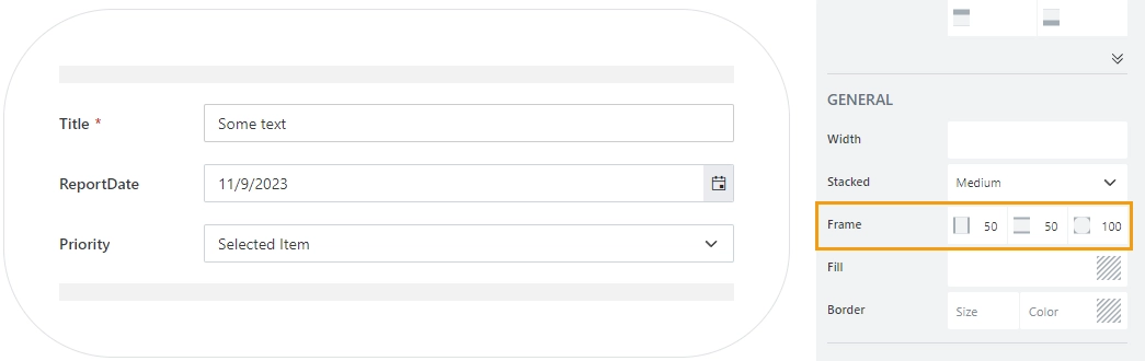
Frame
The property defines the horizontal and vertical padding (extra space) and border radius (roundness) of the container:
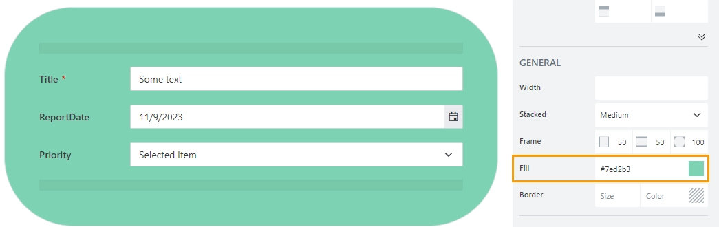
Fill
The property defines the background color of the container:
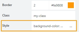
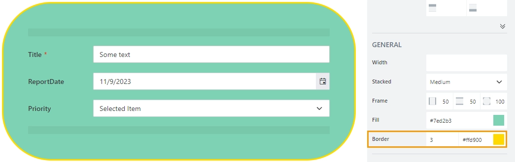
Border
The property defines the width and the color of the container’s border:
Class
Add a CSS class to the container, which comes in handy with CSS or even JavaScript code. This will work as a class attribute for an HTML tag.
The same class can be applied to multiple grids, and then you can use CSS to modify the appearance of these. For example, here we’ve used the following CSS code in the CSS editor to give grids with my-class a thin black border:
.my-class {
    border: 1px solid black;
}
JavaScript
The Class property allows you to work with the grid via JavaScript code, like this:
fd.rendered(() => {
    // hide the container
    $('.my-class').hide();
    // show the container
    $('.my-class').show();
 });
Style
Add custom CSS style to the container. This will work as a style attribute for an HTML tag.
You can apply different styles to the container. For example, the following style will add a blue background to the grid:
background-color: #008EFF;
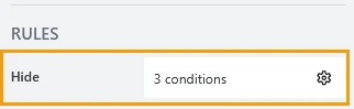
Hide
Define one or more conditions to hide this form element based on form state. To manage these no-code conditions, click the gear icon.