Stack
Stack
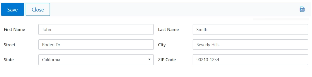
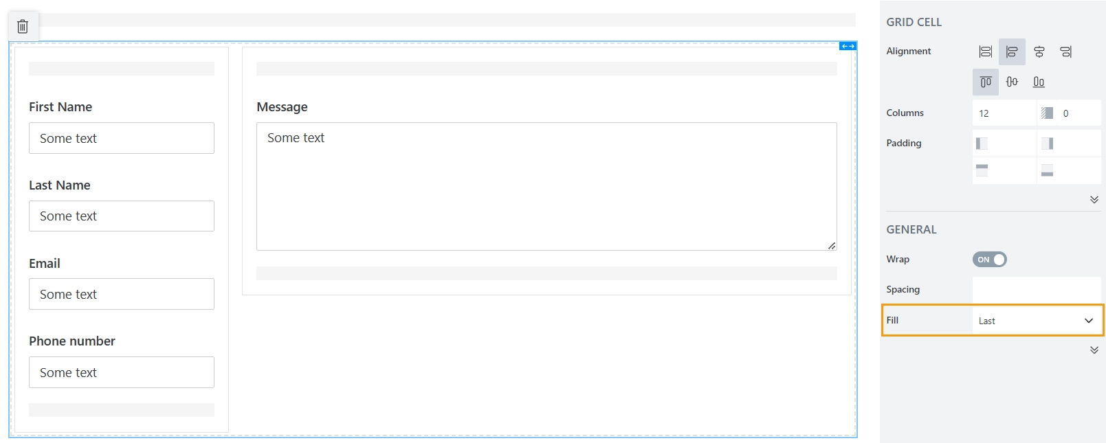
The Stack container allows you to place controls on a fixed distance from each other. This can be useful for fields that should always go together, like first and last name, or address fields.
Stack Properties
Here you can find properties specifically related to the Stack container.
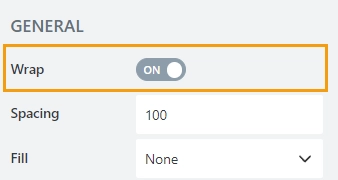
Wrap
Property that controls what happens to content that is too long to fit the Stack width. Two options are available:
No wrap option means that the content is clipped;
Wrap option means that the content wraps to the next line.
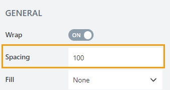
Spacing
Define the spacing between different elements in the Stack container in pixels. The default value is 15.
Fill
Property that allows to set the first or the last element to fill out the remaining horizontal space, while other elements inside have a fixed width.
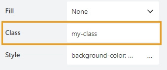
Class
Add a CSS class to the container, which comes in handy with CSS or even JavaScript code. This will work as a class attribute for an HTML tag.
Here’s an example CSS code that you can use in Theme Settings → Custom CSS to give the container with your class a thin black border:
.my-class {
    border: 1px solid black;
}
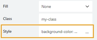
Style
Add custom CSS style to the container. This will work as a style attribute for an HTML tag.
You can apply different styles to the container, for example, the following style will add a light blue background:
background-color: #008EFF;
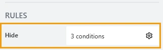
Hide
Define one or more conditions to hide this form element based on form state. To manage these no-code conditions, click the gear icon.