 Multiple Select field
The Multiple Select field allows users to choose from a predefined list of options.
This page contains a detailed description of the field properties and JavaScript samples which you can use with this field.

Common Properties
Multiple Select Properties
Here you can find properties specifically related to the Multiple Select field.
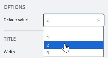
Default value
Specify which value, if any, is chosen in the field by default.
JavaScript framework
In this section, you can find basic examples of how to work with the field using JavaScript.
For more examples, check out Working with form fields in JavaScript article. If you are not familiar with the JavaScript framework, get started with the JavaScript basics.
Note
The field is only accessible once the form is rendered, so all calls to the field must be inside fd.rendered event:
fd.rendered(() => {
    // access the field's value and print in the browser's console
    console.log(fd.field('Field1').value);
});
Wait until field is ready
Wait until the field is loaded. The ready method returns a promise that is resolved when the field has been fully initialized and is ready to work with.
Useful if loading data from Excel data source.
fd.field('Field1').ready(field => {
    // alert when the field is ready
    alert('Field is fully loaded');
});
// or
fd.field('Field1').ready().then(field => {
    // alert when the field is ready
    alert('Field is fully loaded');
});
Get or set field value
The field value is stored as an array of selected options. Get or set it following this example:
// get field value as an array
fd.field('Field1').value;

// set field value
fd.field('Field1').value = ['Item 1', 'Item 2'];
Handle change event
Execute a function when a field value has been changed:
fd.field('Field1').$on('change', value => {
    // log changes to browser's console
    console.log('New value: ' + value);
});
Make field required
Make a field required or optional:
// make field required
fd.field('Field1').required = true;

// make field not required
fd.field('Field1').required = false;
Disable field
Make a field non-editable. The field value can still be changed with JavaScript and saved:
// disabled field
fd.field('Field1').disabled = true;

// enable field
fd.field('Field1').disabled = false;
Get HTML element
Access HTML element inside the field in order to modify it, hide it, or do something else.
// access field's control
let htmlField = fd.field('Field1').$el;

// access field's block, which includes title and control
let htmlFullField = fd.field('Field1').$parent.$el;
Hide field
Hide a field from a user. The field value can still be accessed and changed with JavaScript:
// hide field
fd.field('Field1').hidden = true;

// show field
fd.field('Field1').hidden = false;
Get or set option colors
If you want to change option colors without changing the options, use the following, just replace Your option with actual value:
// get option colors
fd.field('Field1').optionsColors['Your option'].backgroundColor;
fd.field('Field1').optionsColors['Your option'].textColor;

// set option colors:
fd.field('Field1').setOptionColors('Your option', {
    textColor: '#ffffff',
    backgroundColor: '#ebb65e'
});
Limit number of selectable options
You can limit the number of selectable options with field validation:
// prevent user from selecting more than 3 options
fd.field('Field1').addValidator({
    name: 'Field1 options validation',
    error: 'No more than 3 options',
    validate: value => {
        if (value.length > 3) {
            return false;
        }
        return true;
    }
});