Getting started
User guide
Provisioning forms
Examples
General
Multilingual support
Navigation between forms
Generating PDF documents
Integration with Power Automate
On this page, you will find information about the SharePoint form toolbar and how to access its properties.
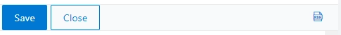
Get all toolbar buttons as an array of objects. Can be used to add new buttons, modify or remove existing ones.
//return toolbar buttons as an array of objects
fd.toolbar.buttons;
By default, the toolbar contains four buttons:
Save
Close
Export to PDF
Comments
You can access a specific button by entering its index number:
//save button
fd.toolbar.buttons[0];
//close button
fd.toolbar.buttons[1];
//export to PDF button
fd.toolbar.buttons[3];
//comments button
fd.toolbar.buttons[4];
The property holds a unique identifier for the button. Use the property to identify a specific button in the toolbar:
//get the Save button
const saveButton = fd.toolbar.buttons.find(function(b) {
return b.id === 'SAVE'
})
//get the index of the Export to PDF button
const indexPDF = fd.toolbar.buttons.findIndex(function(b) {
return b.id === 'PDF'
})
The object holds the button’s CSS classes. Use the property to assign CSS classes with either string or an object. Default class btn cannot be removed or changed.
//set button's class with a string
fd.toolbar.buttons[1].class = 'btn-danger';
//or with an object
fd.toolbar.buttons[1].class = {'btn-danger': true};
The property holds a button’s HTML property style as a string. Use the property to add styles to a specific button.
//hide the button
fd.toolbar.buttons[1].style = 'display: none;';
//increase text font size the button
fd.toolbar.buttons[2].style = 'font-size: 20px;';
The property holds an icon name that matches icon names from Microsoft Fabric Icons. Use the property to add or change a button’s icon.
//get button's icon as a string
fd.toolbar.buttons[0].icon;
//set button's icon
fd.toolbar.buttons[0].icon = 'Save';
The property defines a button position.
0 - the button is located on the left; 1 - on the right.
//move button to the right
fd.toolbar.buttons[0].location = 1
The property defines whether a button is disabled or enabled.
//disable button
fd.toolbar.buttons[0].disabled = true;
//enable button
fd.toolbar.buttons[0].disabled = false;
Holds a function, that is executed when a button is clicked. Can be used to assign a new function.
//change button click function
fd.toolbar.buttons[1].click = function(){
if (confirm('Are you sure you want to exit the form?')) {
fd.close();
}
}
Here you will learn how to customize the form toolbar.
Show or hide the toolbar:
//hide toolbar
fd.toolbar.hidden = true;
//show toolbar
fd.toolbar.hidden = false;
Create a new button and add it to the toolbar.
const approveBtn = {
icon: 'WaitlistConfirm',
class: 'btn-outline-primary',
text: 'Approve record',
location: 1,
click: function() {
fd.field('Status').value = 'Approved';
fd.save();
}
}
//add new button
fd.toolbar.buttons.push(approveBtn);
Add a toolbar button that would save the form without closing it. Add the following code to the New form:
let keepFormOpened = false;
fd.spRendered(() => {
// add a 'Save and stay' button to the toolbar
const saveStayBtn = {
class: 'btn-primary',
text: 'Save and stay',
location: 0,
click: () => {
keepFormOpened = true;
fd.save();
}
};
fd.toolbar.buttons.splice(1, 0, saveStayBtn);
});
fd.spSaved(result => {
if (keepFormOpened) {
const itemId = result.Id;
const listId = fd.spFormCtx.ListAttributes.Id;
window.location = fd.webUrl + '_layouts/15/listform.aspx?PageType=6&ListId=' + listId + '&ID=' + itemId;
}
});
For the Edit form, use the same code but modify fd.spSaved() like this:
fd.spSaved(result => {
if (keepFormOpened) {
//for forms opened in a panel
result.KeepPanelOpened = true;
// for fullscreen forms
result.RedirectUrl = null;
// restoring keepFormOpened state
keepFormOpened = false;
}
});
Create a toolbar button that would save current form data to the list as a new item without closing the form or saving the current item.
fd.spRendered(() => {
const saveAsNewBtn = {
icon: 'Copy',
class: 'btn-primary',
text: 'Save as new',
location: 0,
click: () => {
const title = fd.field('Title').value;
const dateTime = fd.field('DateTime').value;
sp.web.lists.getById(fd.spFormCtx.ListAttributes.Id).items.add({
Title: title,
DateTime: dateTime
});
}
};
fd.toolbar.buttons.splice(1, 0, saveAsNewBtn);
});
Create a toolbar button to run a Power Automate flow without closing the form.
First, enable the Trigger a flow (Power Automate) when the form is submitted flag in the form’s settings to copy its JSON schema:
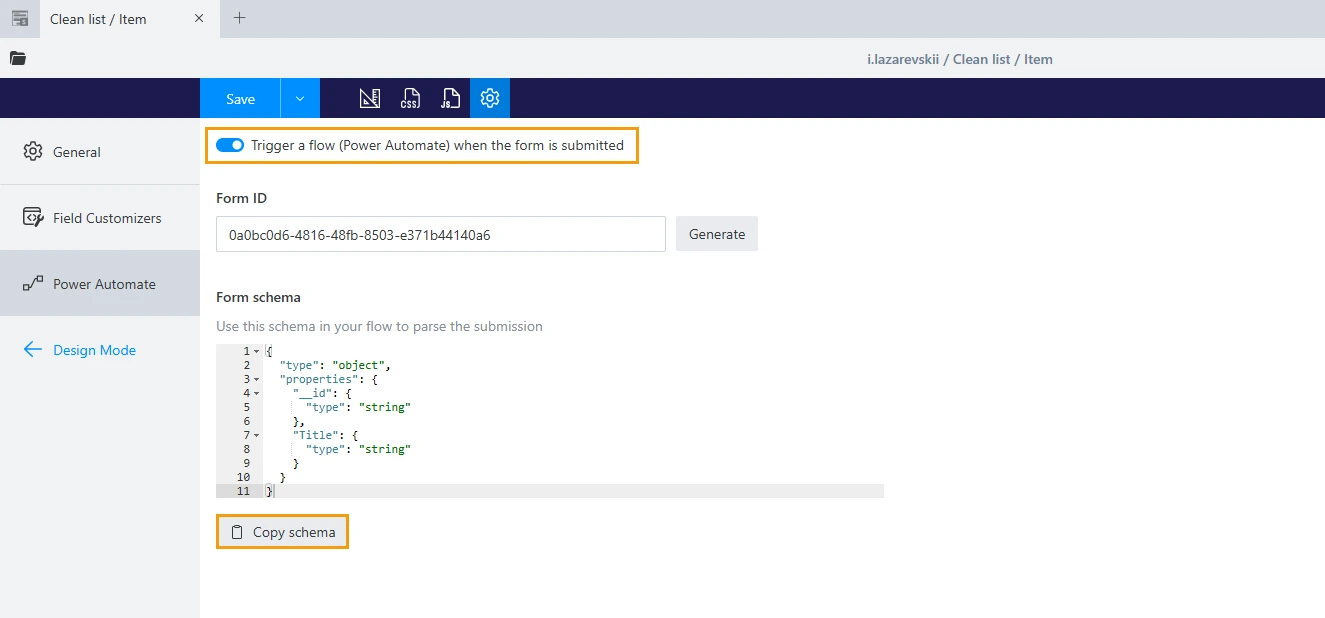
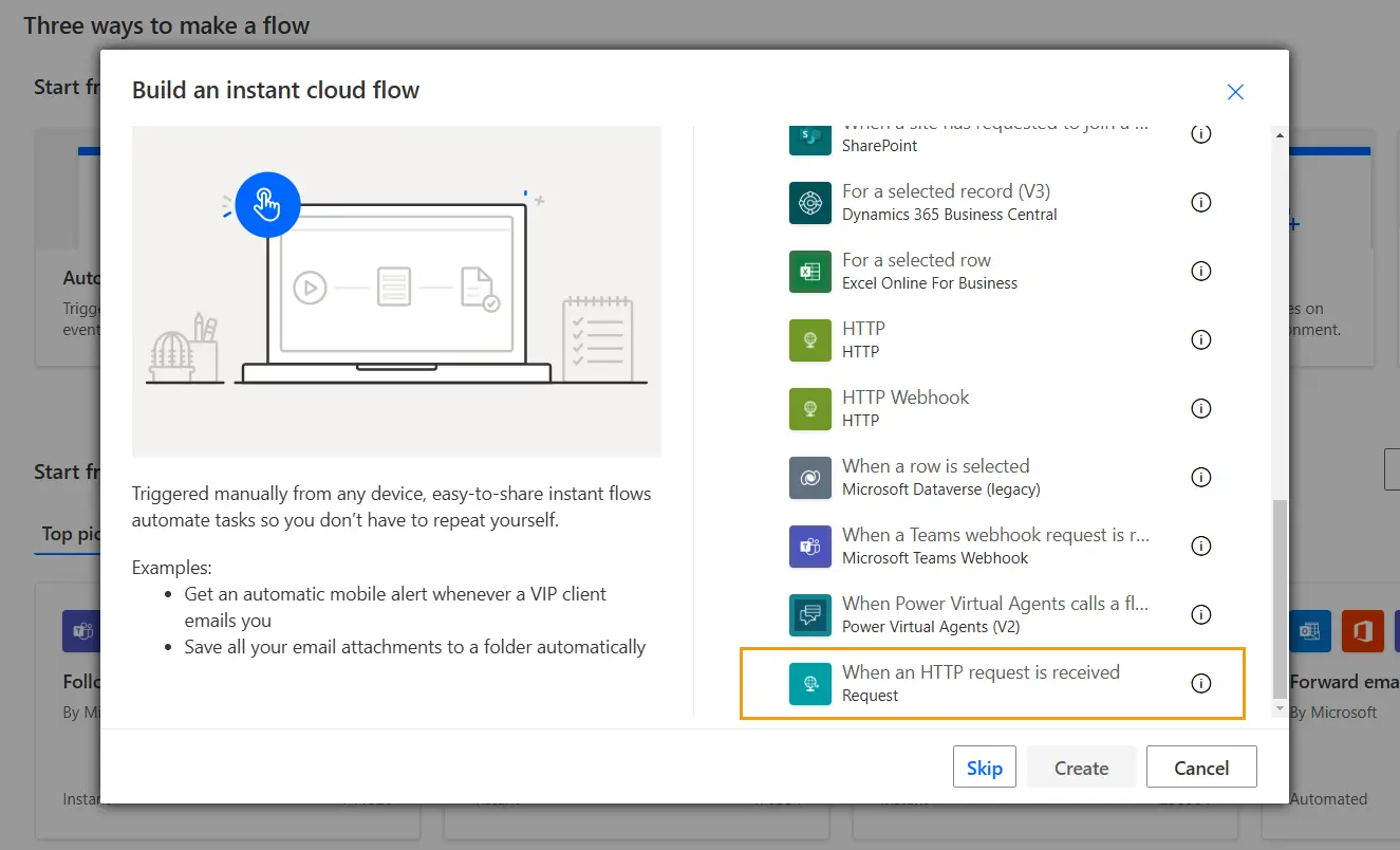
Create an instant cloud flow in Power Automate, using When an HTTP request is received as its trigger:
Then, configure the flow’s trigger action with the JSON schema you copied previously and select Anyone in the Who can trigger this flow? box.
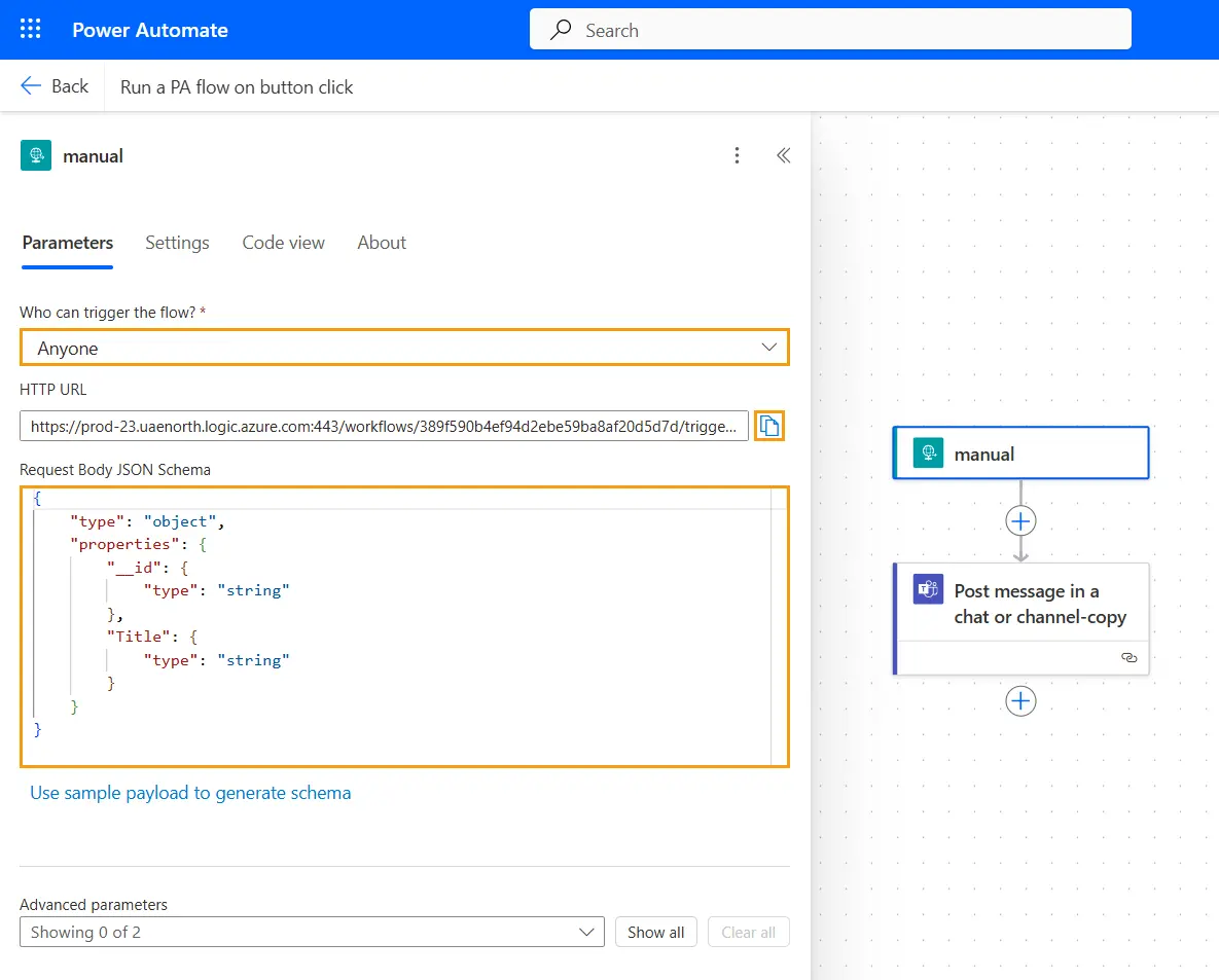
After you save the flow, copy the API link from the HTTP URL field. In the Forms Designer, add the following code to the form and replace the API_LINK placeholder with the link you just copied:
fd.spRendered(() => {
// add a 'Run a PA flow' button to the toolbar
const flowBtn = {
class: 'btn-primary',
text: 'Run a Power Automate flow',
location: 0,
click: () => {
const req = new XMLHttpRequest();
req.open(
'POST',
'API_LINK',
true
);
req.setRequestHeader('Content-Type', 'application/json');
req.send(JSON.stringify(fd.data()));
}
};
fd.toolbar.buttons.splice(1, 0, flowBtn);
});
Remove button object from the toolbar.
//remove the close button
fd.toolbar.buttons.splice(1,1);