
Use notes in charts created with SharePoint Charts
Using notes in charts created with SharePoint Charts
This is a manual on how to use notes in Charts’s charts(in this example we use a Line chart). Look at the screenshot. Each point has a note and a label, but they display different columns from a SharePoint list. It can be useful if a label is already used to display a value, but you need to display additional information related to specific points.
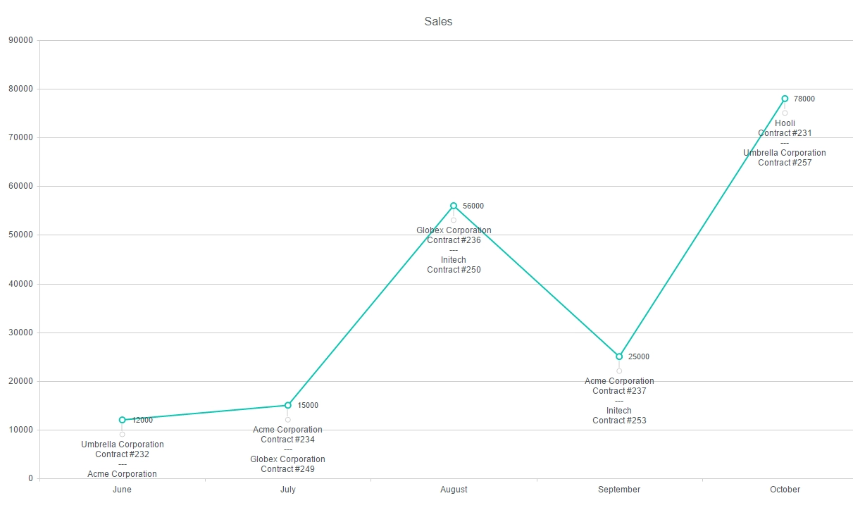
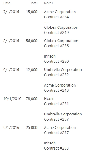
For the chart above we used a SharePoint list containing three fields: Total, Date, and Notes.
So, we have a line chart, where category axis displays Date (to display only a month, set Style -> Category axis -> Label format in {0:MMMM}) and value axis displays Total for each month.
Now, we only need to put the code below into Dashboard ->Advanced tab to add notes:
var handlers = {};
handlers.preRender = function(config, logger) {
    config.seriesDefaults.noteTextField = 'Notes'; //add Notes
    config.seriesDefaults.notes = {
        label: { position: 'outside' },
        position: 'bottom',
    };
    logger.debug('Configuration: ', config);
    return true;
}