
Chart
The Chart tab allows you to define the type of the chart, e.g. line, area, column, pie, etc., and specify its axis fields:
Line Chart
Particularly good at displaying values that change through time, featuring the overall shape of that change.
Fields:
- Category Axis (horizontal)
- Value Axis (vertical)
Area Chart
Based on the line chart, but the area between the category axis and the line is emphasized with colors.
Fields:
- Category Axis (horizontal)
- Value Axis (vertical)
Column Chart
The best way to display a series of discrete quantitative values to highlight their relative sizes.
Fields:
- Category Axis (horizontal)
- Value Axis (vertical)
Bar Chart
Horizontally oriented column chart.
Fields:
- Category Axis (vertical)
- Value Axis (horizontal)
Horizontal Bullet
Variation or a bar chart that allows you to compare each value to a target.
Fields:
- Category Axis (vertical)
- Value Axis (horizontal)
- Target (comparative measure)
Vertical Bullet
Vertically oriented bullet chart.
Fields:
- Category Axis (horizontal)
- Value Axis (vertical)
- Target (comparative measure)
Pie Chart
Usually used to display part-to-whole relationships.
Fields:
- Category (the name of the pie slice)
- Value (the size of the pie slice)
Donut Chart
Similar to a pie chart but allows you to display multiple series (groups) as nested donuts.
Fields:
- Category (the name of the pie slice)
- Value (the size of the pie slice)
Radar Line
A useful way to display multivariate observations with an arbitrary number of variables. Allows you to display groups as separate series on the same chart.
Fields:
- Category (the name of the axis)
- Value (the value on the axis)
Radar Area
Similar to a radar chart but the polygon formed by the lines, that connect the individual values on each axis, is filled in with color.
Fields:
- Category (the name of the axis)
- Value (the value on the axis)
Scatter Chart
Displays the relationship between two sets of paired values. Each set must be numerical.
Fields:
- X-axis (horizontal)
- Y-axis (vertical)
Scatter Line
Similar to a scatter chart but the nearest points in the data set are connected with lines.
Fields:
- X-axis (horizontal)
- Y-axis (vertical)
Bubble Chart
A scatter chart with varying the sizes of points to encode an additional measure. All three sets of values have to be numerical.
Fields:
- X-axis (horizontal)
- Y-axis (vertical)
- Size (the size of the point)
- Color (optional field containing a color of the point)
Linear Gauge
A single-valued chart with multiple predefined ranges. Good to visualize a performance measure or KPI. Displays the value of the first item or group (for aggregated data) in the data set.
Fields:
- Value (the current temperature)
Radar Gauge
Similar to a linear gauge chart but represented as a speedometer.
Fields:
- Value (the current speed)
Map with markers
A graph with a map layer, on top of which you can present your data as markers with latitude and longitude values and a caption.
Fields:
- Latitude
- Longitude
- Title
Map with bubbles
A graph with a map layer, on top of which you can present your data as bubbles with varying sizes and colors.
Fields:
- Latitude
- Longitude
- Value (size of the bubble)
- Color (color of the bubble)
Waterfall bar
Also known as bridge, Mario or flying bricks. A regular category vs value bar chart with consequent bars horizontally connected to each other. Used to help in understanding the cumulative effect of sequentially introduced positive or negative values.
Fields:
- Category
- Value
Range bar
A bar chart that visualizes ranges of values per category value.
Fields:
- Category
- Form
- To
Tree Map
Chart with hierarchical structure.
Fields:
- Category
- Value
Funnel
Displays a single series of data in progressively decreasing or increasing proportions, organized in segments, where each segment represents the value for the particular item from the series.
Fields:
- Category
- Value
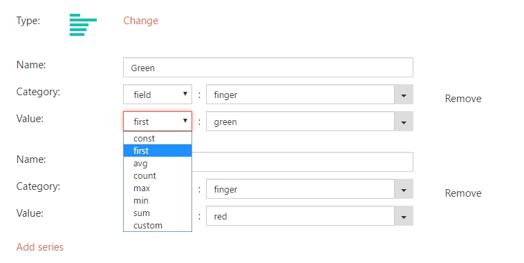
Specifying field aggregation (and other field options)
On the screenshot below you can see a drop-down box to the left of every series’ field. This drop-down box allows you to do one of the following things:
- Specify a constant value via ‘const’. This simply allows you to enter an arbitrary value as the value of the field (more on this in the Adding more series (Aggregating over all list entities)section).
- Specify a list field via ‘field’. Select this option and then select a field from the drop-down box to specify a list column as the value of this field.
- Specify ‘first’ to select the first value from a list column.
- Specify ‘avg’, ‘count’, ‘max’, ‘min’, ‘sum’ or ‘custom’ to select a function that will be used to aggregate the values of the selected column.
A portion of charts (Line, Area, Column, Bar and Bullet among others) support aggregate functions. That is you can, for example, display the average value of your Income column simply by selecting ‘avg’ in the drop-down.
If the category axis field contains dates, you can specify the aggregation unit like seconds, minutes or hours among others, or set it to “fit” to determine the units automatically. The choice of unit influences the way chart builder will treat date values. For example, 01/01/2014 and 12/12/2014 can be treated as distinct values if the unit is set to ‘months’ (Jan 14 and Dec 14 respectively) or as one value if set to ‘years’ (both 2014).
Another property for date based category axis is Step (the interval in selected units between nearest points on the category axis).

Display each group as a separate series
This option is only available if you utilize grouping in Data Source → Aggregation (i.e. if the Group by box is not empty) and have specified only one series (see Adding more series section below). If you attempt to add a second series with ‘Display each group as separate series’ option on you’ll get a message confirming to turn it off. You cannot add additional series and have this option on – you can however simply replicate the required behaviour via additional series.
If your data is grouped and contains several aggregations, the chart will be rendered based on aggregate fields by default and will contain a single data series. But you can pick the “Display each group as a separate series” option to build a chart based on the “items” array of each group, so each group will be rendered as a separate series on the same chart and you will be able to compare them.

Sample Data:
{
    items : [],
    groups: [
        {
            field: 'customer',
            value: 'Janet Leverling',
            TotalOrder: 2200,
            items: [
                { orderId: 7, customer: 'Janet Leverling', total: 2000, date: new Date(2014, 07, 05) },
                { orderId: 9, customer: 'Janet Leverling', total: 200, date: new Date(2014, 07, 06) }
            ]
        },
        {
            field: 'customer',
            value: 'Nancy Davolio',
            TotalOrder: 2400,
            items: [
                { orderId: 5, customer: 'Nancy Davolio', total: 1300, date: new Date(2014, 07, 05) },
                { orderId: 6, customer: 'Nancy Davolio', total: 500, date: new Date(2014, 07, 05) },
                { orderId: 8, customer: 'Nancy Davolio', total: 600, date: new Date(2014, 07, 06) },
            ]
        }
    ]
}
Configuration 2 (a single series based on aggregation):
- Chart Type: Column
- Display each group as a separate series: False
- Category: ‘field’ value
- Value: ‘first’ TotalOrder

Adding more series
To start with you are given one data series to put on your graph. However, you may wish to put multiple data series on your graph, for example, it could conceivably be useful to display Month vs Income and Month vs Revenue next to each other on the same diagram. Do note, however, that our software allows you to either use the automatically generated series via group by (see Display each group as separate series above) or add multiple series manually – but not both.
Let’s review two basic use cases.
Sample Data:
{
items : [
{Month: 'Jan', Revenue: 200000, Income: 100000},
{Month: 'Jan', Revenue: 200000, Income: 100000},
{Month: 'Jan', Revenue: 200000, Income: 100000},
{Month: 'Feb', Revenue: 250000, Income: 120000},
{Month: 'Feb', Revenue: 350000, Income: 220000},
{Month: 'Feb', Revenue: 250000, Income: 120000},
{Month: 'Mar', Revenue: 450000, Income: 200000}
]
groups: []
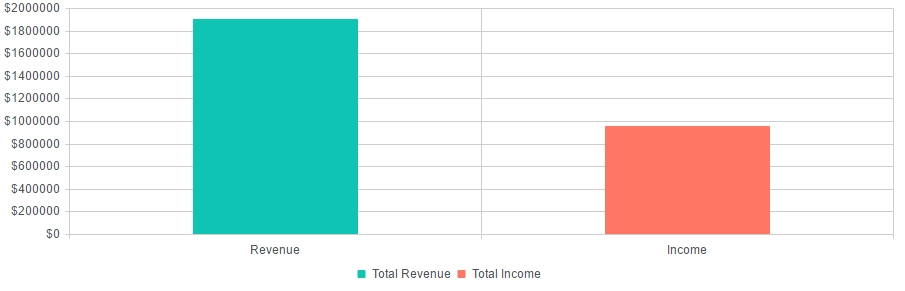
}Aggregating over all list entitiesYou can select an arbitrary constant value as your category to create a series based on all of your data set. With this feature you can create charts to display things like total Revenue vs total Income for all of your data set.
Sample configuration:
- Chart Type: Column
- Series 1:
- Category: ‘const’ Revenue
- Category: ‘sum’ Revenue
- Series 2:
- Category: ‘const’ Income
- Category: ‘sum’ Income
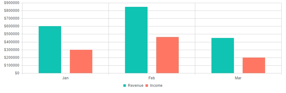
Aggregating over list fields
You can also select a list field to be used as the basis for aggregation. The following chart shows total Income and total Revenue for each month.
Sample configuration:
- Chart Type: Column
- Series 1:
- Category: ‘field’ Month
- Category: ‘sum’ Revenue
- Series 2:
- Category: ‘field’ Month
- Category: ‘sum’ Income
Rendering
With the help of Rendering mode option you can control the technology which is used to render the chart. If you need to increase the performance of the chart and are ready give up its animation and interactivity, you can switch to Canvas rendering.
If your data changes intensively and you need to monitor it in real time, you can pick “Refresh periodically” and specify the interval in seconds when the chart will refresh.