
Sales Dashboard
Dashboard
Data
Configuration
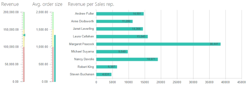
Revenue
Calculates and displays the total revenue from all orders.
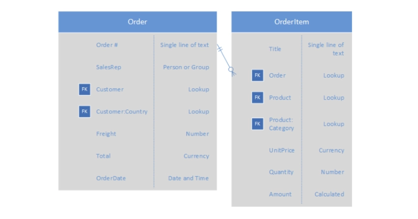
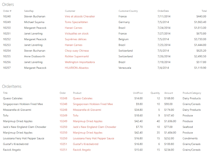
Data Source
SharePoint List
List: Orders
Fields: TotalAggregation:
Group by: emptyAs you can see the empty field doesn’t exists in the data source. We use it here to calculate aggregate values over all rows in the data set because for each row it equals to “undefined”, thus we get a single group containing all items.
Aggregations:
Total = sum of Total
Dashboard
Chart
Type: Linear Gauge
Value: Total
Avg. order size
Calculates and displays the average order size.
Data Source
SharePoint List
List: Orders
Fields: TotalAggregation:
Group by: emptyAs you can see the empty field doesn’t exists in the data source. We use it here to calculate aggregate values over all rows in the data set because for each row it equals to “undefined”, thus we get a single group containing all items.
Aggregations:
AvgTotal = average of Total
Dashboard
Chart
Type: Linear Gauge
Value: Total
Revenue per Sales rep.
Displays the total revenue generated by each sales representative.
Data Source
SharePoint List
List: Orders
Fields: SalesRep, TotalAggregation:
Group by: SalesRepAggregations:
Total = sum of Total
Dashboard
Chart
Type: Bar
Display each group as a separate series: False
Category: value
Value: Total
Aggregate over category: False
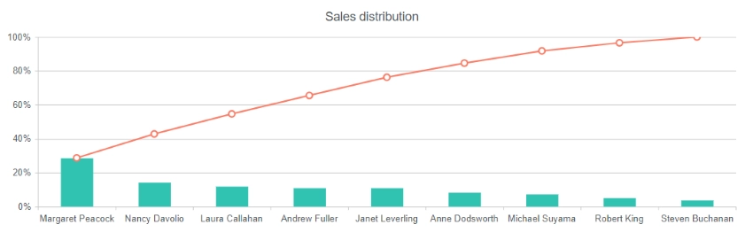
Sales distribution
Displays sales revenue by sales representatives, encoded as columns, as well as the cumulative revenue, encoded as a line. This chart is also known as Pareto chart or Pareto diagram.
Data Source
SharePoint List
List: Orders
Fields: SalesRep, TotalAggregation:
Group by: SalesRepAggregations:
Total = sum of AmountAdvanced:
var handlers = {};
handlers.aggregationSuccess = function (data, logger) {
    data.groups.sort(function (a, b) { return a.Total <= b.Total ? 1 : -1 });

    var total = 0;
    $.each(data.groups, function () {
        total += this.Total;
    });

    $.each(data.groups, function () {
        this.Percentage = this.Total / total * 100;
    });

    return true;
}
The code above calculates individual rank of each sales representative in total revenue in percent.
Dashboard
Chart
Type: Column
Display each group as a separate series: False
Category: value
Value: Percentage
Aggregate over category: FalseStyle
Value axis:Label format: 0%Advanced:
var handlers = {};
handlers.preRender = function (config, logger) {
    var data = [];
    $.each(config.series[0].data, function (i) {
        if (data.length == 0) {
            data.push(this.Percentage);
        } else {
            data.push(this.Percentage + data[i - 1]);
        }
    });

    config.series.push({
        type: 'line',
        data: data
    });

    logger.debug('Configuration: ', config);
    return true;
}
Here we populate a new data series with cumulative values, that increase from one salesperson to the next, representing meaningful change. Next, we build a line chart based on the new data set.
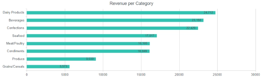
Revenue per Category
Displays revenue by product category.
Data Source
SharePoint List
List: OrderItems
Fields: Amount, Product:CategoryAggregation:
Group by: Product:CategoryAggregations:
Total = sum of AmountAdvanced:
var handlers = {};
handlers.aggregationSuccess = function (data, logger) {
    data.groups.sort(function (a, b) { return a.Total <= b.Total ? 1 : -1 });
    return true;
}
Sorting groups by total revenue.
Dashboard
Chart
Type: Bar
Display each group as a separate series: False
Category: value
Value: Total
Aggregate over category: False
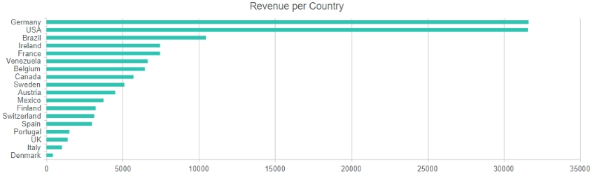
Revenue per Country
Displays revenue by customer's country.
Data Source
SharePoint List
List: Orders
Fields: Customer:Country, TotalAggregation:
Group by: Customer:CountryAggregations:
Total = sum of TotalAdvanced:
var handlers = {};
handlers.aggregationSuccess = function (data, logger) {
    data.groups.sort(function (a, b) { return a.Total <= b.Total ? 1 : -1 });
    return true;
}
Sorting groups by total revenue.
Dashboard
Chart
Type: Bar
Display each group as a separate series: False
Category: value
Value: Total
Aggregate over category: False