
Build Simple Charts – Sales Report (SharePoint)
Where to start with Charts? It can be quite overwhelming at first – lots of graphics and potential configurations, the possibilities are nearly endless. That’s why we prepared this article for you, here you will find how to design simple charts in just a few clicks, without writing any code! We’ll build three charts based on Sales list and with this knowledge, you’ll be able to design similar and even more complex charts based on your needs. Let’s get started!
SharePoint List – Sales
In this case, I have a rather standard Sales List:
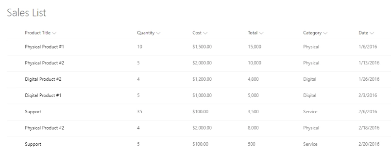
have all the regular columns for each product sold, such as Title, Quantity, Cost, Category and Date of the sale. Total is a calculated column, it simply multiplies Quantity by Cost.
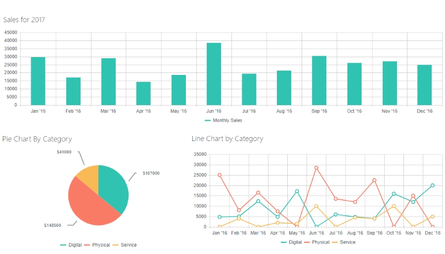
Sales Column Chart
First, let’s create a rather simple column chart to represent all sales in the table. We add Charts Web Part to the page and go to configuration, here we first see this screen:
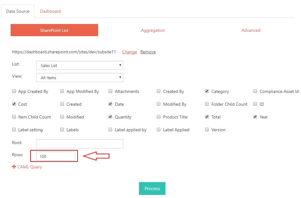
After selecting Site, List and View, column selection will be applied automatically. You don’t need to change much on this screen, but I would keep close attention to the amount of Rows you need to select, this needs to be entered manually. It can be higher than total amount of Rows, but if it is lower, only some will be loaded. Other than that, you can remove selection from columns you don’t need in your chart. You can also edit CAML query to apply filtering to selected Rows. For example, select only ones with specific Category or use any other criteria. Read more about CAML queries here. We will skip Aggregation and Advanced tabs for this specific Chart, as it is fairly simple and we don’t need to change anything in these tabs. Press Process after making all the necessary alterations in Data Source section and if the logger doesn’t give you any error, your data should be ready to be used in a chart. Next, we go to Dashboard Section:
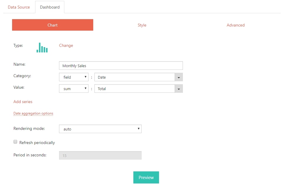
Here, we need to change a few things:
- First, select Column chart Type.
- Then, remove unnecessary Series if you have any.
- In the existing Series, enter custom Namefor the Series, in my case “Monthly Sales”.
- In Category select “Field” and “Date”, to separate each column by date.
- Finally, Value should be a “Sum” of “Total” field, which represents total sales for each row.
One last thing that we need to change before building a chart is to expand Date aggregation options:

Select “months” as Unit and “1” as Step. Now, we can press Preview button and look at our chart:
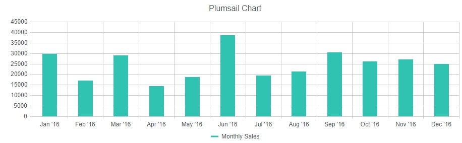
Once the chart is ready and you like the result, press Save button in the upper right corner and then the Close button next to it. It’s also very important to Apply changes to the Web Part, so the changes get saved to the page as well. Congratulations! Your chart is ready and displayed on the page. Now we can work on the next one.
Sales Pie Chart
Now, we can design a chart to visualize different types of sales with a Pie Chart. Most of configuration is the same, so you just need to add a new Charts Webpart and configure Data Source in the same way we previously did. The only change is in Aggregation tab:
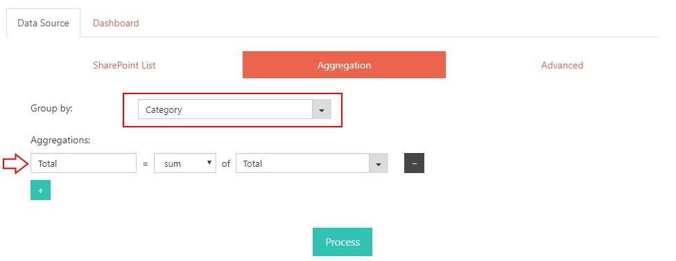
Here, we will need to group data by Category choice field. It has three options – Physical sales, Digital sales and Services. Then, we also create new Total field equal to the Sum of Total for each Category. Now, to Dashboard section Chart tab:
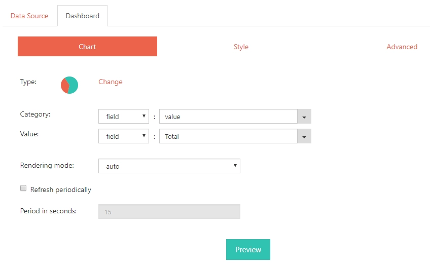
Here, just select Pie as Type. In Category, select “field” and “value”, in value, select “field” and newly created “Total” field. That’s enough. Finally, I want to add labels with Total value per Category to our chart. For that, I need to go to Style tab:
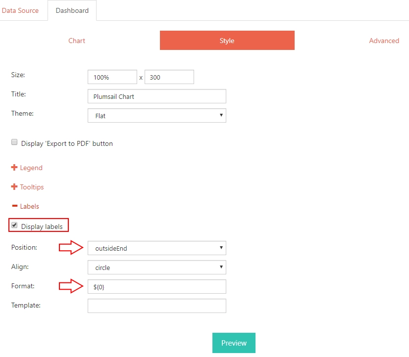
In style tab, I expand Labels section, select Display labels, Position – “Outside End” and I also add a dollar sign to the Format. I press Preview and get this result:

Second chart is ready!
Now it’s time to go to the third Chart.
Sales Line Chart
Finally, we’ll build a line chart that will show us how the sales changed for each Category throughout the year. Once again, we add another Charts Webpart and go to configuration. Similarly, we don’t need to change anything for SharePoint list, but there is something we need to configure in Aggregation in order to separate Sales by Categories:
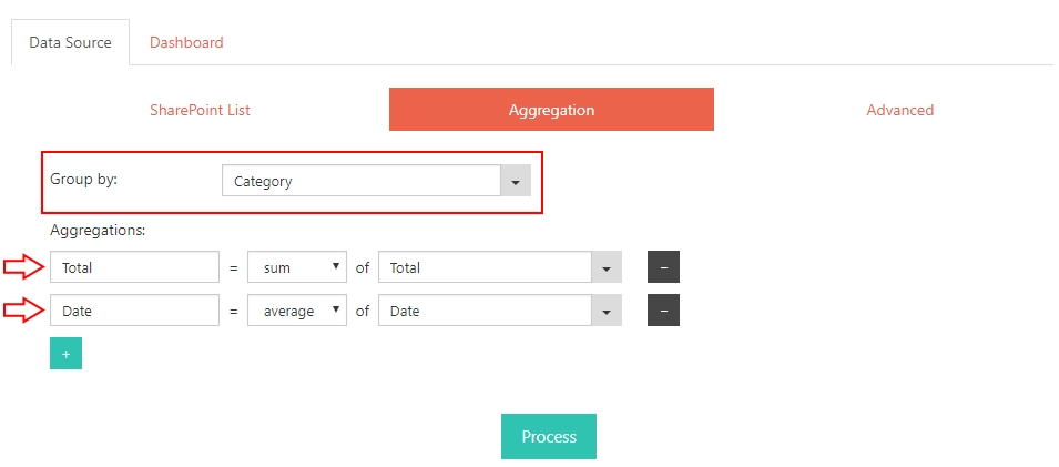
Once again, we group results by “Category”, but this time we add two new fields:
- Total – a sum of “Total”
- Date – an average of “Date”
This would allow us to display Line chart for each category with Dates and Total values. Now, we go to Dashboard Chart tab:
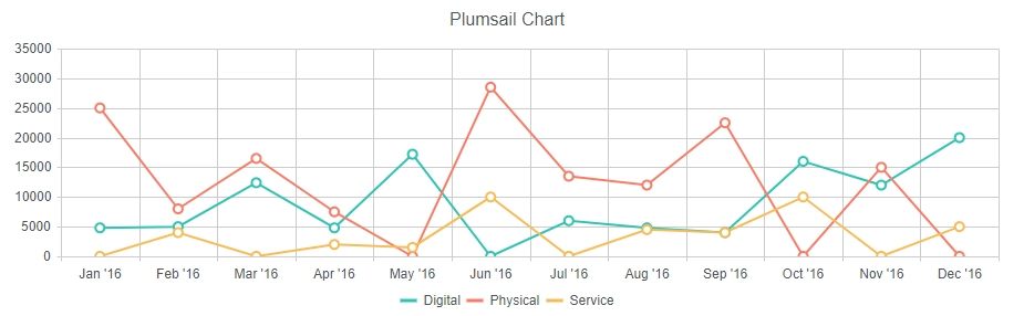
Here, we select Line as Type of the Chart. We also select to Display each group as a separate series in order to get three different, one for each Category. In Category, select “field” and “Date”. In Value, select “sum” and “Total”. Finally, in Date aggregation options, select Unit “Months” and Step “1”. Now, the chart can be built and we press Preview and get this result:
All three charts are built! Congratulations, you are victorious!
Hope you enjoyed this basic tutorial. You are now ready to design charts of any difficulty! Check out more advanced scenarios, such as CEO Dashboard, Sales Dashboard or Helpdesk Dashboard.