
Build Simple Charts – Helpdesk Tags (SharePoint)
Welcome to the third article in the series. If you haven’t yet, I strongly recommend you to check out our two previous articles – Sales Report (Basic) and Client Demographics (Advanced). In this article, we will work with Advanced sections and write some basic JavaScript, so it will be a little more challenging, but you should be ready by now, you’ve learned all the basics. Let’s say, we have our Plumsail Helpdesk set up. It already comes with a number of useful charts, but tags are not addressed in them. Plumsail Helpdesk has Tickets list where each Item (or ticket) can have multiple tags each, which we will visualize with these charts. You can use the same technique for your Plumsail Helpdesk instance or any other list with Multiple Choice Lookup field. Tags column is a Lookup column which allows multiple values. Such fields are not supported by Charts by default, but I will show you how you can access them and use them when building your own charts. I will also show you how to apply color to charts, especially to column chart and pie chart.
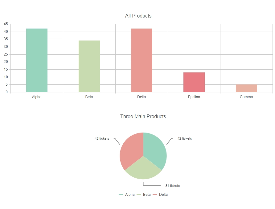
Tickets per tags (column chart)
On our first chart, let’s show total amount of tickets per every tag. First, as usual, we select site and list, increase amount of rows selected. But then, we go to Data Source -> Advanced tab and replace default handlers.requestSuccess with:
handlers.requestSuccess = function(data, logger) {
//here we will create new set of items
var items = [];
//we go through each item from the list
data.items.forEach(function(item) {
//if it has _Tags:
if (item._Tags) {
//for each tag:
item._Tags.forEach(function(tag) {
//we create new object and add it to our items:
items.push({
tag: tag.get_lookupValue(),
count: 1
});
});
}
});
//we replace default items with our items:
data.items = items;
return true;
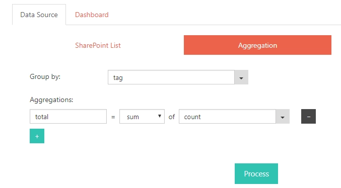
}So, what are we doing here? We have column Tags, why are we opening _Tags for some reason? The problem is that Charts doesn’t recognize all the values in the multiple values fields and Tags field only has first tag of the item. But there is another, hidden field named _Tags from which we can retrieve all the values for the item. That’s why we go through every item, check if it has any tags, go through all the tags and create a new item for every tag. We collect all these items and replace our data with them, as we only need to have these values. Once this code is added, we click Process. Now, we also can configure Aggregation to better separate the results. This needs to be done after processing the data, so we get access to the new items that we’ve created inside the code:
Click Process once again and let’s go to Dashboard -> Chart tab:
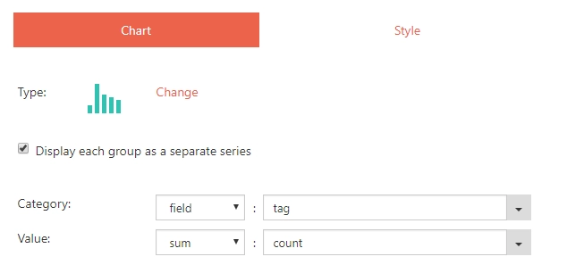
We select Column Chart Type, check Display each group as a separate series. In Category, we choose “field” – “tag” In Value, we choose “sum” – “count” We also go to Style tab, change Title and expand Legend to remove selection from Display legend as we do not need to display it, we have “tag” as our Category. Finally in Advanced section, we can add color to each series based on its name, with this code:
var handlers = {};
handlers.preRender = function(config, logger) {
    console.log('Configuration: ', config);
    var colors = {'Alpha': '#97d5be', 'Beta': '#cbdab0', 'Gamma': '#eeb2a5', 'Delta': '#ee9994', 'Epsilon': '#ee7a83'};
    config.series.forEach(function(item){
        item.color = colors[item.name];
    });
    return true;
}
I click Preview and here’s the result:

Tickets per subset of tags (pie chart)
But what if we do not need all the tags? In this chart, I will limit selection to the three of the most popular tags – Alpha, Beta and Delta. How can this be done? Very simple! We start the same way, add another Web part, select site and list, expand amount of rows and go to Data Source -> Advanced tab and replace default handlers.requestSuccess with:
handlers.requestSuccess = function(data, logger) {
    var items = [];

    data.items.forEach(function(item) {
        if (item._Tags) {
        item._Tags.forEach(function(tag) {
            var product = tag.get_lookupValue();
            if (product == 'Alpha' || product == 'Beta' || product == 'Delta'){
            items.push({
                tag: product,
                count: 1
            });
            }
        });
        }
    });

    data.items = items;
    return true;
}
It’s the same code as before, but this time we only select three main tags and ignore all the others. We click Process and go to Aggregation tab:
Selection here is the same, but this time we will use the new field. Click Process once again and we now go to Dashboard section:

- Select Pie Chart Type
- Category – “field” : “value”
- Value – “field” : “total”
- In Value, select "sum" - "Revenue"
Now, in Style tab, we also change Title and expand Label, select Display labels, Position – outsideEnd, Format: {0} tickets Finally, in Dashboard Advanced section we use the following code to add color to the chart:
var handlers = {};
handlers.preRender = function(config, logger) {
    console.log('Configuration: ', config);
    var colors = {'Alpha': '#97d5be', 'Beta': '#cbdab0', 'Delta': '#ee9994'};
    config.series[0].data.forEach(function(tag){
        tag.color = colors[tag.value];
    });
    return true;
}
I click Preview once again and here’s the final result:

Hope you enjoyed another one of our tutorials, this one is a little more advanced. You are now almost a Pro with Charts! Check out even more advanced scenarios, such as Configure aggregation and sorting, Use multiple lists in Charts or Navigate over data by using draggable charts.