
Build Simple Charts – Client Demographics (SharePoint)
Continuing with our introduction articles for Charts, we want to show you how you can work with a list of people. If you haven’t seen our first article Build Simple Charts – Sales Report (SharePoint), we recommend you to check it out as well! We’ll build three charts based on Client Demographics list and with this knowledge, you’ll be able to design similar and even more complex charts based on your needs. Let’s get started!
SharePoint List – Client Demographics
My list is fairly simple, the company keeps track of all its clients, their age, gender, country of living and amount of revenue brought by the client:
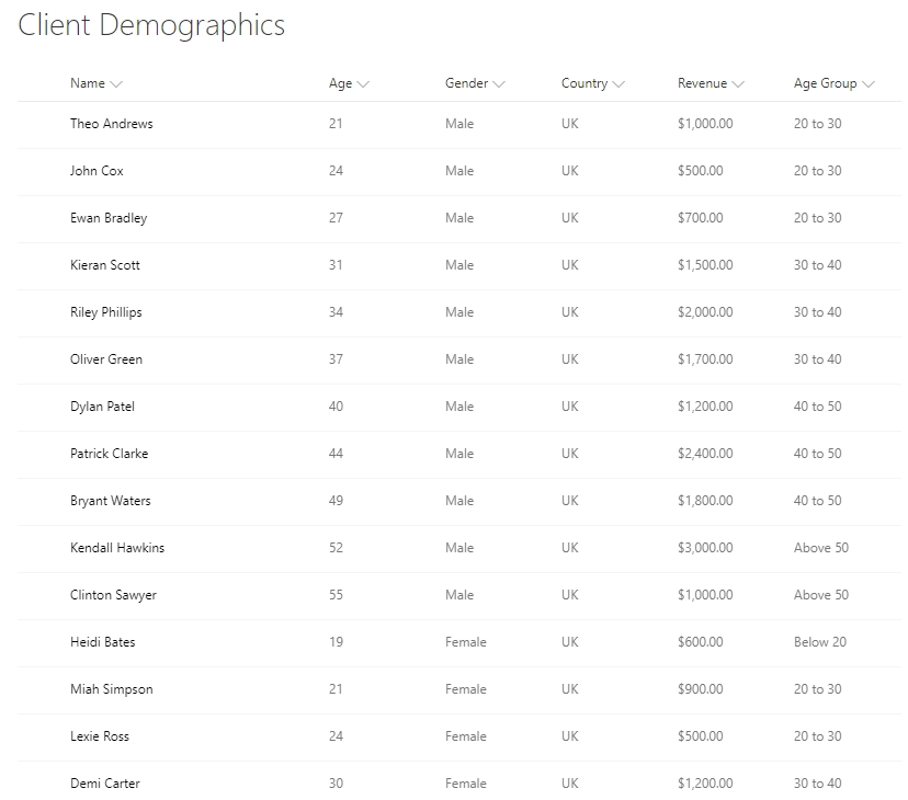
Most columns are fairly straightforward, Title is replaced with client’s Name(obviously, fake!), we also have numeric Age field, Gender choice field, Country field and Revenue field. The Age Group field is slightly more complex, it’s a Calculated it takes the age of the person and based on its value assigns a particular age group. I’ve used this formula to build Age Group Calculated Column:
=IF(Age<20,"Below 20",IF(AND(Age>=20,Age<30),"20 to 30",IF(AND(Age>=30,Age<40),"30 to 40",IF(AND(Age>=40,Age<50),"40 to 50","Above 50"))))
Demographics Column Chart
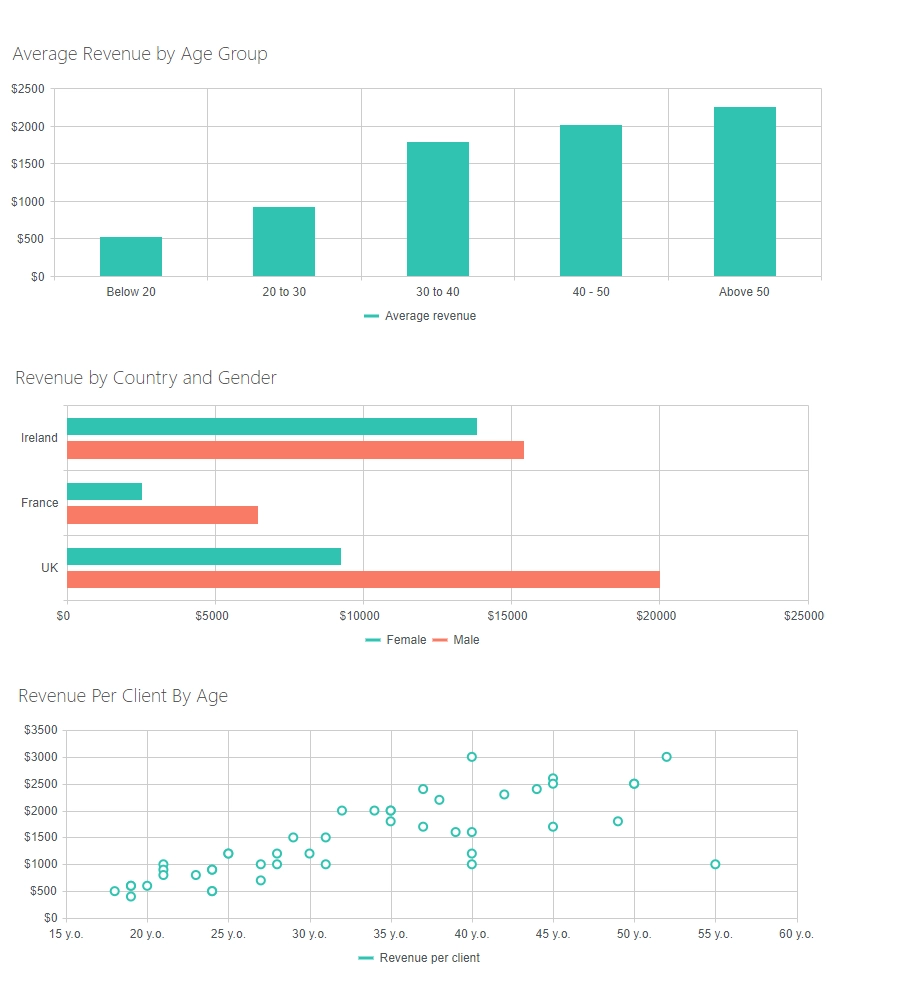
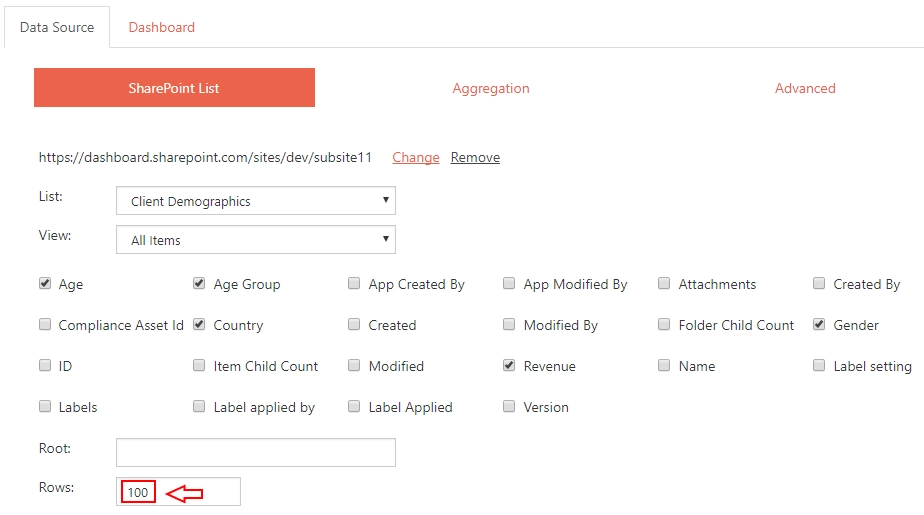
Our first chart will be very simple to create - it will be a column chart which represent average revenue from a client in each Age Group. As usually, we add Charts Web Part to the page and open its configuration. In Data Source, we select our list and expand amount of Rows:
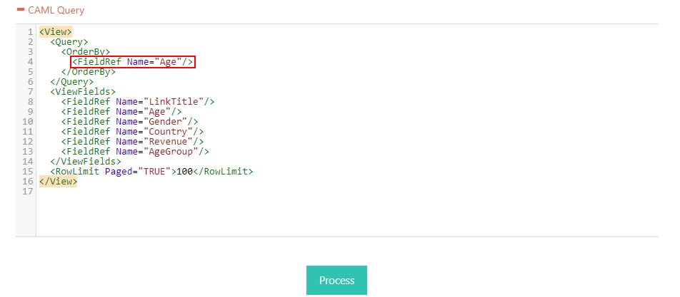
One extra thing that we will configure is the CAML Query, since we want results ordered by Age. Simply replace ID with Age in OrderBy tag:
Click Process, make sure there are no errors and let's move to Dashboard section:
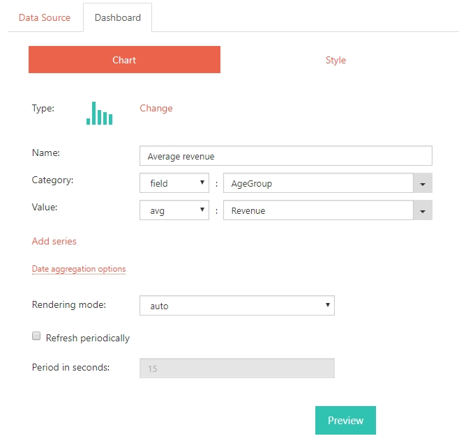
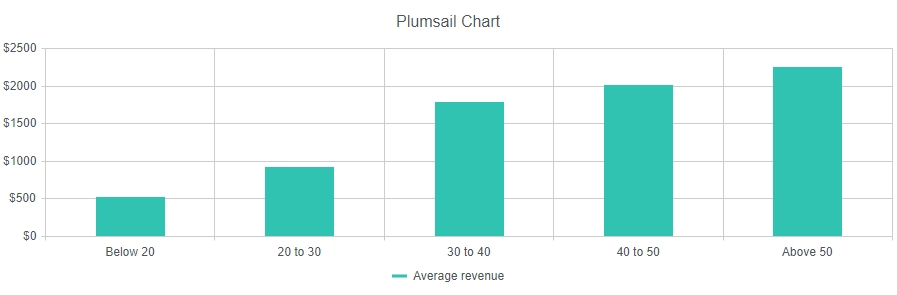
Here we select Column Chart Type. We can give Name to our series, but since we have only one, this is optional. For Category, I select "field" - "Age Group", and for Value, I select "avg" - "Revenue" to get the average revenue. We can also go to Style tab, expand Value axis and set Label format: ${0} Now, I click Preview and get the following Chart:
One done, two to go! Next up is a bar chart.
Demographics Bar Chart
We have information about gender and country of living of our customers, so let's utilize it. We add another Charts Webpart, configure Data Source SharePoint List the same way, but this time we can leave the CAML Query alone. Instead we need to go to Aggregation tab and select Group by: "Gender":

No extra fields required, just click Process. Now, we move to Dashboard section Chart tab:
A few things here:
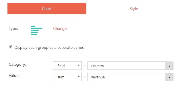
- Select Bar Chart Type
- Check Display each group as a separate series
- In Category, select "field" - "Country"
- In Value, select "sum" - "Revenue"
We can also go to Style tab, expand Value axis and set Label format: This will add a dollar sign to revenue, though this is fully optional. Click Preview to get this result:

Two charts! We are on a roll! Scatter chart coming next.
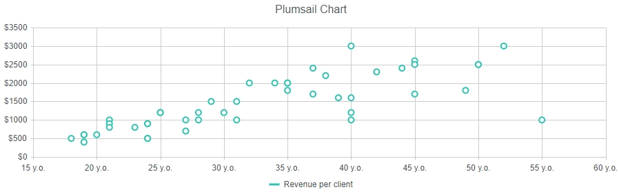
Demographics Scatter Chart
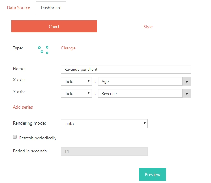
Finally, we can get an even better understanding on amount of Revenue brought by each client and overall stats with scatter chart which allows us to visualize spending habits of every single client. Let's add another Charts Web Part to the page and go to configuration. Data Source configuration is similar to two previous ones, but here we don't need to neither edit the CAML query or use Aggregation. Simply select the list, expand amount of Rows and that's it. Don't forget to Process the data! Now we move to Dashboard section Chart tab:
Once again, we follow these steps:
- Select Scatter Chart Type
- In X-Axis, select "field" - "Age"
- In Y-Axis, select "field" - "Revenue"
We also need to tweak a couple of things in Style tab: In order to make Age more readable, let's open X-Axis and set Label Format: {0} y.o. We can also remove empty section from 0 to 15 years, since there are no customers of this age, by setting Boundaries(Min): 15 Expand Y-Axis and set Label format: ${0} (optional) Finally, click Preview to get this result:
All charts are built! Hurray!
Hope you enjoyed another one of our basic tutorials. You are now even more prepared to build charts like a Pro! Check out more advanced scenarios, such as Project Dashboard or a Live Voting Chart.