
Add more series to a SharePoint Chart with Charts
Adding more series to a SharePoint Chart with Charts
SharePoint Charts as of version 2.6.0 has the ability to display a practically unlimited number of series on one graph. Such series may be based on entirely different list columns or may have, say, a common category but separate value fields.
Let’s take a look at an example.
Producing totals for multiple columns
Say, you have a table like this one:
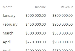
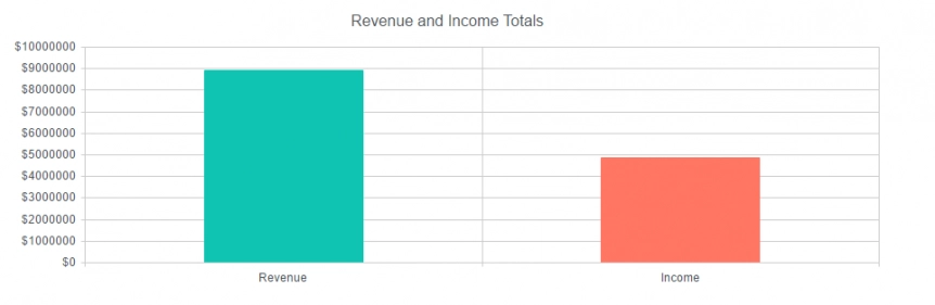
And you want to produce totals for the income and the revenue columns over all entities:
For this you will need to perform the following configuration steps in Charts:
- Retrieve data from your SharePoint list in Data Source → SharePoint list
- Clear the Group By column in Data Source → Aggregation
- Click Process
- In Dashboard → Chart your configuration will need to look like this:
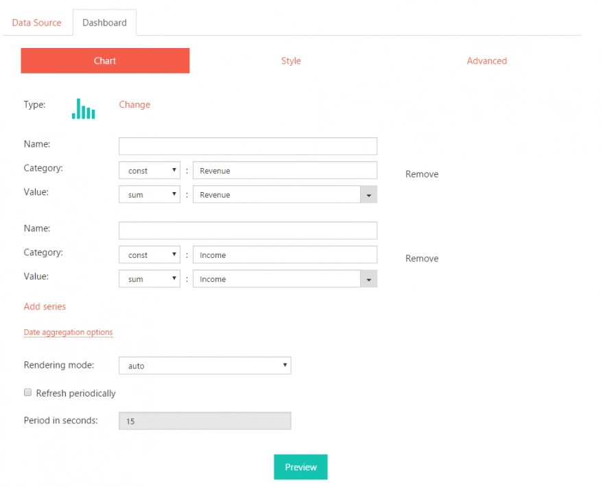
The picture is self-explanatory, however a couple of things to note:
- We’ve introduced a little dropdown box for every series field: it lists values like ‘const’, ‘field’, ‘sum’ and others. It is nothing more than either an aggregate function you can use on the field, the value of the field itself (the ‘field’ option) or an arbitrary constant value (the ‘const’ option). In our example all we did was create two categories: ‘Revenue’ and ‘Income’ (‘const’ fields). And used real list columns (called also ‘Revenue’ and ‘Income’) together with the ‘sum’ aggregate function to sum everything we have retrieved from the list.
- We’ve added the second series via the ‘Add series’ button, it can be used to add any amount of series – and you also have your Remove button to remove any series up until the last one.
Producing totals for multiple columns based on another column
So, what if we wanted to calculate total revenue and total income for each month from our sample data above?
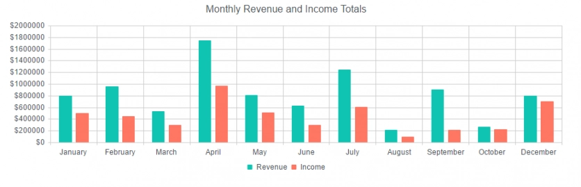
Our steps will be exactly the same as in the previous example, except our chart configuration page will look a little different:
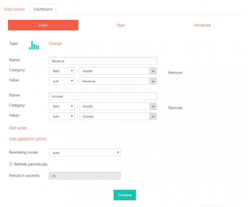
The only difference here is that we’re using real fields for categories instead of constant values (instead of ‘const’ in the Category dropdowns we have ‘field’ – so, instead of manually entered ‘Revenue’ and ‘Income’ categories we get real values from the Month list column).
Counting entries in multiple columns
And now let us do a slight variation on the previous example. For our sample data we’ll use a customer satisfaction survey list with three single-choice questions:
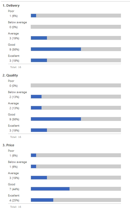
The above is a standard SharePoint graphical summary of our survey.
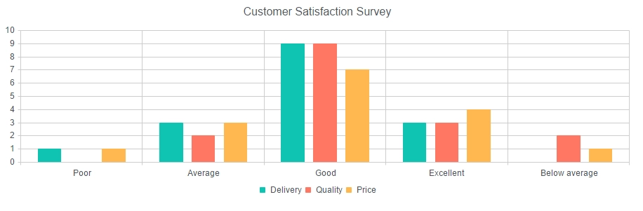
And our chart will look like this:
And this is out Chart configuration tab:
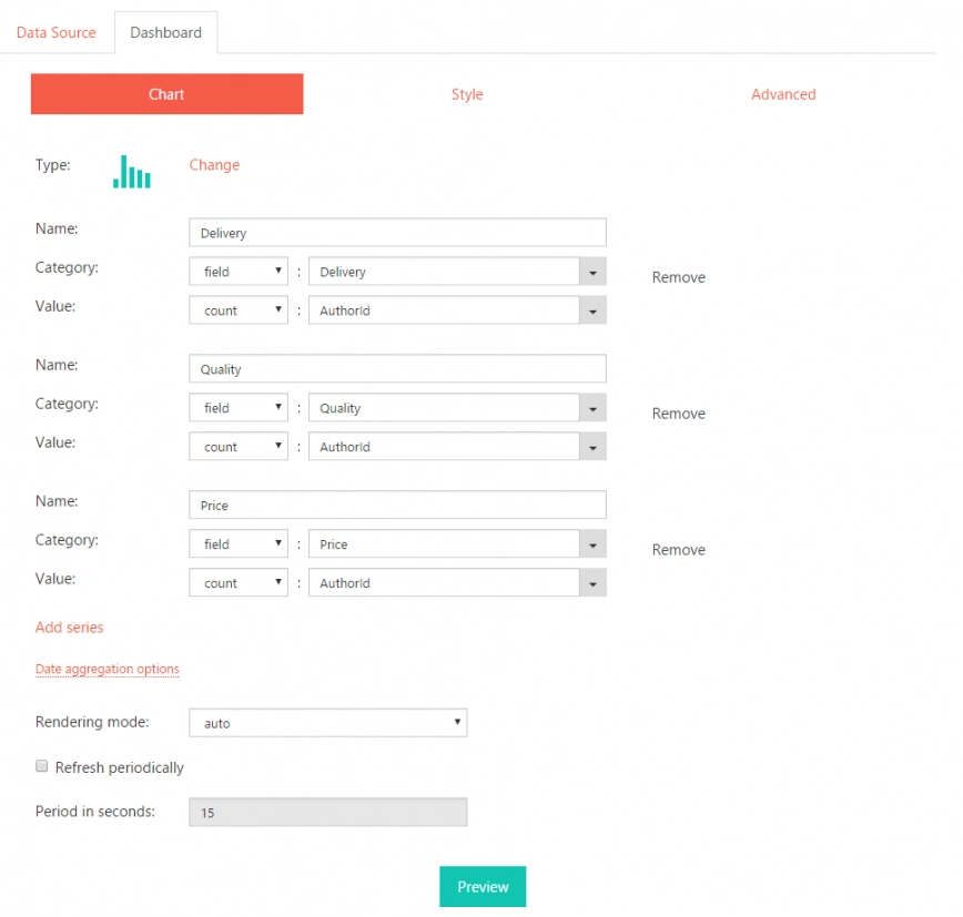
The idea here is straightforward:
- Three series.
- Name attribute is set. The name attribute is simple text that is displayed as the chart’s legend.
- ‘count’ function counts the number of occurrences of AuthorID (it can be any field really – we use this to count the number of entities).