
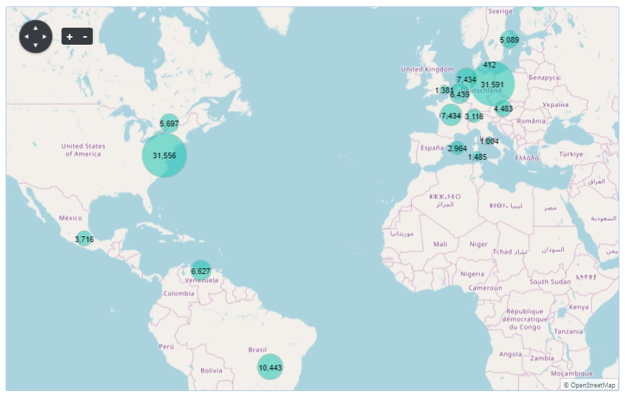
Bubbles on a map
Dashboard
Data
Configuration
Revenue per Country
Displays revenue aggregation by country as bubbles on the map.
Data Source
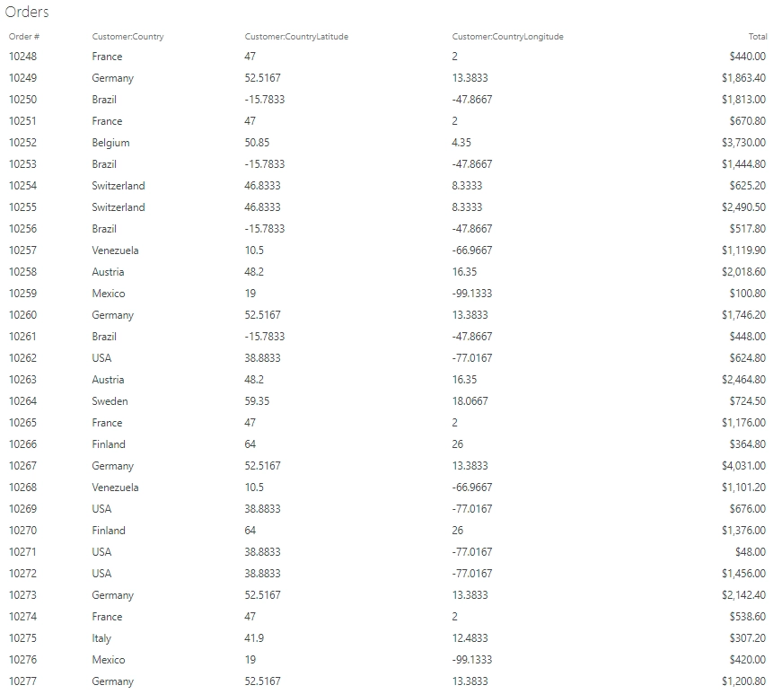
SharePoint List
List: Orders
Fields: Total, Customer:Country, Customer:CountryLongitude, Customer:CountryLatitude
Rows: 2000Aggregation:
Group by: locationAs you can see the location field doesn’t exists in the data source. We assign it in the JavaScript code in the advanced panel (see below).
Aggregations:
Total = sum of Total
Latitude = min of Customer:CountryLatitude
Longitude = min of Customer:CountryLongitude
Country = min of Customer:CountryAdvanced:
var handlers = {};
handlers.requestSuccess = function(data, logger) {
$.each(data.items, function() {
    this.location = this.Customer_x003a_CountryLatitude + '_' + this.Customer_x003a_CountryLongitude;
})
return true;
}
This bit of code is used to assign the location field that is used as a group by value. The location field has the format of CountryLatitude_CountryLongitude.
Dashboard
Chart
Type: Map with bubbles
Latitude: Latitude
Longitude: Longitude
Value: TotalStyle
Size: 100% x 600Width x height dimensions of the map. Default units is px.