Forms
Apr 20, 2022
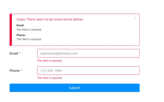
Field validation for online forms
Popular use cases of how to validate a particular field in a web form.

According to Statista, in 2022, over 60 percent of the global internet population uses a mobile device to go online. This number will only get bigger in the future. And that's why we came up with some tips how to adapt to this trend and design mobile-friendly forms for your website.
In 2022, the number of unique mobile internet users stood at five billion, indicating that over 60 percent of the global internet population uses a mobile device to go online.
Everyone will agree that your website, the content, and the online forms must be mobile-friendly for better business performance. Our team at Plumsail understands that need, and our product Plumsail Public Web Forms are responsive and mobile-friendly by default. Yet, in some cases, it's a good idea to create a unique layout for a mobile device to increase mobile conversions and produce a better mobile user experience.
We put together essential best practices on how to design mobile-friendly forms and increase the conversion rate. These are our tips:
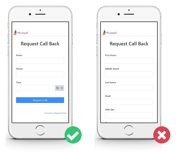
Reduce the number of fields in the form. Remember that people use smartphones and tablets on the go. Users want to get work done quickly, and they're likely to be scared off by a large, cluttered form.
Make sure you ask for the information that you really need. Decreasing the number of fields on the form enhances conversion rate and improves user experience.
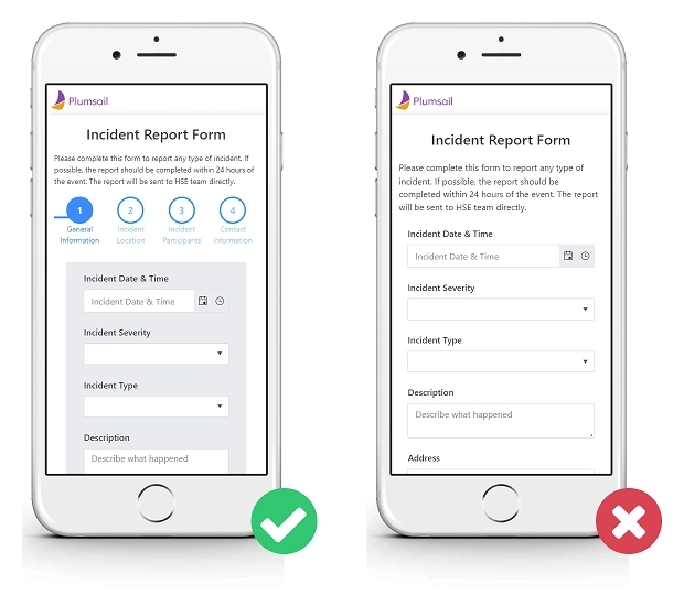
If there is no way to narrow down the number of fields, you should consider creating a multi-step form.
In Plumsail Forms, you can add the Wizard container to group related fields into logical steps. The step indicator at the top of the form will give users an idea of what information they need to fill out and how much time they need to spend.
Depending on what type of information you need, there are various types of fields — text fields, number fields, date & time fields, dropdowns, checkboxes, radio buttons, and others.
Your main goal is to make data entry for users as easy as possible.
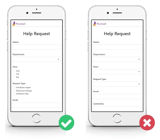
For example, if you have a list of predefined options, you can choose between a dropdown, radio buttons, and checkboxes. When using the dropdown, users have to double-tap to complete the field: open the list of options and select the option. If there are less than 6 options in the list, use checkboxes or radio buttons instead. This way, users complete the field in one touch.
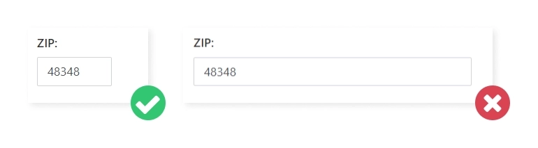
The length of the input also matters. Set the input length for fields that have a defined character count like quantity, zip codes, etc.
You can pre-fill some fields for the user, which will make filling out the form faster and more accurate.
For example, populate the call-back date. That saves users' time and avoids selecting dates in the past.
But use default values with caution, as users tend to leave pre-selected fields in forms as they are.
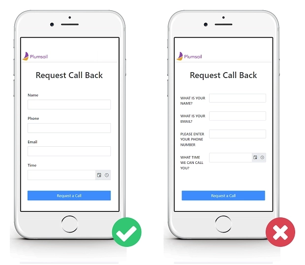
A clear field title that tells the purpose of the field helps users quickly scan the form.
Keep these simple rules in mind when choosing the field title:
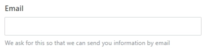
If there is a need to give users more information about what information and why they should provide it, add a description to the field. It will be visible while users are typing and will guide them.
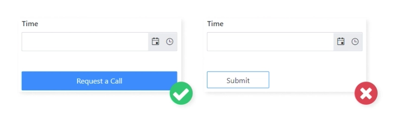
The most important button on the form is the Submit button.
Here are some must-dos for you to design better mobile-friendly forms:
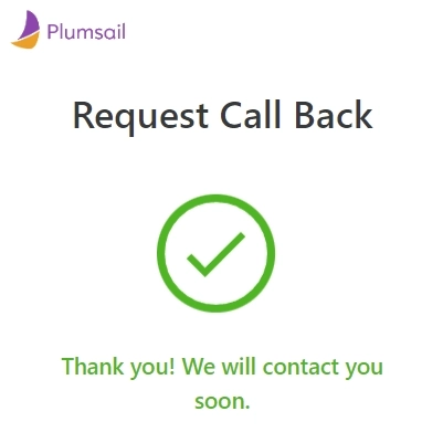
After a user has completed all fields and clicked the submit button, indicate that the submission is successful and their data is sent. In Plumsail Forms, you can enter the text to display on the form submission and choose either to hide the form or not.
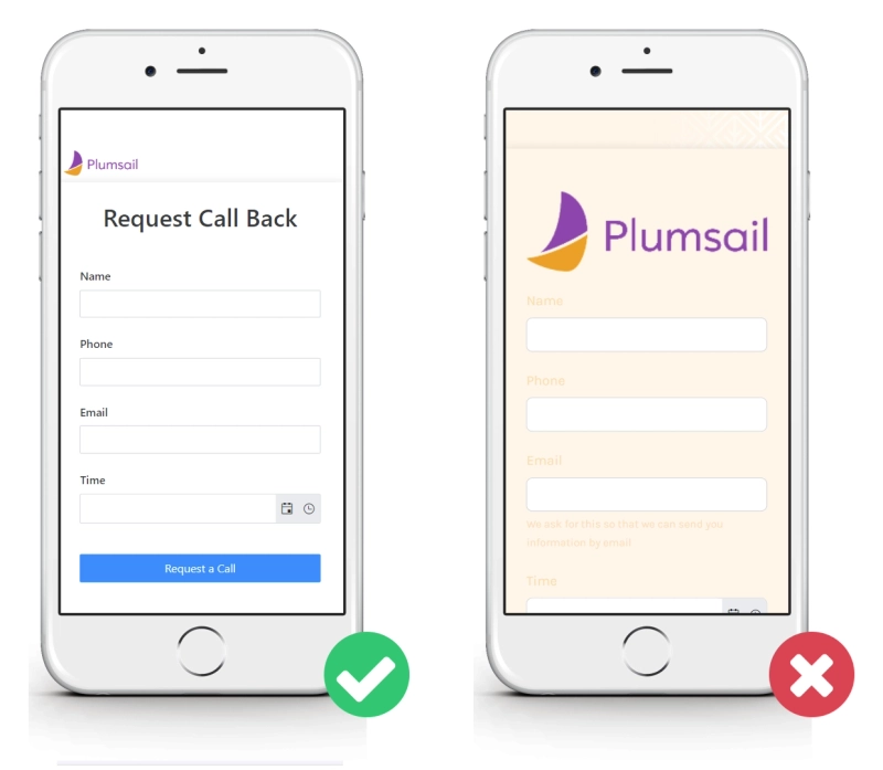
You can brand your form in various ways: define a primary and background color, choose a font, and add a logo. But don't forget that the form must be easy to read and load quickly.
It's a terrible idea to choose a font color that doesn't contrast with the background and add large pictures that load slowly on mobile devices.
If you follow these simple suggestions when designing your mobile forms, you will increase the usability of mobile forms, build positive relationships with your users and increase conversion rates.
Put these tips into practice today. Create a Plumsail account and design a mobile-friendly form for your business needs.
Popular use cases of how to validate a particular field in a web form.
Public web forms for all your needs built quickly online
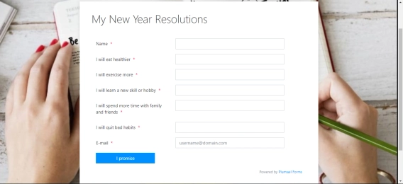
Fill in the Public Web Form to receive New Year’s Resolutions list in a DOCX format by email.