Does your organization need to visualize data from SharePoint Lists and Libraries? There are many solutions on the market, but if you are looking for an alternative which won’t hurt the budget, and still produce awesome results — look no further.
Our Dashboard Designer product allows you to build all types of charts and graphs — such as Line chart, Column chart, Bar chart, Bullet chart, Pie chart, Radar, Scatter, Map with markers or bubbles, and many other types. It supports Aggregation, using multiple lists from different sites, linking charts to lists and other charts, and much more.
In this article, I will show you examples of charts that you can easily build by following introductory articles on our site. Starting with simple Sales charts, all the way to Maps built in real time using Google Maps Geocoding API.
Sales Charts
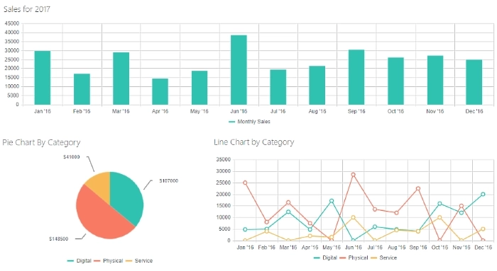
Our first example is three sales charts built from a very simple list of sales. Each sale is a SharePoint item and contains information about each transaction.
Column Chart shows how many total sales have been made during a particular month. Same can be done by day, or by week, or even year — you can choose how big a step should be between each column.
Pie Chart, on the other hand, doesn’t have any dates but shows overall sales grouped by Category. Aggregation is done in one simple step and allows us to see how much money each category has brought.
Line Chart is very similar to the first Column Chart, but instead of simply showing monthly sales, it’s also grouped by category, so we can see how much money has been made for a particular category in each month. This is just an example, same data can be visualized with Column Chart as well, showing three columns per month instead or by stacking columns together.
This is a very basic example, no coding is needed here. If you want to see how to build these charts, check out our step-by-step article about it here.
Demographics Charts
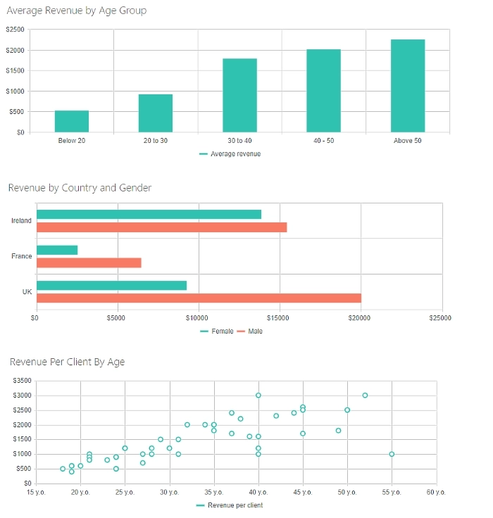
Here you can see how demographics can be visualized as well. In this case, we are using Client Demographics and see how much revenue is brought by each group, but these charts can be used in all sorts of situations — from public polls to deep market research.
Column Chart, in this case, is used to represent average Revenue brought by the customers of each age group. This chart clearly shows how the Revenue brought clearly increases with Age.
Bar Chart, on the other hand, provides information based on Country and Gender, we can clearly see that there is a difference in the dynamic in Ireland where both genders bring almost the same amount of Revenue to the company.
Finally, Scatter chart shows information on each individual client and is a great way to represent the demographics overall. We can clearly see outliers here and there, but the overall picture is clear.
All these charts are built without any extra code needed — the only exception is the calculated field. You can find all the information on how to build these in our article here.
Helpdesk Tags Charts
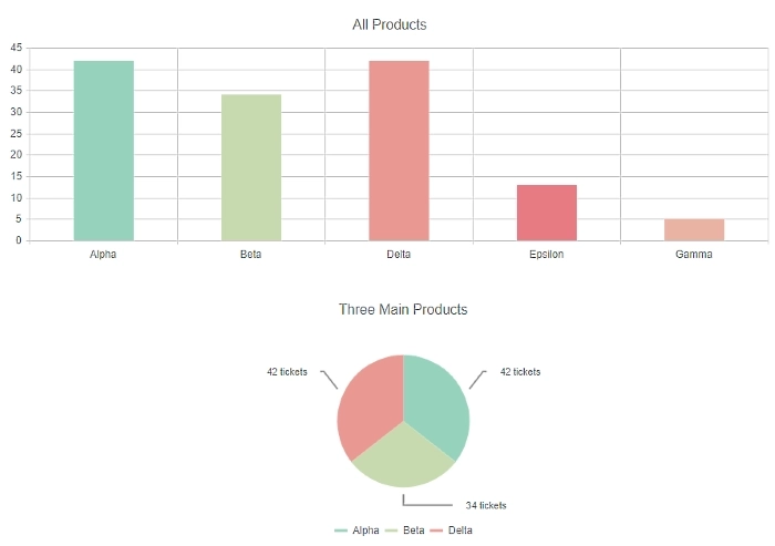
Our third example looks fairly simple, after all, you’ve already seen both the column chart and the pie chart. But in this case, we are starting to use JavaScript to work with even more complex fields.
These charts are based on our Helpdesk product where all customer requests are created in the SharePoint List of Tickets. All tickets have tags which you can add to them, for example, questions related to specific products. The trick is that Tags field is a Lookup field with Multiple selection options.
In this article, we show how a little bit of JavaScript code can be used to work even with more complex SharePoint Fields. It also shows how you can apply custom colors to series on your charts.
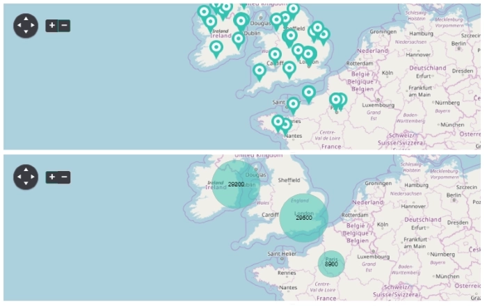
Map charts with Geocoding API
Final example I am going to show is the maps that you can build. These charts require latitude and longitude to position markers and bubbles correctly, but if you don’t have that information included in the list, it’s possible to make requests to a public Geocoding API, such as Google Maps Geocoding API.
Now, the number of requests you need to make and your quota will make a difference here when you build these charts, but it’s absolutely possible to get real-time data each time you open the chart in SharePoint. It will update with all the latest added items and you will get the real-time picture at all times.
Read here about setting it up and configuring the maps. You will also need to have an API key for the public API you are planning to use.
Hope this article will show you something that you can use in your own projects, but if you haven’t found an example here, check out our website for more information and examples.