
On-site construction forms with Dynamics 365 integration using Plumsail Forms
How LDD Construction Ltd operatives use Plumsail forms on-site to record daily works, with direct integration and data loading from Dynamics 365.
This business case was described to us by developers at LDD Construction Ltd and showcases real-life use of Plumsail Forms on-site and Documents in Power Automate flow for construction daily report automation.
In this article
We've faced many challenges before adopting Plumsail Forms and Plumsail Documents into our workflow, mainly:
Our company-wide goal is to use less paper. Using less paper can have several positive environmental impacts, contributing to the well-being of the planet. Promoting a shift towards digital alternatives, implementing paperless practices, and encouraging responsible paper consumption can all contribute to the overall conservation of natural resources, reduction of pollution, and protection of the environment.
Paper worksheets required manual handling and storage, making it difficult to efficiently organize and manage data. Retrieving specific information or generating reports from paper-based records introduced unwanted, additional steps that were time-consuming but inevitable.
As is often the case with hand-written documents, the illegibility of written words caused delays and postponed proceedings. We would again need to contact operatives to enquire about works carried out which often leads to us doubling our workload. Sometimes the paper worksheets caused more issues than they solved.
The condition of our worksheets — some of which were creased or stained — made us look unprofessional. These documents were sometimes difficult to read and comprehend, which hindered effective communication and understanding amongst our staff and with our clients. This led to misunderstandings, errors, or delays in decision-making processes.
Collecting our worksheets through various avenues meant that a lot of additional work was needed to keep track of which of our operatives had submitted worksheets and which had not. It was often inconvenient for our operatives to drive to the office and hand their worksheets in. In addition, sometimes we had photos of worksheets sent by text, WhatsApp, and email to multiple in-office staff, which again made it confusing and difficult to keep track of them all. The quality of these photos would render the worksheets useless, as they were too poorly lit or blurry for anyone to read and understand them.
Sometimes operatives would forget to send us their worksheets or would send/bring them days later. This often would cause delays and postpone all following procedures that needed to be done such as costs and takeoffs.
We had paper worksheets missing which required us to contact our operatives on site and chase these up. Redoing sheets at a later date meant that the information could contain errors which in turn would lead to errors in scheduling and pricing. Missing worksheets led to delays in other areas of the business — such as estimating/costing, quantity takeoff, quality control, etc. — which affected submittals and documentation.
When we updated the paper worksheet templates to include extra fields or additional bits of information, it was a job onto itself to get everybody to use the new version of the worksheets, as people needed to be informed and instructed on the newly updated sheets. What would often happen is that we would have people returning from holiday, and they would continue to use the old sheets unaware of the change. This led to additional work and time spent communicating changes and tracking that people are using the new format.
It was inconvenient carrying around paper worksheets, especially for the operatives who work on multiple sites or move between locations. These sheets had to be kept as immaculately clean as possible which most of the time was not reasonable to ask for from our operatives.
All of these problems made us consider looking for a modern alternative, which we've found in Plumsail products.
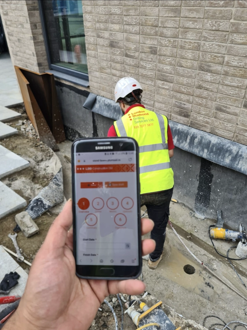
Company's operatives are filling out the worksheets directly on site
And after some Power Automate and Plumsail Documents magic running behind the scenes in an automatic flow, the company gets ready to use PDF files:
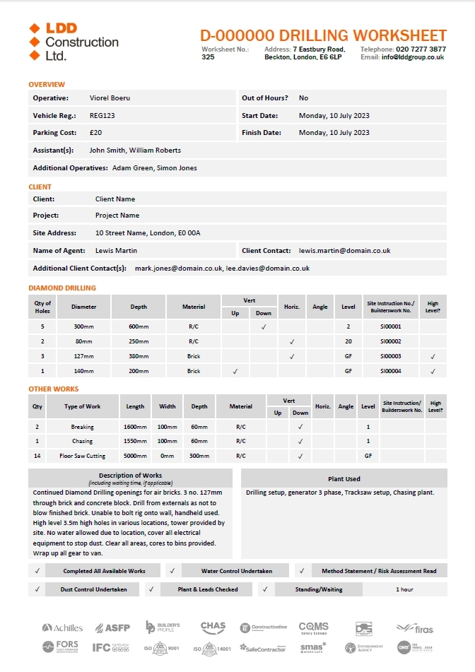
Final PDF generated automatically in Power Automate
This new workflow was welcomed by all of the involved agents:
"Now it’s so much easier to update our forms and have everyone use the same, most up-to-date version, compared to before how we weren’t even updating the form because of the havoc it would create. It takes a couple of clicks and we know for sure that everyone is providing us with the exact data we need."
"We can much more easily reinforce the reporting of specific information by just adding a few extra fields and making them mandatory, whereas with a piece of paper, people can really just pick and choose what they fill in and what they don’t. Limiting fields to specific inputs is also useful. Where we ask for specific start and finish times, our operatives now need to report them as accurately as possible and they’re much more accountable for the information that they report."
"Having these forms and this system helps us massively from a reporting standpoint, both internally and in relation to our clients. We know with certainty that when a form is submitted, everybody is informed of every detail of our work. Everybody is on the same page. Everybody is immediately informed when works are done and when our client’s representative has approved our works. It saves us a lot of time from having to cross-reference worksheets with actual work, and approvals from clients. It’s all beautifully packaged together, in one place, and it’s distributed to all involved parties."
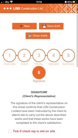
The form was designed specifically with hand-held devices in mind:
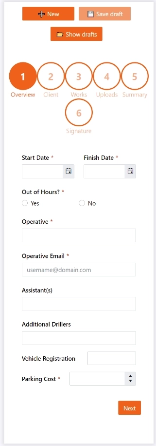
How the form looks on mobile device
Visible on every step of the form. Users can choose at any time to save a copy of all the data they entered on the form and return to it at a later time. Every piece of data is remembered, including data entered in any of our DataTables, signatures, photos & attachments uploaded, any costs associated, etc.
We've divided our form into multiple steps so it’s easier to fill in, understand, and be able to quickly find specific parts of the form. Dividing our form into 6 steps enables us to build a form that is perceived as easier to fill in, than it would have been if all the fields were on one step/page.
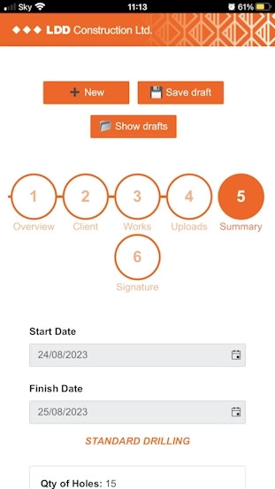
Dividing the form into multiple steps also allowed us to separate the fields that our operatives fill in from the summary and signature steps that are meant for our client’s representative on our various construction sites. On the summary step, the client’s representative is shown only the data that is relevant to them, therefore eliminating the need to jump between fields and not being able to get an overview of what’s important for them.
Our form contains some hidden fields that get revealed upon user input. For example, when users select Yes for the Out of Hours question, two additional fields show underneath asking them for specific start and finish times. On other steps, we’ve simplified filling in some of the more detailed yet important details by having them auto-filled from our Dynamics 365 system.
We use our in-house project numbering system to trigger to rest of the needed information onto the form, saving our workers on site from having to manually type in each detail. Some of these details are extremely important such as our client contact, which if typed in wrong or left blank will result in lots more manual work, double-checking and backtracking. This being automatically filled in, we can rest assured that our clients’ contact details are accurate and that they will get a copy of the submission.
Users on-site and in the offices both have appreciated the change from paper to mobile devices:
"We’ve solved the issue of having to decipher people’s handwriting. Now everyone can read and understand with accuracy all our work reports, whereas before it sometimes required us to contact the person that submitted the paper worksheet for clarification."
"It’s so much faster doing the worksheets on my phone than it ever was doing them by hand."
"I’m not very tech savvy and I worried I wouldn’t be able to submit digital worksheets. It turned out to be way easier than I thought and it’s become second nature after 2 or 3 attempts."
Like any task, implementing such a system was not without challenges, which we'll describe for you in this article.
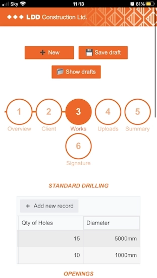
Tables were initially difficult to fill in on mobile as they required users to tap, fill in, then scroll to the right, and repeat the process for every column. Sometimes after filling in a field, the table would jump you to the first field, which meant that now you lost where you were at with the table and needed to scroll back to the right to continue filling in the table.
I spoke to the support team and gave them my opinion of how it should work. The developers got to work and amended the Data Table functionality according to my suggestions and their expertise. The result was better than I expected. Now, when users go to create a new row, they get a popup of all the fields displayed in a vertical layout, which is much easier to fill in.
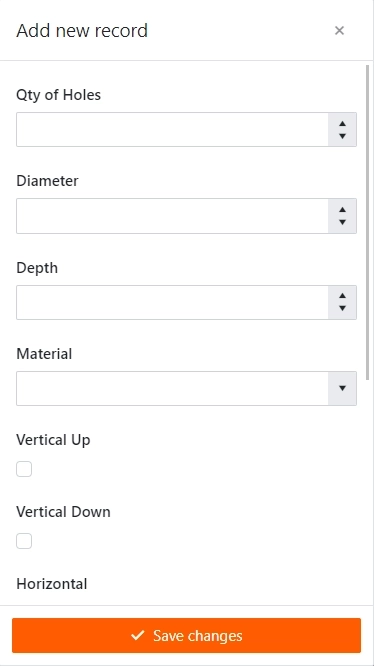
How records are added on mobile
Users were required to fill in every field on the form manually. Certain fields required them to fill in information about the project, some of which they didn’t have; other information needed to be copied from job sheets given to them before the start of the job.
Since we already hold a lot of our projects’ & clients’ information within Dynamics365, we connected it to Plumsail, so now users only need to type in the project number, and every other information about the projects gets automatically populated on their behalf straight from our Dynamics365 database.
Firstly, we told Plumsail how we envisioned it all to work: the user fills in the job number, and the next fields get auto-populated from Dynamics365. We gave Plumsail temporary access to our Dynamics365 system.
Then we joined a Zoom meeting where they set up an Azure connection to facilitate the data transfer. Plumsail returned a few weeks later with a demo which worked exactly as we described. We then asked for a few additions which they rapidly implemented.
Then they assisted once again through Zoom to connect our actual form to Dynamics365. It worked like a charm!
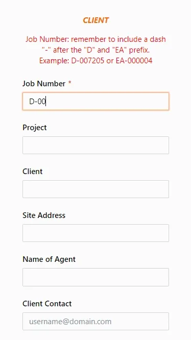
Data is loaded dynamically from Dynamics365
There are situations where our operatives needed to fill in a form, but could not submit it then and there due to incomplete data. It made perfect sense to integrate a drafts functionality where users can fill in a form as much as they could then save the form and continue it at a later time. We took it one step further and thought it might be a good idea to allow users to save multiple drafts, in case they ever need to do so.
We started off outlining our requirements in an email, the reasons for the implementation, and how we would see it work. Within no time they returned a demo which we tested and worked from the get go. Now we were able to fill in a form, save it as a draft and return to it at a later time to either submit it or update the details and resave the draft. With this draft functionality, we can easily differentiate between them as each is named in the following format: date, time, job number, project name. There’s no problem in returning to a draft or saving a draft, and all the information users have previously entered is still there: dates, amounts, tables, photos, signatures, etc.
We couldn’t be more grateful!
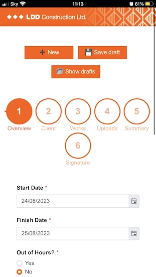
The form was incredible, but the look of it wasn’t on brand. We used orange as our accent colour, but everything in the form was blue. We wanted it to be more on-brand, adding in our exact orange and our logo.
This was exceptionally easy to amend but I totally missed the Theme Settings tab in the Plumsail Forms editor. Plumsail replied to my email with screenshots and explained how I can use any of the present theme templates and how I can create my own custom theme. So that’s what we did. We replaced the default blue with our branded orange, then added in the logo. Now it looks like an LDD form!
Some of the data entered by our operatives needs to be approved by our client representatives on site before they can submit the form. Could we implement a summary section where only specific fields are shown again for our clients to approve? But in this section, can we make them read-only so none of the info here can be amended?
Plumsail have given us an example of how to set this up, with ample explanation of how it works. Then we were able to replicate this functionality on our own form with our fields and data. Where we couldn’t figure something out, the developers quickly made themselves available to help us and point us in the right direction.
As our forms became more ambitious, we implemented more and more of the features we needed. We asked Plumsail: how do I make two fields appear when users select Yes for this question and how do I hide them if users select No? Taking it a step further, we don’t want to see those two fields unless users press Yes, so let’s begin with not showing them at all, until users select Yes. Is that possible? We need the two fields to be obligatory when shown and not required when hidden. Are we asking for too much?
Sure enough, not only was this possible but easy to implement too. The developers returned with the JavaScript necessary to make all the above happen, and explained to me carefully what I needed to change if the name of my fields changed. They also provided me with a link to their documentation which explains every additional step I could take to push the functionality further.
We started off with a fairly straightforward form which meant that the Word template was exceptionally easy to format. As we saw that no matter how much we asked of Plumsail Forms, it always delivered, we kept pushing and adding more and more functionalities that further eased the jobs of our operatives, office staff and clients.
We wanted to insert photos uploaded through the form onto the Word document, but couldn’t figure out how to.
After talking to Plumsail, they provided us with the formatter we needed to insert in the template. Then through emails and a Zoom call we solved the placement of photos onto the template through Power Automate. Furthermore, Plumsail have helped us resize, compress, and position them like we wanted.

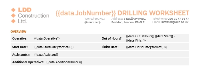
Can I format the date to show me what day of the week it is, followed by the day, month, and year?
Sure enough, an additional formatter in between the closing brackets did the trick:
:format(D)
How do I make it so that when users check this box the export shows a check mark, but if they don’t check the box, it’s empty?
Another additional formatter saves the day:
:bool( ✓, )

The signature is too large on the export document. Is there a way to resize it?
Plumsail have provided us with the necessary formatter which we amended according to our needs:
:picture(150)

Overcoming these issues has allowed the company to come up with great looking documents for both internal and external use:
"The worksheets generated by the Plumsail system look much more professional, and are more on brand than ever before. No longer will we have the issue of sending creased, dirty, or damaged worksheets to our clients."
"One of the most amazing things about Plumsail is that it works unlike DocuSign. We’ve trialed DocuSign for a good few months before trying out Plumsail and it fell short of the mark in many, many ways.
With DocuSign you have to leave long gaps in-between your text for where the data entered by users would appear. So often, you’d end up with a massive gap right after the data entered by users which would disturb the flow of the document and look primitive.
The other issue was when users were entering more data than we expected and it would cause their information to overlap the rest of the text on the template. Again, it makes the document look broken and not at all professional.
On the other hand, with Plumsail, you can insert your code in-between the rest of the text and the data submitted by users will occupy the exact space it needs but not more, making the entire document look as if it was put together by an actual person."
"We often have entire paragraphs of text where some of the details need to be filled in by the data inputted through the form. You can not tell that our documents are automatically generated. It saves us from having to manually look at any submitted data and manually add each detail where it belongs in the document."
We’ve set up Power Automate to save the outcome file onto SharePoint. Since we’re recording worksheets for two divisions, we needed to save files in separate destinations. I’ve tried a few things myself to differentiate between the two divisions and set Power Automate to save files separately but couldn’t figure it out myself.
Once again, I sent Plumsail screenshots of my Power Automate flow and asked for their help.
With Plumsail’s help we picked the most appropriate solution for us. We set a condition which stated: Job Number contains “EA”, if yes - create file in EA location, if no - save file in Drilling location. This worked like a charm.
We previously set the form to only accept job numbers that started with “D-“ or “EA-“. Therefore this solution was an easy but effective implementation. Once again, Plumsail were quick to jump in with help.
They knew exactly how to solve this issue, and delivered their response in an easy to understand coherent manner.

How the Power automate flow looks when complete
This flow has massively helped with the document storage and processing:
"Undoubtedly, having implemented the Plumsail system has helped us make this information much more accessible than ever before. Records of our works are no longer stuffed in hundreds of folders taking up lots and lots of cupboards and space in our offices and physical document depository.
Resurfacing details of our old projects was a task onto itself. Now we can do it from our phones. We have these records on our emails, and our SharePoint system, making it very convenient to retrieve any detail from any of our previous work."
With Plumsail Forms and Documents, you can also set up a system like this, and if you need anything else, you can contact our support to make sure your forms meet your goals. We provide help and guidance to beginners and experienced users alike, and are always open to new ideas.
If you'd like to check what the limit of custom web forms is and go beyond, get started with a free version of Plumsail Forms by checking how to design your first form guide, which includes a full video walkthrough. Here you can also find out how to generate documents from templates.