Charts can be a great way to visually present information which can otherwise be very hard to process. Visualizing large lists gives you a clear picture overall. But sometimes, just the chart is not enough — you need more information than just the graph.
That’s where notes, tooltips, and labels come into play. Here, you will find how Dashboard Designer can display all sorts of additional information on top of what is already seen in the chart.
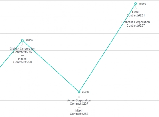
As with the example charts above, notes can be crucial to seeing the bigger picture. The sales chart by itself is rather helpful, but it only shows the abstract information while notes present you the details. No need to guess what sales have been made during each month — the chart simply shows you. Find out how this can be done in SharePoint here.
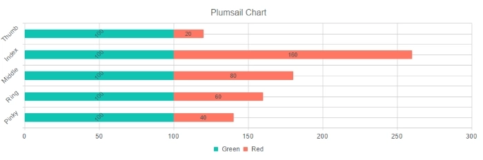
Labels also play an important role, as well as their formatting. For example, different series can have different rotation as shown in the picture above. Formatting is not limited to just rotation either, and if necessary, you can apply various styles to see what works best for you.
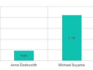
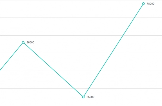
What about large numbers? Seeing many zeroes on the chart might look unprofessional and sloppy, but this can easily be rectified by shortening the label as seen on the chart above. Instead of giving the exact number, just show the number of thousands or millions. All of this can be adjusted to any scale with some light JavaScript.
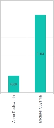
Just like value labels, column labels can be rotated as well. It can be names or values, but you can apply different styles and rotation as you see fit. You are not restricted to straight angles either, set rotation to what you feel is right for your presentation.
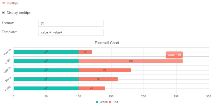
Last but not least are the tooltips — a very powerful and also highly customizable source of information. You don’t see them by default, but once your mouse hovers over an element you get all the extra info you need.
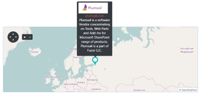
Customization options are endless! As you can see there is so much additional information on this tooltip. All this information is taken directly from the list — it contains logo, description and site URL. With some adjustments to the template, we can see all this information neatly presented on our tooltip.
All of these examples and even more information can be found in this article. It’s my hope that these will inspire you to create your charts as you see them and not settle for less. There is so much that can be done with Dashboard Designer, be it a small stylistic change or a large modification to present as much as possible on one chart, our product has you covered.
Check out our site for additional information and examples, there are many more options that you can find there.