Charts based on just one list can be good, but sometimes, you might need more than that. What about multiple lists? And what if these lists are located on different sites? Maybe even site collections?
Today I will show you how Dashboard Designer can use advanced functionality to pull data from several SharePoint lists and then use it to build charts with information from multiple sites.

We have several projects, each has its own site. Each site has a Task List that contains all project’s tasks assigned to different employees. We’ll first get the project list, iterate over the projects, get the data located in the task lists in each of the projects and do some graphical presentation with this data.
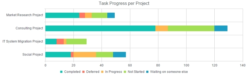
As you can see, the chart displays tasks for each project. Each series shows the total number of tasks by Status on each project. That allows you to see how overall progress is going on the project, and what is getting in the way.
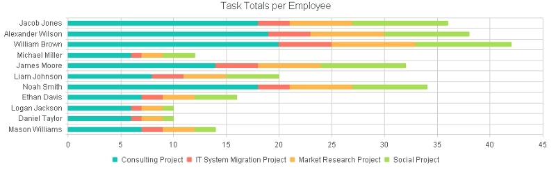
The second chart instead focuses on employees and their involvement in each project represented with a different color. This allows you to see the personal involvement of each and every employee as well as what projects give the most tasks to employees.
If you are interested in the implementation of these or similar charts, please, check out this article and visit our site for even more information about Dashboard Designer features and functionality. This, of course, is just an example, but hopefully, it shows how powerful the designer actually is. If you need to build charts and aggregate data from multiple sites — Dashboard Designer has you covered.