Forms
Last updated: Jun 28, 2023
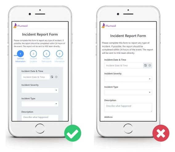
How to design Mobile-Friendly Online Forms
Elevate your web forms for mobile era! Follow these 7 simple tips to create mobile-friendly online forms that are responsive and easy to complete.

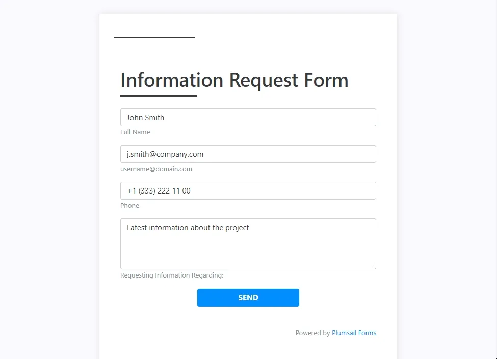
When users complete the form, you might want to give them some feedback. Starting from a simple thank you down to much more elaborate messages and recommendations, depending on your needs.
In Plumsail Public Web Forms, you can customize the message users see on form submit, you can:
Here we will review some examples that you can reuse in your form.
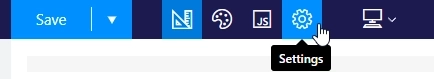
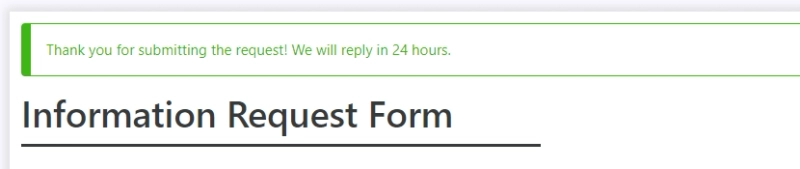
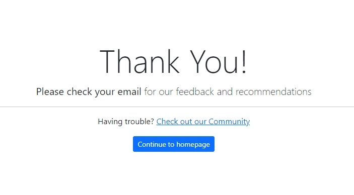
In form settings, you can write your own custom message which will appear when the form is submitted:
This message will allow you to relay some info to the client, for example, you can say that you will reply in 24 hours:
In the settings you can also hide the form from the user, and even add a timeout, so the form cannot be submitted again by the same user for this time:
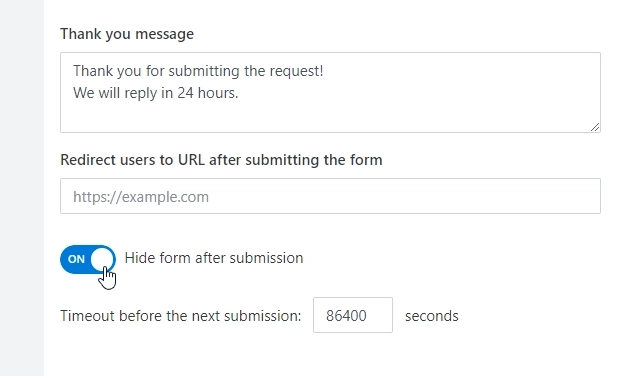
Once a user completes and submits the form, they will get this message and won't be able to edit the form until the timeout runs out:
Also in the settings, you can instead enter a URL of the page where user will be redirected to after submit:
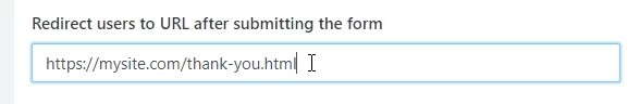
Once a user completes and submits the form, they will be redirected to this webpage of your choice:
Now, if you use JavaScript code, you can personalize the page and use form data, as you will be able to pass some parameters from the form's fields, and use them on your webpage:
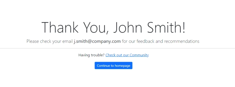
You can pass info from the form, and create a URL with parameters with the following code:
fd.saved(function() {
    var name = fd.field('Name').value;
    var email = fd.field('Email').value;
    var url = 'https://sitename.com/thank-you.html?name=' + name + '&email=' + email;
    window.location.href = url;
});Put these tips into practice today. Create a Plumsail account to get started designing forms and learn more about these settings in our documentation.
Elevate your web forms for mobile era! Follow these 7 simple tips to create mobile-friendly online forms that are responsive and easy to complete.
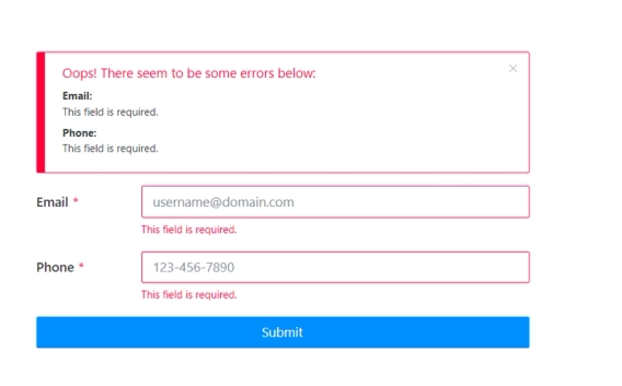
Popular use cases of how to validate a particular field in a web form.
Public web forms for all your needs built quickly online