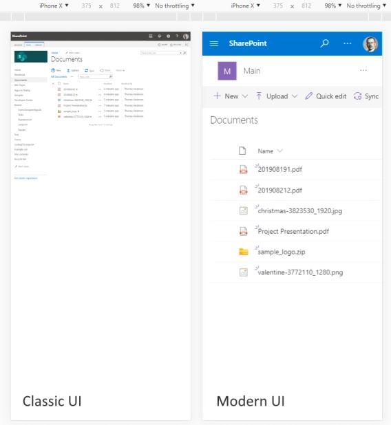
Modern and classic SharePoint UI — differences and advantages of switching
What’s this Modern UI all about?
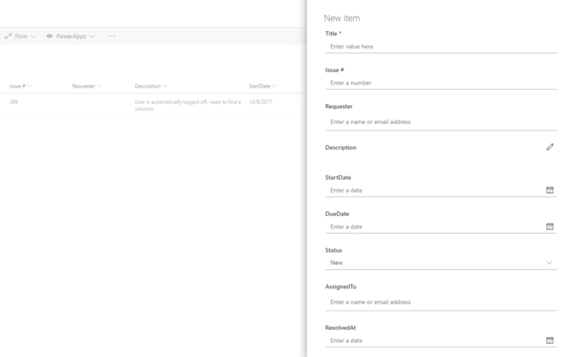
Do you want to customize modern SharePoint forms and still open them in the list view? As you most likely know, default forms in modern SharePoint UI open in a panel. So, it looks like this:

It’s not looking bad, but unfortunately it’s not very customizable. And if you have a complex form with lots of fields, it does get cumbersome. More importantly for some, it’s very hard to add custom logic to it. But we’ve found a solution for you.
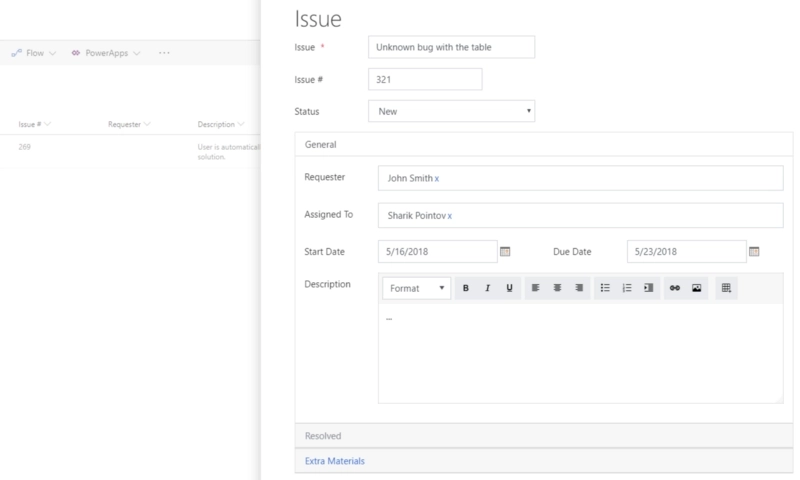
In the v.1.1.5 our Forms product has received a new functionality — an ability to open its custom and responsive forms in a panel, right in the List view. Not only that, but all the original functionality is preserved — including automatic routing, our custom JavaScript API and all the other options, including containers such as Tabs or Accordion.
Here’s what it looks like in SharePoint:

Now, configuration is very easy, it’s all done in just a couple of steps. You can also choose what size does the panel take. Find out more by reading the description on our site.