Forms
Feb 27, 2018
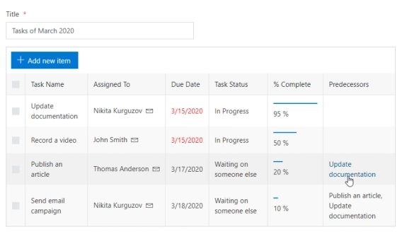
Repeating rows functionality with modern responsive forms (SharePoint Online)
Easy to use and highly customizable alternative to Repeating rows for SharePoint Online Modern UI.

In this article:
SharePoint List is a container that consists of all necessary data in a structured manner. It is a collection of data items called list items. Lists help manage and track information like events, survey results, announcements, etc.
In SharePoint, a list contains columns and rows where columns define the metadata, and rows represent the data. Lists in SharePoint can be easily added, edited, deleted, and viewed.
Charts are an easy way to visualize data. We'll show different approaches you can use within SharePoint forms to visualize data from any lists – using Microsoft's Power Apps platform and Plumsail's alternative.
We'll use the same list in both cases, showcasing example orders that your company might have to fulfill:
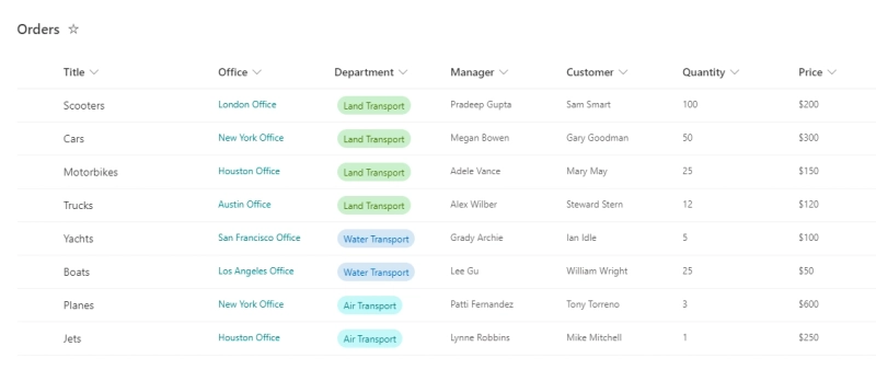
Many columns here are simple Single Line text, but we're also using a Choice column for Department, a Person column for Manager, and a Lookup column for Office.
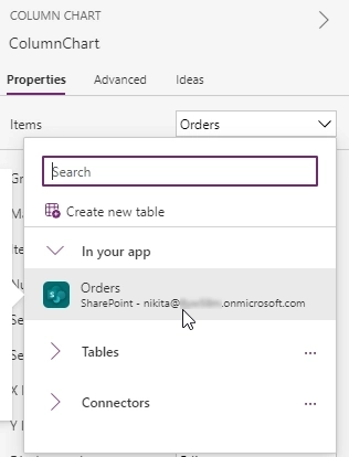
Technically, adding Charts to Power Apps is very easy. When customizing a SharePoint form, first make sure that the list on which you want to base your chart is present in Data Sources. If you want to base your chart on the currently customized list, it should already be available, but if it's a different list, you can add a Data Source, go to the Data tab → click Add data → search for SharePoint:
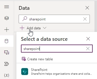
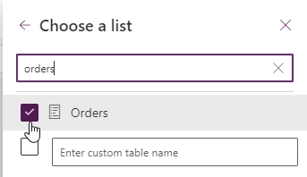
Then choose SharePoint site, and search for the SharePoint list you want to use, in this case Orders:
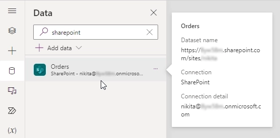
Once added, the list will appear in Data sources:
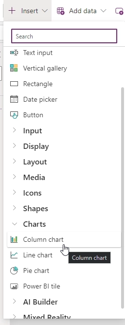
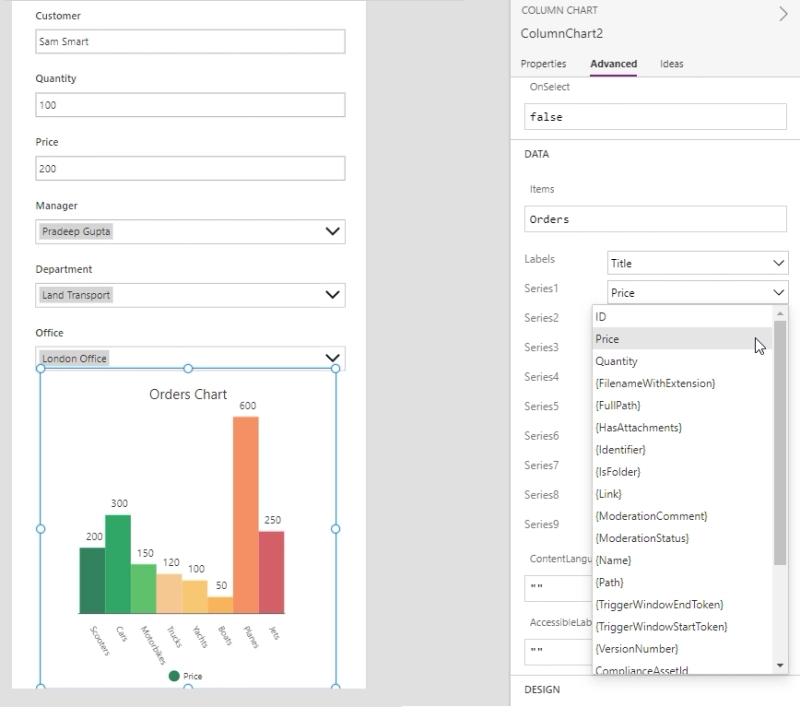
Now, you can find a place within the limited confines of the form where you want to place the chart, click Insert → Charts and select the chart type, we'll start with the Column Chart:
Once the chart is added, you can move it and adjust on your form, along with its title and legend, and for all charts you need to select Items → SharePoint list that we've added as Data source:
In the Advanced section of the chart configuration, you can select which columns from the list to use in your chart:
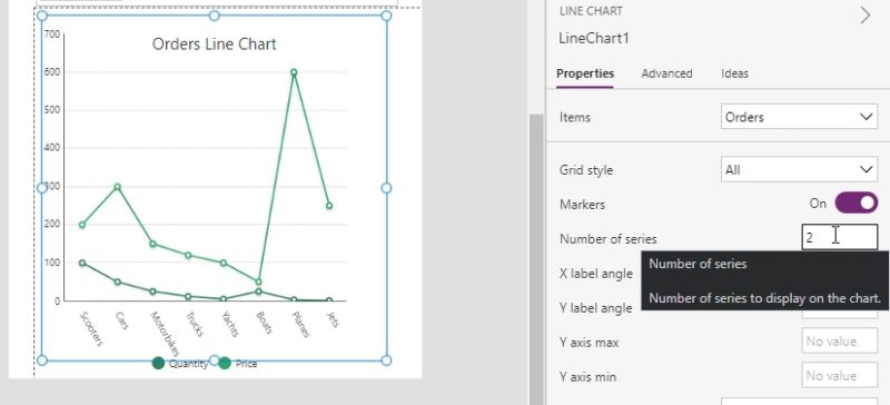
With the Line Chart, we can experiment with the number of series, comparing Quantity and Price difference between orders:
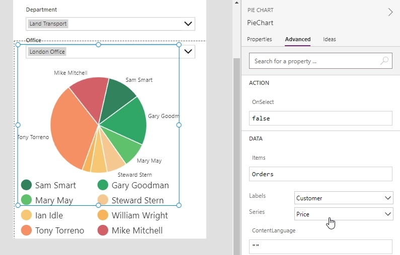
A Pie Chart can be used to analyze the Price paid by each client, and see who's paying more:
While these are great and easy to setup – there are a few serious drawbacks, some of you might've noticed already:
While the default charts offer no option to select Choice field as a data source for the Power Apps charts, there are some workarounds with advanced formulas to make Choice fields work as an option:
I want to make a Pie Chart from a SharePoint List. But if I change the text field to a choice field to force one of three choices, I receive an error.
Currently, we can have several series on the Column chart but we cannot stacked them. I suggest to add the option to stack the column on the Column chart.
Feedback from users of Power Apps seems to indicate that other types of charts are highly requested, but they haven't been added yet, only in integration with Power BI. The Stacked Bar chart has been in ideas for over 5 years.
I understand Power BI can be embedded inside Canvas Apps. But, for most simple scenarios, it is useful to have it embedded as part of Canvas Apps. For simple scenarios, it doesn't make sense to have Power BI license issues for all users.
We'll work around all these limitations with the alternative option – Plumsail Forms and Chart.js
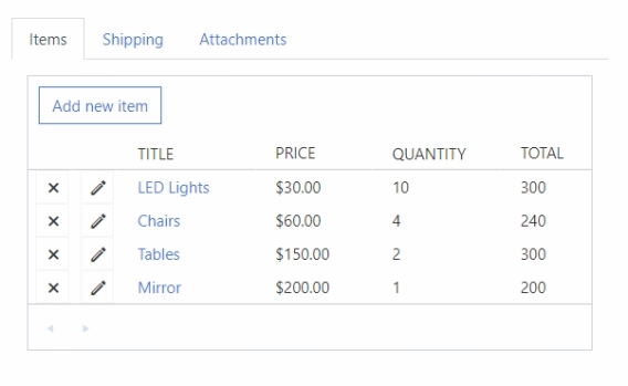
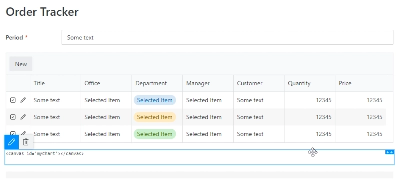
Plumsail Forms is a product that allows customization of SharePoint Forms in Modern UI with many new controls, such as Data Table, allowing data input in table format, or List or Library control, which allows you to publish related lists or document libraries directly on the form:
We'll use Chart.js library to visualize data on the forms in a similar way to Power Apps, with many more options:
Once you've configured a List or Library control on the form, you just need to add a canvas element to an HTML control where the chart will appear:
<canvas id='myChart'></canvas>
You will then need to configure the chart with JavaScript, for example, the following customization will allow it to read data from List or Library control and it will build a bar/column chart with total price based on the Department choice field:
requirejs.config({
    paths: {
        chart: 'https://cdn.jsdelivr.net/npm/chart',
    },
});

const containerId = 'myChart';
const listControlName = 'OrdersTable';
const valueField = 'Price.'; // Currency value without currency sign is stored in the '{FieldName}.' field.
const groupField = 'Department';

function getGroups() {
    const groups = fd
        .control(listControlName)
        .widget.dataItems()
        .map((v) => v[groupField]);
    return [...new Set(groups)];
}

function getValues() {
    const groups = getGroups();
    const items = fd.control(listControlName).widget.dataItems();
    const result = [];

    for (let i = 0; i < groups.length; i++) {
        result[i] = items.reduce((sum, v) => (v[groupField] == groups[i] ? sum + parseFloat(v[valueField]) : sum), 0);
    }

    return result;
}

fd.spRendered(function () {
    require(['chart'], function (Chart) {
        fd.control(listControlName).ready(function () {
            const chart = new Chart(document.getElementById(containerId), {
                type: 'bar',
                data: {
                    labels: getGroups(),
                    datasets: [
                        {
                            label: 'Price',
                            data: getValues(),
                            borderWidth: 1,
                            backgroundColor: ['rgba(76, 255, 0, 0.3)', 'rgba(0, 148, 255, 0.3)', 'rgba(0, 255, 255, 0.3)'],
                        },
                    ],
                },
                options: {
                    scales: {
                        y: {
                            beginAtZero: true,
                        },
                    },
                },
            });

            fd.control(listControlName).$on('change', function () {
                setTimeout(function () {
                    chart.data.labels = getGroups();
                    chart.data.datasets[0].data = getValues();
                    chart.update();
                }, 1000);
            });
        });
    });
});
It will even update in real time as the values in the List or Library control change:
![]()
This is just a basic example, but a much more in-depth customization is possible with more extensive code, and all fields can be included, even fields such as Lookup or Person to make a chart which will work for your company and your form requirements.
With Plumsail Forms for SharePoint, you can add data tables or related lists to any form, and even connect lists from different sites together, and with Chart.js you can visualize this data with graphs. Many other controls are available, and you can add any other resources that you might need.
If you'd like to try it out and see if it works for your needs, get started with 30 days free trial of Plumsail Forms for SharePoint Online by following the installation instruction in our documentation, which has a video walkthrough.
If you're using SharePoint 2019 or Subscription Edition, follow the SharePoint On-Premises installation guide.
Easy to use and highly customizable alternative to Repeating rows for SharePoint Online Modern UI.
Change appearance or expand functionality of any column
Enjoy advanced list views right on your forms