In the last article, I’ve shown how to build charts from SharePoint lists. What if you want something more than static charts? Need to add some interactivity to your charts? Imagine — instead of two charts, you get a dozen, all of them just one click away.
No need to imagine it — Dashboard Designer already has it:
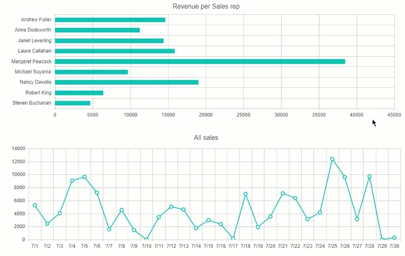
As you can see, we have two charts — Bar Chart and Line Chart. By default, Line Chart displays revenue from All the sales. Bar Chart shows total revenue by a sales representative. These are good charts, but what if we want more information about individual sales for each sales rep?
Can’t be easier! No need to build individual charts for each Sales rep — tie two charts together instead. When a user clicks on a name or bar at the top chart, the bottom chart rebuilds automatically and you can see individual sales by date.
Check out how to link two charts together here.
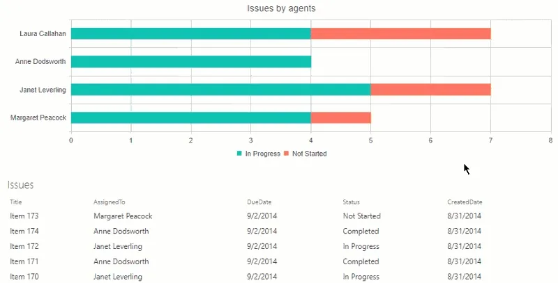
Another option is to link chart to list. Same concept and very simple realization, but a powerful tool to quickly find related data in the list.
As you can see, the chart shows all issues assigned to each agent. Two series show issues that are either in progress or haven’t been started yet. Depending on where the user clicks the list below will be filtered by both the Assigned To and the Status field. Check out how this works in this article.
Hope this information helps all SharePoint users, including you! Static charts can be useful, but interactive ones can provide much more content to the users of your sites.